Intro
Those who have seen my HoloLens apps (most notably Walk the World) have noticed I tend to use floating "info screens", especially for help screens. My apps are mostly voice command driven as I don't like to have floating controls that are in view all of the time. They stress the fact that you are in an virtual environment, and that degrades the actual immersive experience, IMHO. So I go as much for gestures and voice as possible.
But where there are no visual clues for functionality, there's also lack of discoverability. So I tend to include a voice command "help" or "show help" that brings up a simple floating screen that shows what the app can do.
A few important things that you might not see right away:
- The screen follows your gaze
- The screen tries to move away from you to be readable, but will stop moving if it get's pushed against an obstacle. So it won't disappear into another hologram or a physical object, like the wall or a floor. Or at least it tries to. I must admit it does not always works perfectly.
- Notice that at first it will appears like 1 meter before you and move into view, next time it will appears where you last left it and then move into view.
In a two-part post I will describe how I have created such a screen.
- The first part will handle building the actual visual structure in Unity (and one little behaviour)
- The second part describes the code for all other Unity behaviours.
I am going to assume you know a bit about Unity but not too much, so there's going to be lot of images.
Setting up a base project

The basic setup of an info screen
My info screens basically exist out of three simple components:
- A background, usually a Plane
- Text displayed by a 3DTextPrefab
- Some kind of 'button' to close the screen. I tend to use a rotating Sphere for that, a step towards true 3D UIs that I already explored in this post.
So let's build those!
Background plane
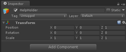
Inside the HologramCollection that we inherited from my previous post we will first make an empty game object that I called "HelpHolder" as this will be a help screen, but you can call it anything you like. To make designing a little easier, set it's Z position to 1, else it will be sitting over the camera, which is always on 0,0,0 in a HoloLens app. That kind of obscures the view.
Inside that HelpHolder we first make a common Plane. This gives the standard, way too big 10x10m horizontal square. Change it's rotation to 270 and change X and Z scale to 0.07m (changing the Y scale makes no sense as a Plane essentially has no Y dimension).
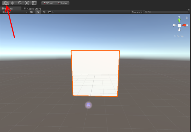
Double click the Plane in the HelpHolder - this will make your scene zoom in. Now use that hand button and left top the scene screen and the CTRL key to rotate around to you get to see the white side of the Plane (the other side is translucent). Notice the HoloLens cursor ;)
Now a white background for a text doesn't look good for me, I find it too bright. So we are going to make a material to make it look better.
To keep things organized, we first create an "App" folder in "Assets", and within that a "Materials" folder. In that Materials folder we create a HelpScreenMaterial Material
Setting some color and reflection
Now over on the right side:
- Set "Shader" to "HoloToolkit/StandardFast"
- Set "Rendering Mode" to "Transparent"
- Set "Color" to a background color you fancy, I took a kind of sky blue (#0080FFFF)
- Move the "Smoothness" slider all the way to the left - we don't want any reflections or stuff from this 'screen'
Now you only have to drag the material on your plane and it will turn blueish.
Rather standard Unity stuff this, but I thought it nice to point it out for beginners.
Changing the collider
A Collider is a component that determines how a game object collides with other objects. When you use primitive objects, those are of the same type as actual shape you use, although the names are not always the same. So a Sphere typically has a Sphere Collider, but a Cube has a Box Collider. There is no Plane collider, as a Plane is a generic Mesh - so it uses a Mesh Collider. And here we run into an issue, because a Plane typically has one side and it looks the Mesh Collider has that as well - and if not, it does not prevent the help window from getting pushed though the floor or a wall. As I found out making this demo :D.
So select the Plane, hit the Add Component button at the bottom and add a Box Collider.
Then
- Unselect the checkmark next to "Mesh Collider". This will disable the old Mesh Collider. A game object may have only one active Collider so we want to get rid of this. You can also delete it if you want using the dropdown that appears if you click the gear icon all the way to the right.
- Put "0.02" in the Y filed in the "Size" Section. This will make the Collider as big as the blue plane, and 2 cm thick.
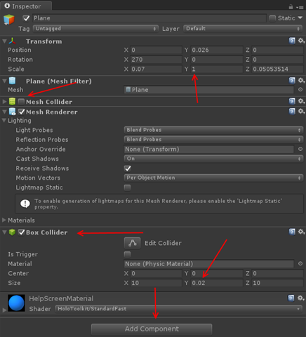
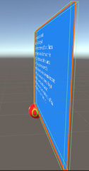 If you look at the screen on edge, you can see the green indicator lines showing the outline of the Collider:
Adding text
Find the 3DTextPrefab and drag it onto the HelpHolder:
It should end up under the Plane. Zoom a little in on the plane to see the text clearly.
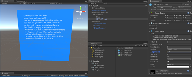
Now change the text into the help text you want (I took some Lorum Ipsum) and change some of the text settings:
- Change Y to 0.133 (this will move the text towards the top of the 'screen', making room for the button later on).
- Change Z to -0.02 (this will move the text to 2cm before the 'screen', this will prevent rendering issues later on
- Change "Alignment" to left
I wish to stress the Y value hugely depends on the size of your text, the the font size, and the size of your 'help screen'. To get it right, it requires some fiddling around (as we will see later on).
Building the button - part 1

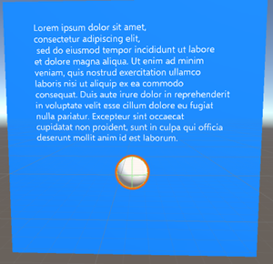
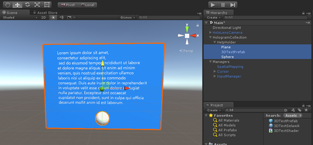
This results in the following and now you can see where the fiddling starts, because that screen is too big for the text and the button it not quite where we want it
Some in-between fiddling around

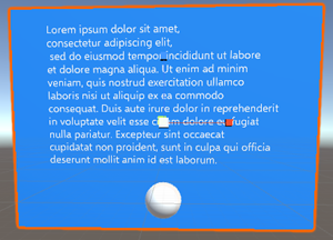
By dragging the blue block in the left image you can change the screen size in vertical direction, the red block will do so in horizontal. With the yellow arrow (right image) you can move the plane upward until it is where you like it.
In my Inspector pane on the right it said this when I was done:
But... now all of or stuff is quite off center as far as the HelpHolder, the root object, is concerned. It's center point is pretty low on our screen, which means the screen it too high.
This can be fixed by selecting all three denizens of HelpHolder (using the CTRL button), select the Move button again, grab the yellow arrow and move the whole combination downward until the read arrow is more or less on the horizon.
It does not have to be a super precise hit, as long as it's not so much off center as it first was.
Building the button - part 2
A white sphere is not a button, so add some that makes sure you can click it. I think a real designer might have to say something about it, but I have found that a red texture with a large OK text on it works - in the sense that I never had to explain to anyone that it's something you can air tap and that will act like something of a button. So I created this awesome :D picture, created a "Texture" folder under app and put it there
It's odd shape will become clear soon.
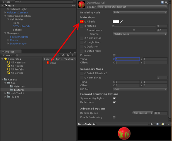
First, create a "DoneMaterial" in Materials. Then:
- Set "Shader" once again to "HoloToolkit/StandardFast"
- Set "Rending Mode" to "Fade" (not Transparent)
- Select the "Textures" folder in the App/Assets folder, and drag the "Done" texture on top of the little square left of the "Albedo" text
- Change the X value of "Emissions/Tiling" to 3. This will morph three images on the Sphere, repeating them horizontally.
If you have done everything correct, you will see the material looks like above.
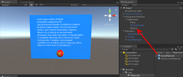
Now drag the DoneMaterial from the Materials folder onto the Sphere in the Hierarchy
And the button on the screen looks already familiar :). I left the default Shader settings as it's a bit smooth, so it looks like it reflects a little light adding to it's 3D appearance.
Turn off shadows
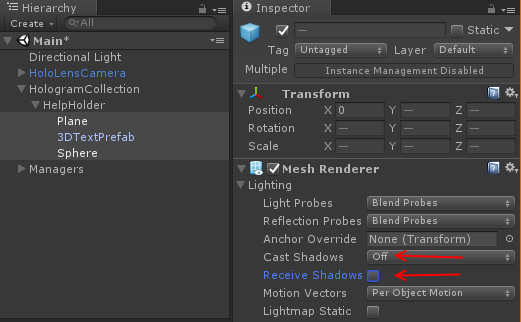
This is a thing trick I learned from Dennis Vroegop, long time Microsoft MVP, my unofficial MVP 'mentor' who learned me to deal with suddenly being a Microsoft MVP too way back in 201,1 and long time expert on Natural User Interface. The trick is this: unless your app really really uses them for some reasons, turn off "receive shadows" and "cast shadows" for the renderers of all three objects. As you can see the actual real light sources in your room through HoloLens, shadows will appear on the wrong places anyway and only give cause for confusion at best - at worse they will 'break the spell'. As a bonus, the Unity engine won't need to calculate the shadows so you will save some performance as well.
So select all three objects (use the CTRL key for that like in any other normal Windows program) and turn this off in one go:
A little code for dessert
This is part of my HoloToolkitExtensions libary, that I one day will publish in full, but, well, time. It is called HorizontalSpinner, and basically is the grandchild of the SimpleRotator that briefly passed by (without explaination) in my post about a generic toggle component for HoloLens. It uses LeanTween and looks like this:
using UnityEngine;

namespace HoloToolkitExtensions.Animation
{
    public class HorizontalSpinner: MonoBehaviour
    {
        public float SpinTime = 2.5f;

        public bool AbsoluteAxis = false;

        private void Start()
        {
            if (AbsoluteAxis)
            {
                LeanTween.rotateAround(gameObject, Vector3.up, 360 / 3.0f,
                   SpinTime / 3.0f).setLoopClamp();
            }
            else
            {
                var rotation = Quaternion.AngleAxis(360f / 3.0f, Vector3.up).eulerAngles;
                LeanTween.rotateLocal(gameObject, rotation, SpinTime / 3.0f).setLoopClamp();
            }
        }

        private void OnEnable()
        {
            LeanTween.resume(gameObject);
        }

        private void OnDisable()
        {
            LeanTween.pause(gameObject);
        }
    }
}
Default this spins an object around for 120° in local space. Since our the tiling of our 'button' is 3 in X direction, this will look like the button spins around in 2.5 seconds, while in reality, it will jump back to it's original position. But as you can see if you press the Unity Play button, it looks like the button is rotating around endlessly. LeanTween is doing most of the work: it rotates the game object around and the setLoopClamp at the end makes it a loop. No need for coroutines, lerps, and heaven knows what.
I am using local space because I want the button to perpendicular to the user's view at any given moment, but since the screen moves around with the user's gaze and gaze angle, it needs to be in the local space of the HelpHolder.
The HorizontalSpinner is in HoloToolkitExtensions/Scripts/Animations. Simply drag it on top of the Sphere, then change values as you like, although I would recommend not changing the Absolute Axis setting.
Conclusion
We have built the visual parts of a help screen but with very little functionality or interaction. It's actually not hard to do, if you know what you are doing. I hope I have helped you getting a bit more feeling for that.
In the next installment, which will hardly contain images, we will see WAY more code.
The project so far can be found at GitHub, as always.








No comments:
Post a Comment