Showing posts with label Blend. Show all posts

27 August 2014

Simple workaround for “Design view is unavailable for x64 and ARM target platforms”

When you are developing for Windows Phone or Windows and you are faced with using a native component (for instance the Bing Maps control on Windows, or the SensorCore api on Windows Phone) you will loose your designers when you are testing, both in Visual Studio and in Blend, as they will only work for “AnyCPU”  or “x86” configurations.This is highly annoying, but there is a kind-of fix.

The trick is to create an extra configuration. I usually make a copy of “Debug”, which I call “DebugArm” I do this by right clicking on the solution, selecting “properties”, and then hit “Configuration Manager”

image

Then I make a copy of Debug, by selecting “New” in the “Configuration” drop down, and I make a copy of Debug, called DebugArm.

image

In that solution I set everything to ARM:

image

So far so good, and nothing new. Now select the Debug project configuration again in Visual Studio, hit “Save all” and compile. Then open the solution in Blend. You will notice of course the designers now work, but now you cannot deploy. Changing that configuration every time again is slow and cumbersome, and it won’t be picked up by Blend. So you have to restart that time and time again. This now, my friends, we will use to our advantage.

Go back to Visual Studio, select “DebugArm”. You can now deploy and test again, but your designers will of course go dead again. But like I said Blend does not pick up that configuration change. Apparently that is only read at startup. So that will keep the Debug configuration and the designer still will work! So now you can use Blend to do design changes, and Visual Studio to actually run and deploy, using two different configuration settings, without having to change al the time!

This switchemarole you have to do every time you start Visual Studio and Blend. Granted, it’s not ideal, but a lot less of a hassle than constantly having to change configurations, which is is slow, while now you only have to select a different Icon in the Task Bar. And this is how it should be done most of the time IMHO – Blend is for the UI, Visual Studio for code.

No code this time, as this is a tools-trick only post.

10 April 2013

ViewModel driven multi-state animations using DataTriggers and Blend on Windows Phone

Long long time ago I wrote how to drive animations from your ViewModel using DataStateBehavior, and I explicitly stated this was the only way to do it, since (quoting myself), “Windows Phone 7 does not support DataTriggers”. That was then, and this is now. The drawback of DataStateBehavior is that you basically can only do on/off animations, which makes more complex multi-state animations impossible. There was another behavior that could do that, but I could not find that anymore and I could not quite remember the name. And then I suddenly stumbled upon the Microsoft.Expression.Interactions assembly – and in its Microsoft.Expression.Interactions.Core namespace there is indeed a DataTrigger. And that seems to have been present in the 7.1 framework as well. *Cough*.

So in this blog post I am going to demonstrate how to animate a few ‘popup windows’ via a single Visual State block and a ViewModel, using DataTriggers. I am going to show this using Visual Studio 2012, MVVMLight and mostly Blend. It’s time to give this unsung hero some love again, so I am going to follow the tutorial-style again.

imageSetting the stage

  • Open Visual Studio, create a “Windows Phone app”, and target 8.0 (it should work in 7.1 as well BTW)
  • Click Tools/Library Package Manager/Manage NuGet Packages for Solution.
  • Search for MvvmLightLibs, select “MVVM Light Libraries only”
  • Click “Install”, “Ok” and “I Accept”

Building the ViewModel

The ViewModel actually consist out of two files – an enumeration describing the states and the actual ViewModel itself. First, create a folder “ViewModel” in your solution, and the create the enumeration like this:

namespace DataTriggerAnimation.ViewModel
{
  public enum DisplayState
  {
    Normal = 0,
    ShowPopupHello = 1,
    ShowPopupBye = 2,
  }
}

And then the ViewModel like this:

using System;
using System.Windows.Input;
using GalaSoft.MvvmLight;
using GalaSoft.MvvmLight.Command;

namespace DataTriggerAnimation.ViewModel
{
  public class DisplayViewModel : ViewModelBase
  {
    private DisplayState displayState;
    public DisplayState DisplayState
    {
      get { return displayState; }
      set
      {
        if (displayState != value)
        {
          displayState = value;
          RaisePropertyChanged(() => DisplayState);
        }
      }
    }

    public ICommand DisplayPopupCommand
    {
      get
      {
        return new RelayCommand<string>(
            (p) =>
              {
                DisplayState = (DisplayState)Enum.Parse(typeof(DisplayState), p);
              });
      }
    }

    public ICommand CloseCommand
    {
      get
      {
        return new RelayCommand(() 
           => DisplayState = DisplayState.Normal);
      }
    }
  }
}

The important thing to note is that the command “DisplayPopupCommand” requires a parameter to determine the popup that must be displayed. The CloseCommand is equivalent to a DisplayPopupCommand with parameter “Normal”, and is just there for making the designer’s life easier.

… and that’s all the coding we are going to do. Build your application and close Visual Studio. The rest, just like my last animation post is done in Blend! All of it.

Creating the first panel

  • imageDrag a grid on the empty rectangle “ContentPanel”. Like all GUI objects, these can be found on the Assets tab on the left top.
  • Click on the “Grid” in the “Objects on Timeline” pane left, and rename it to “Panel1”
  • Right-click on the “Panel1” grid, hit ‘Reset Layout/All”
  • Go to the right-hand pane, select “Properties” and expand the “Layout” pane if it’s collapsed.
  • Then click “Top” for Vertical Alignment.
  • Then enter “150” for height

Then proceed to add a text:

  • imageDrag a TextBlock on the “Panel1” grid. You can do this by either dragging it on the design surface on top of “Panel1”, or on the “Objects and Timeline” pane (also on top of “Panel1”)
  • Change the text from “TextBlock” to “Hello this is popup one”
  • Do Reset Layout/All on this text as well
  • In the Layout Pane, select Horizontal Alignment “Center” and Vertical Alignment “Top”

And finally add a button:

  • imageDrag a button on Panel1
  • Do Reset Layout/All on this button as well
  • Change the caption to “Done”
  • In the Layout Pane, select Horizontal Alignment “Center” and Vertical Alignment “Bottom”

And then finally do something that seems like pretty bonkers, but trust me: it will all become clear in the end:

  • imageSelect Panel1 in the Objects and Timeline panel.
  • Go to the Properties pane on the right hand side, and find the “Transform” pane. It’s usually collapsed. Expand it first.
  • Select Center Point tab - the 2nd tab from the right under “Rendertransform” (with the dot on in)
  • For both X and Y type “0.5”. This sets the transformation point dead in the middle of the panel
  • Then also select the Global offset tab – that’s the 2nd tab from the right under “Projection” (with the up and left pointing arrow on it)
  • imageEnter “500” for X.

Your design surface now should look like showed on the right. The panel is sitting well right of the phone. Bonkers, I said it. ;-).

Creating the second panel

Going to be a bit lazy here. I don’t want to to the whole sequence again

  • Select Panel 1 in “Objects and Timeline”
  • Hit CTRL-C, CTRL-V. This will result in a Panel1_Copy below Panel 1
  • imageRename that to “Panel2”
  • Go to the Properties tab again on the right, and enter “160” for top margin. This should result in Panel2 appearing under Panel1
  • Then, for an encore, go to the Transform panel again and change “500” for X Projection to -500

The second panel should jump to the left and imageresulting design surface should now look like this:

Creating the popup buttons

At this time I am going to assume you now understand the layout panel, so I am not going to make screenshots of every button you need to click and number you need to enter in the layout panels ;-)

  • Drag a StackPanel on the design surface, near the bottom of the screen.
  • Do Reset Layout/All,
  • Select Vertical Alignment Bottom, and enter a height of 220.
  • Proceed to drag three buttons on top of the StackPanel. These should appear under each other, taking the full width of the screen.
  • Change the captions of the buttons to (from top to bottom) “Popup 1”, “Popup 2” and “Done”.

The final design surface, including the objects tree, should look like this:

image

Defining the Visual States

We have three visual states:

  • None of the popups are displayed
  • Popup 1 is displayed
  • Popup 2 is displayed

To create these, proceed as follows:

  • imageAt the top left, click the “States” Tab.
  • Click the “Add state Group” Button
  • Rename “VisualStateGroup” to "PopupGroup”
  • Enter “0.5” for “Default Transition”. This indicates any state transitions will be automatically animated over a 0.5 second time period.

Next steps:

  • imageClick the “Add state” Button
  • Rename the state “VisualState” to “Normal”
  • Add two more states, “ShowPopupHello” and “ShowPopupBye”
  • Click the red dot before “ShowPopupBye”.  The red color disappears. The main design surface should now have a caption “ShowPopupBye state recording is off”

Now the next things are tricky, so pay close attention and make sure you do this exactly right.

  • Select “Panel1” in “Objects and Timeline”
  • Click state “ShowPopupHello”. The main design surface should now have a caption “ShowHelloPopupstate recording is on” and have a red border.
  • Go to the Transform panel again, select under projection the Global offset (2nd tab from the right) again and change 500 back to 0. Panel 1 should now appear in the phone screen
  • Now select state “ShowPopupBye”. Panel 1 disappears again
  • Select Panel2
  • Change its global offset to 0 as well. Now panel 2 appears in the phone screen
  • Select State “Normal”
  • Select the red dot before “Normal” to turn state recording off. Both panels now should be outside of the phone screen again.
  • Select “Base” on top of the State panel.

Bringing in the ViewModel

Before we are going to connect the Visual States to the ViewModel’s actions, let’s first bring it in. That’s pretty easy.

  • imageGo top right and select the data tab.
  • Select the “Create data source” button all to the right and select “Create object data source”
  • On about the 8th line you should see “DisplayViewModel”. Select that
  • Enter “DisplayViewModelDataSource” in the “Data source name” box
  • Hit OK.
  • Net result should be as displayed to the right.

Setting up initial data binding

This is so ridiculously easy in Blend it always makes me happy when I get to this state.

  • Drag “DisplayViewModel” from the data tab on top of the LayoutRoot panel in the Objects and Timeline panel
  • Drag “CloseCommand” on top of all three “Done” buttons. You can do that either on the design surface or on the Objects and Timeline panel, whatever you like.
  • Proceed to drag “PopupCommand” on top of both the “Popup 1” and “Popup 2” button.
  • Now select the “Popup 1” button, and select the “Properties” tab again.
  • On top there’s a “Search properties” box. The developers of Blend soon recognized the number of things you can set it so big you can easily loose track. Enter “Command” in that search box to limit the number of properties it shows.
  • The Properties box now should only show “Command” and “CommandParameter”. Enter value “ShowPopupHello” for “CommandParameter”
  • Now select the “Popup 2” button, and enter “ShowPopupBye” for “CommandParameter”
  • Clear the text “Command” from “Search Properties” so you can see all the properties again.

Programming by dragging stuff on top of each other. Ain’t life fun sometimes?

Furioso dragon-13-Enter the dragon: datatriggers for putting it all together

And now for the really scary part – the datatriggers. Just kidding of course – just more dragging stuff and filling in some fields. The odd thing is – from the Blend perspective, data triggers are hardly visible. We are using GotoStateActions. Finish the app by following these final steps:

  • Drag a GotoStateAction from Assets box on top of ContentPanel. If you can’t find it: type “goto” in the search box of the Asset panel. It will popup in the list to the right of the panel
  • Under Properties, Click on the “New” button next to “TriggerType” and select “DataTrigger” in the box that pops up.
  • Behind “Binding”, click the barrel like icon. A dialog pops up with the properties of your DisplayViewModel. Select “DisplayState” and hit OK
  • Enter “0” for value
  • imageFor StateName, select “Normal”
  • Drag another GotoStateAction from Assets box on top of ContentPanel. Make this a DataTrigger to, select the same property to bind to, but
    • Enter “1” for “Value”
    • Select “ShowPopupHello” for StateName
  • And finally, a third GotoStateAction with 2 as value and “ShowPopupBye” for StateName.

And that’s all. If you run your application (you should be able to hit F5 from Blend) you will get a simple app that scrolls Popup 1 from the left in half a second when you hit “Popup 1”, and scroll it back when you hit on of the done buttons. If you hit the “Popup 2” button when Popup 1 is visible, it will scroll the second popup into the screen while simultaneously scrolling the first on out of the screen.

The data triggers look like this in XAML:

<i:Interaction.Triggers>
  <ec:DataTrigger Binding="{Binding DisplayState}" Value="0">
    <ec:GoToStateAction StateName="Normal"/>
  </ec:DataTrigger>
  <ec:DataTrigger Binding="{Binding DisplayState}" Value="1">
    <ec:GoToStateAction StateName="ShowPopupHello"/>
  </ec:DataTrigger>
  <ec:DataTrigger Binding="{Binding DisplayState}" Value="2">
    <ec:GoToStateAction StateName="ShowPopupBye"/>
  </ec:DataTrigger>
</i:Interaction.Triggers>

Some things to note

  • We hardly did program anything at all, and what’s more – we did not even make animations or storyboards. By simply setting the default transition to 0.5 seconds and indicating where we want stuff to be once a state is reached, the Windows Phone framework automatically infers and creates an animation when changing state, moving the GUI elements from one place to another in half a second (in stead of flashing them from one place to another).
  • In the Command I was able to use names as defined in the enumeration because I did an Enum.Parse in the ViewModel, in the data triggers I had to use the real value (0,1,2) to be able to compare. Something that can be fixed using a converter, but I did not want to complicate things.
  • The fact that the visual state names have the same name as the enumeration values, does not bear any significance. I could have named them Huey, Dewey, and Louie for all I cared. Only the CommandParameter values need to be the same as the Enumeration string, and the DataTriggers need to have the same numeric value.

That’s it. Although the Visual Studio 2012 designer is light years ahead of the 2010 designer, Blend still rocks when defining a lot of stuff in XAML. Have fun making beautifully animated apps with this.

If you don’t feel like following all these steps yourself, find, as usual, the completed solution here.

29 January 2012

Templating a XAML CheckBox to a thumbs-up/down control using Expression Blend

Preface
The checkbox has been been around in the Graphical User Interface for as long as I can remember doing GUI – since the early 90’s I guess. You know what, let’s make that “it’s been around for longer than I care to remember” ;). For my newest Windows Phone project I wanted something different. In stead of boring old 
checkbox 
 
I wanted something like this:
thumbsupdown
Turns out you can do this in pure XAML. And almost entirely in Expression Blend, too. I could just post the XAML and be done with it, but I like to document the track I took, not only to educate you, but also to remember myself how the hell I got here in the first place ;-).
Setting the stage
  • Open Visual Studio 2010
  • Create a new Windows Phone 7 (7.1 of course!) project,
  • Make a folder “icons”build actions
  • Download this image to your computer
  • Paste it in the “icons” folder in Visual Studio
  • Double check the image’s properties, they should be as showed to the right.
  • Save the project
Creating style and control template
  • Open the project in Expression blend
  • Put one (or more, for all I care) CheckBoxes on the phone page.
  • Select one of them, then click in the main Blend menu “Object/Edit Style/Create Empty”.
  • In the dialog that follows, enter “Thumbupdowncheckboxstyle” for a name and select “Application” under “Define in”
  • You will get a screen with a single CheckBox. Right click it, select “Edit template/Create Empty”.
  • In the dialog that follows, enter “Thumbupdowncheckboxtemplate” for a name and select “Application” under “Define in”
First thing you will notice is that the selected CheckBox completely disappears from your design surface. That’s because basically you have replaced the entire look for the CheckBox by an empty template, which is essentially well, pretty empty indeed. It only contains a grid, and even that’s gonna go.
  • Delete the Grid
  • Add a Rectangle to the template by double clicking on the Rectangle button from the Assets toolbar on the left
This is a good moment to turn on Split View in the designer, because that shows you what the designer is actually doing. Right-click the rectangle in the Objects and Timeline panel, and select “View XAML”. At this point you will see only this:
<Application.Resources>

  <ControlTemplate x:Key="Thumbupdowncheckboxtemplate" TargetType="CheckBox">
    <Rectangle Fill="#FFF4F4F5" Stroke="Black"/>
  </ControlTemplate>

  <Style x:Key="Thumbupdowncheckboxstyle" TargetType="CheckBox">
    <Setter Property="Template" Value="{StaticResource Thumbupdowncheckboxtemplate}"/>
  </Style>

</Application.Resources>
And the design surface will only show a horizontal white rectangle with a black border.
Default control size
ResourcesFirst and foremost, set the default size of your control. To get this done, look right top, select the Resources tab and expand App.Xaml. Then proceed as follows:
  • Right-click Thumbupdowncheckboxstyle
  • Select “Edit”
  • Select the “Properties” tab left of the “Resources” tab
  • Locate the “Width” and “Height” fields and enter 40 for both.
Your XAML now should look like this:
<Application.Resources>

  <ControlTemplate x:Key="Thumbupdowncheckboxtemplate" TargetType="CheckBox">
    <Rectangle Fill="#FFF4F4F5" Stroke="Black"/>
  </ControlTemplate>

  <Style x:Key="Thumbupdowncheckboxstyle" TargetType="CheckBox">
    <Setter Property="Template" Value="{StaticResource Thumbupdowncheckboxtemplate}"/>
    <Setter Property="Width" Value="40"/>
    <Setter Property="Height" Value="40"/>
  </Style>

</Application.Resources>
Propagate default size to template
Now go back to editing the Control template again:
  • Once again go to the “Resources” tab left top
  • Right-click Thumbupdowncheckboxtemplate
  • Select “Edit”.
  • Select the Rectangle and Click the tab “Properties” top left againwidth
  • Click the little square all the way to the right behind the field “Width”
  • This will popup a menu. Select “Template Binding/Width”
  • Click the little square behind “Height” and Select “Template Binding/Height”
This will set the width and height of the rectangle to the full width and height of the control. If the user does not set a specific width and height, the values in the default Setters (both 40) will be used. XAML at this point:
<Application.Resources>

  <ControlTemplate x:Key="Thumbupdowncheckboxtemplate" TargetType="CheckBox">
    <Rectangle Fill="#FFF4F4F5" Stroke="Black" Width="{TemplateBinding Width}" 
    Height="{TemplateBinding Height}"/>
  </ControlTemplate>

  <Style x:Key="Thumbupdowncheckboxstyle" TargetType="CheckBox">
    <Setter Property="Template" Value="{StaticResource Thumbupdowncheckboxtemplate}"/>
    <Setter Property="Width" Value="40"/>
    <Setter Property="Height" Value="40"/>
  </Style>

</Application.Resources>
Initial colors
Next steps:
  • ColorClick the white white rectangle behind “Fill”
  • Don’t bother to select a color: simply type in “Green” in the text box and Blend will make a pretty hex string of it ;-)
  • After that, click the little white square behind “Stroke”
  • From the popup-menu, select “Reset”
The design surface now shows a green rectangle. Oh wow ;-) but bear with me, we will get there in the end. Your XAML should now look like this:
<Application.Resources>

  <ControlTemplate x:Key="Thumbupdowncheckboxtemplate" TargetType="CheckBox">
    <Rectangle Fill="Green" Width="{TemplateBinding Width}" Height="{TemplateBinding Height}"/>
  </ControlTemplate>

  <Style x:Key="Thumbupdowncheckboxstyle" TargetType="CheckBox">
    <Setter Property="Template" Value="{StaticResource Thumbupdowncheckboxtemplate}"/>
    <Setter Property="Width" Value="40"/>
    <Setter Property="Height" Value="40"/>
  </Style>

</Application.Resources>
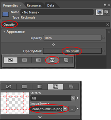
Including the image as an ‘opacity mask’
OpacityBlend’s greatest asset – it’s enormous capabilities – unfortunately is also sometimes its Achilles’ heel: there’s a bewildering set of options that’s not always easy to find your way in. Fortunately, at the top of the Properties there’s a Search box that helps you find that hard-to-find-options. Which is extremely helpful – if you happen to know what to look for ;-). In this case:
  • Enter “Opacity” in the Search box
  • Click “No Brush”
  • Select “Tile Brush” – that’s the 2nd icon from the left
  • That produces a drop-down where you can select “icons/thumbsup.png”
your XAML should now look like this:
<Application.Resources>

  <ControlTemplate x:Key="Thumbupdowncheckboxtemplate" TargetType="CheckBox">
  <Rectangle Fill="Green" Width="{TemplateBinding Width}" Height="{TemplateBinding Height}">
    <Rectangle.OpacityMask>
    <ImageBrush Stretch="Fill" ImageSource="icons/thumbsup.png"/>
    </Rectangle.OpacityMask>
  </Rectangle>
  </ControlTemplate>

  <Style x:Key="Thumbupdowncheckboxstyle" TargetType="CheckBox">
  <Setter Property="Template" Value="{StaticResource Thumbupdowncheckboxtemplate}"/>
  <Setter Property="Width" Value="40"/>
  <Setter Property="Height" Value="40"/>
  </Style>

</Application.Resources>
desing2designYour design surface should now looks like to the image to the left, which is kinda crummy. You can use the little triangle on the right bottom, and the two little lines on the right and the bottom, to resize the design surface. This will have no effect on the control template itself, it will make just make it look better (see right image) .
You can also manually add the attributes d:DesignWidth="75" and d:DesignHeight="75" to the Rectangle.
Defining Visual States
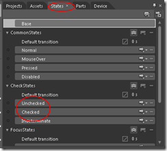
statesA CheckBox has certain states, the most obvious being Checked and Unchecked. Actually there are quite a lot more, and you can see them by clicking on the “States”  tab. Now all these states are defined, but there are no visuals connected to it anymore, since you have replaced the control template by something empty and started filling in yourself. This next step will bring a bit of those visual states back. To prepare for that:
  • Make sure the Rectangle is selected in the “Objects and Timeline”  panel left
  • In the Properties panel to the right of the screen, scroll down to “Transform”
  • Expand the Transform panel if it’s collapsed
  • Selected the leftmost tab
  • Enter 0.5 in both X and Y boxes
transformXAML at this point:
<Application.Resources>

  <ControlTemplate x:Key="Thumbupdowncheckboxtemplate" TargetType="CheckBox">
    <Rectangle Fill="Green" Width="{TemplateBinding Width}" Height="{TemplateBinding Height}" 
       d:DesignWidth="75" d:DesignHeight="75" RenderTransformOrigin="0.5,0.5">
      <Rectangle.RenderTransform>
        <CompositeTransform TranslateX="0.5" TranslateY="0.5"/>
      </Rectangle.RenderTransform>
      <Rectangle.OpacityMask>
        <ImageBrush Stretch="Fill" ImageSource="icons/thumbsup.png"/>
      </Rectangle.OpacityMask>
    </Rectangle>
  </ControlTemplate>

  <Style x:Key="Thumbupdowncheckboxstyle" TargetType="CheckBox">
    <Setter Property="Template" Value="{StaticResource Thumbupdowncheckboxtemplate}"/>
    <Setter Property="Width" Value="40"/>
    <Setter Property="Height" Value="40"/>
  </Style>

</Application.Resources>
In the “States”  panel, click on the “Checked” state. This will add quite some XAML code: you will see a “VisualStateManager.VisualStateGroups” tag appear, defining all three states of the “CheckStates”  group, i.e. “Checked”, “Unchecked”  and “Indeterminate”.
  • Now Select the “Unchecked”  state
  • Make sure the “Rectangle” still is selected in the “Objects and Timeline”  panel
  • Select the “Properties” tab on the top right again
  • Select the (now green) “Fill” Rectangle again.
  • In the box where you previously typed “Green” (which will say ”#FF008000” now), type “Red”. The thumbs-up image will now turn red
  • flipScroll down to “Transform” again
  • Select the right most tab
  • Select the “Flip Y-axis” button, in the middle. The thumbs-up image will now flip vertically and turn into a thumbs-down picture.
  • recordingLocate the little red button on top of the design pane that says “Unchecked state recording is on”. Click it and the text should change into “Unchecked state recording is off”.
If you press F5, the project will compile and run (yes, that works from Blend as well), and you will see that the checkbox shows a green thumbs-up image when selected, and a red thumbs-down image when unselected.
Now, for a finale to make things a little more visually appealing:
  • AnimateGo back to the “States” tab again
  • Select the Textbox with “0 s” in the “Default transition” panel above state “Unchecked”
  • Type 0.5 in the text box
  • And press F5 again.
You will now see the thumbs not simply flip: now it rotates in half a second and change color from red via orange to green. By simply specifying a time you tell the application to actually infer an animation. And there you are. A completely customized, animated, thumb-up-thumbs-down control with just some clicking around. Code-wise it behaves just like a normal checkbox. And if you want to make more of these checkboxes, just select a standard CheckBox, right click it, Select “Edit template/Apply Resources/Thumbupdowncheckboxstyle” and boom – yet another Thumbup-thumbsdown control.
Final XAML:
<Application.Resources>

  <ControlTemplate x:Key="Thumbupdowncheckboxtemplate" TargetType="CheckBox">
    <Rectangle x:Name="rectangle" Fill="Green" Width="{TemplateBinding Width}" 
               Height="{TemplateBinding Height}" 
               d:DesignWidth="75" d:DesignHeight="75" RenderTransformOrigin="0.5,0.5">
      <Rectangle.RenderTransform>
        <CompositeTransform TranslateX="0.5" TranslateY="0.5"/>
      </Rectangle.RenderTransform>
      <Rectangle.OpacityMask>
        <ImageBrush Stretch="Fill" ImageSource="icons/thumbsup.png"/>
      </Rectangle.OpacityMask>
      <VisualStateManager.VisualStateGroups>
        <VisualStateGroup x:Name="CheckStates">
          <VisualStateGroup.Transitions>
            <VisualTransition GeneratedDuration="0:0:0.5"/>
          </VisualStateGroup.Transitions>
          <VisualState x:Name="Indeterminate"/>
          <VisualState x:Name="Unchecked">
            <Storyboard>
              <DoubleAnimation Duration="0" To="-1" 
                    Storyboard.TargetProperty="(UIElement.RenderTransform).(CompositeTransform.ScaleY)" 
                    Storyboard.TargetName="rectangle" d:IsOptimized="True"/>
              <ColorAnimation Duration="0" To="Red" 
                   Storyboard.TargetProperty="(Shape.Fill).(SolidColorBrush.Color)" 
                   Storyboard.TargetName="rectangle" d:IsOptimized="True"/>
            </Storyboard>
          </VisualState>
          <VisualState x:Name="Checked"/>
        </VisualStateGroup>
      </VisualStateManager.VisualStateGroups>
    </Rectangle>
  </ControlTemplate>

  <Style x:Key="Thumbupdowncheckboxstyle" TargetType="CheckBox">
    <Setter Property="Template" Value="{StaticResource Thumbupdowncheckboxtemplate}"/>
    <Setter Property="Width" Value="40"/>
    <Setter Property="Height" Value="40"/>
  </Style>
</Application.Resources>
You could of course go on and define all other states, but this already works pretty well IMHO ;-). Oh and by the way: this should work on any XAML platform, not just on Windows Phone. And for those who don’t like typing or copy-and-pasting, here is, as always, the complete demo solution.
Thanks to Willem Meints for helping me out via twitter on default setters for styles.

22 November 2011

Using MVVMLight, ItemsControl, Blend and behaviors to make a ‘heads up compass’

When I talk of the MVVM pattern, people usually think of business objects that get wrapped by ViewModels which get data bound to a user interface. Usually this is something like a list of people, news, items that can be purchased, whatever – and usually this data is displayed in a list box, with a bit of templating if it isn’t too much trouble. That’s fine in itself and good way to use my favorite pattern but there are more things possible using MVVM data binding than most people imagine. The most fun way I have been able to discover is to combine ItemsControl and behaviors. This is what drives my game Catch’em Birds. And this article shows how to use this technique make a kind of heads up compass. I’ll sprinkle some ‘how to do things in Blend’ (like adding and configuring behaviors) throughout the article as well.

For the hasty readers: “Setting the stage”, “Building the models” and “Building the ViewModel” is the ground work. The real stuff starts at “Initial user interface”.

Setting the stage

  • Create a new Windows Phone 7 application. Let’s call it “HeadsUpCompass”. Select Windows Phone 7.1 - duh ;).
  • Install my wp7nl library from codeplex via NuGet. This will get you some of my stuff and MVVMLight and some more stuff as well in one go.
  • Add references to Microsoft.Device.Sensors and Microsoft.Xna.Framework.

Building the models

The application has two models: CompassDirectionModel – holding stuff that wants to be displayed, and CompassModel, that checks the compass direction using the motion API. The CompassModel is implemented below. I’ve explained using the Motion API to check where the camera is looking in an earlier post so I’ll skip the details here. It’s basically the same functionality, wrapped in a model, with an event firing at the end:

using System;
using System.Windows;
using Microsoft.Devices.Sensors;
using Microsoft.Xna.Framework;

namespace HeadsUpCompass.Models
{
  public class CompassModel
  {
    Motion motion;

    /// <summary>
    /// Inits this instance.
    /// </summary>
    public void Init()
    {
      // Check to see if the Motion API is supported on the device.
      if (!Motion.IsSupported)
      {
        MessageBox.Show("the Motion API is not supported on this device.");
        return;
      }

      // If the Motion object is null, initialize it and add a CurrentValueChanged
      // event handler.
      if (motion == null)
      {
        motion = new Motion {TimeBetweenUpdates = TimeSpan.FromMilliseconds(250)};
        motion.CurrentValueChanged += MotionCurrentValueChanged;
      }

      // Try to start the Motion API.
      try
      {
        motion.Start();
      }
      catch (Exception)
      {
        MessageBox.Show("unable to start the Motion API.");
      }
    }

        /// <summary>
    /// Stops this instance.
    /// </summary>
    public void Stop()
    {
      motion.Stop();
      motion.CurrentValueChanged -= MotionCurrentValueChanged;
    }

    /// <summary>
    /// Fired when a direction change is detected
    /// </summary>
    void MotionCurrentValueChanged(object sender, 
                                   SensorReadingEventArgs<MotionReading> e)
    {
      var yaw = MathHelper.ToDegrees(e.SensorReading.Attitude.Yaw);
      var roll = MathHelper.ToDegrees(e.SensorReading.Attitude.Roll);
      var pitch = MathHelper.ToDegrees(e.SensorReading.Attitude.Pitch);

      if (roll < -20 && roll > -160)
      {
        SetNewCompassDirection(360 - yaw + 90);
      }
      else if (roll > 20 && roll < 160)
      {
        SetNewCompassDirection(360 - yaw - 90);
      }
      else if (pitch > 20 && pitch < 160)
      {
        SetNewCompassDirection(-yaw );
      }
      else if (pitch < -20 && pitch > -160)
      {
        SetNewCompassDirection(360 - yaw + 180);
      }
    }

    private void SetNewCompassDirection(double compassDirection)
    {
      if (compassDirection > 360)
      {
        compassDirection -= 360;
      }
      if (compassDirection < 0)
      {
        compassDirection += 360;
      }

      if (CompassDirectionChanged != null)
      {
        CompassDirectionChanged(Convert.ToInt32(Math.Round(compassDirection)));
      }
    }

    // Event communicating compass direction change to outside world
    public event CompassDirectionChangedHandler CompassDirectionChanged;
    
    public delegate void CompassDirectionChangedHandler(int newDirection);
  }
}

The stuff that gets displayed has it’s own model, and is very simple:

using System.Collections.Generic;

namespace HeadsUpCompass.Models
{
  public class CompassDirectionModel
  {
    public int Direction { get; set; }

    public string Text { get; set; }

    public static IEnumerable<CompassDirectionModel> GetCompassDirections()
    {
      return new List<CompassDirectionModel>
      {
        new CompassDirectionModel {Direction = 0, Text = "N"},
        new CompassDirectionModel {Direction = 45, Text = "NE"},
        new CompassDirectionModel {Direction = 90, Text = "E"},
        new CompassDirectionModel {Direction = 135, Text = "SE"},
        new CompassDirectionModel {Direction = 180, Text = "S"},
        new CompassDirectionModel {Direction = 225, Text = "SW"},
        new CompassDirectionModel {Direction = 270, Text = "W"},
        new CompassDirectionModel {Direction = 315, Text = "NW"}
      };
    }
  }
}

And most of is a static factory method too that I, being a lazy programmer, just plonked into a class. This model accepts a text and a compass direction where it wants to be displayed. You can limit or add whatever you like.

Building the ViewModel

So far it has not been quite rocket science, and neither is the only ViewModel that is employed in this solution:

using System.Collections.ObjectModel;
using System.Windows;
using GalaSoft.MvvmLight;
using HeadsUpCompass.Models;

namespace HeadsUpCompass.ViewModels
{
  public class CompassViewModel : ViewModelBase
  {
    private readonly CompassModel model;

    public CompassViewModel()
    {
      model = new CompassModel();
      model.CompassDirectionChanged += ModelCompassDirectionChanged;
      CompassDirections = 
        new ObservableCollection<CompassDirectionModel>(
          CompassDirectionModel.GetCompassDirections());
      if( !IsInDesignMode) model.Init();
    }

    void ModelCompassDirectionChanged(int newDirection)
    {
      Deployment.Current.Dispatcher.BeginInvoke(
        () => { CompassDirection = newDirection; });
    }

    private int compassDirection;
    public int CompassDirection
    {
      get { return compassDirection; }
      set
      {
        if (compassDirection != value)
        {
          compassDirection = value;
          RaisePropertyChanged(() => CompassDirection);
        }
      }
    }

    private ObservableCollection<CompassDirectionModel> compassDirections;
    public ObservableCollection<CompassDirectionModel> CompassDirections
    {
      get { return compassDirections; }
      set
      {
        if (compassDirections != value)
        {
          compassDirections = value;
          RaisePropertyChanged(() => CompassDirections);
        }
      }
    }
  }
}

The ViewModel creates a CompassDirectionModel and subscribes to its events, and fills an observable collection with CompassDirectionModels – so basically a list of texts and the direction in which they want to be displayed.

Initial user interface

First of all, open MainPage.xaml, set shell:SystemTray.IsVisible="false", SupportedOrientations="PortraitOrLandscape" and then delete the grid “LayoutRoot” and everything inside it (and get rid of the App Bar sample code that commented out as well, that clears the stage). Replace it by this:

<Grid x:Name="LayoutRoot" >
  <Grid.RowDefinitions>
    <RowDefinition Height="Auto"/>
    <RowDefinition Height="*"/>
  </Grid.RowDefinitions >

  <!--TitlePanel contains the name of the application and page title-->
  <StackPanel x:Name="TitlePanel" Grid.Row="0" Margin="12,17,0,28">
    <TextBlock x:Name="ApplicationTitle" Text="HeadsUp Compass" 
      Style="{StaticResource PhoneTextNormalStyle}"/>
  </StackPanel>

  <!--ContentPanel - place additional content here-->
  <Grid x:Name="ContentPanel" Grid.Row="1" Margin="12,0,12,0">
    <Grid>
      <Grid.RowDefinitions>
        <RowDefinition Height="0.7*"/>
        <RowDefinition Height="0.3*"/>
      </Grid.RowDefinitions >
    <ItemsControl x:Name="CompassItems" ItemsSource="{Binding CompassDirections}"
           Grid.Row="0">
      <ItemsControl.ItemsPanel>
        <ItemsPanelTemplate>
          <Canvas Background="Transparent" />
        </ItemsPanelTemplate>
      </ItemsControl.ItemsPanel>
      <ItemsControl.ItemTemplate>
        <DataTemplate>
          <Grid>
            <TextBlock Text="{Binding Text}" FontSize="48" Foreground="Red"/>
          </Grid>
        </DataTemplate>
      </ItemsControl.ItemTemplate>
    </ItemsControl>

    <TextBlock TextWrapping="Wrap" Text="{Binding CompassDirection}" 
       VerticalAlignment="Top" Margin="0,10,0,0" FontSize="48" Foreground="Red" 
       HorizontalAlignment="Center" Grid.Row="1"/>
    </Grid>
  </Grid>
</Grid>

The interesting part I’ve marked red. This is an ItemsControl - nothing more than a simple repeater. The declaration used in this article uses two templates: an ItemsPanelTemplate, which describes what all the bound items are rendered upon – in this case, a transparent canvas – and an ItemTemplate, which describes how each individual item in the CompassDirections property bound to the control itself is displayed – in this case, a grid with a simple text bound to a Text property. But on the ItemTemplate you can put literally everything you can dream. Including behaviors.

Setting up data binding using Expression Blend

First let’s get the data binding done. This is considerably easier using Expression Blend. Compile the application so far, and open it up in Expression Blend. Then use the following workflow:DataSource

  • On the top right hand side, select the “Data” tab
  • Click the Icon on the right that gives as tooltip “Create data source”
  • Select “Create Object DataSource”
  • Select “CompassViewModel” in the popup that appears.
  • Drag “CompassViewModel” under “CompassViewModelSource on top of the “LayoutRoot” grid in the Objects and Timeline Panel to the left bottom

Bound

If you have done things correctly, you should immediately see appear a red zero in the horizontal middle of your screen a little below the center, and a lot of texts stacked upon each other in the top left op your screen.

The fun thing is, this application already works more or less. If you deploy this on a device and fire it up, you will already see that the 0 starts to display the compass direction in degrees. But the compass direction texts are still stacked upon each other in the top left corner. Now it’s time for the coupe de grâce: a behavior that dynamically changes the location of the compass direction texts.

Location calculation

The behavior actually consist out of two parts: the LocationCalculator class and the actual CompassDirectionDisplayBehavior. I pulled the actual location calculation out of the behavior because I had to cobble it together by trial and error – and adding it to a test project by means of a link and testing it by unit tests made this a lot easier. Anyway, the code itself it pretty small: most of it is comments and properties:

using System;
using System.Windows;

namespace ARCompass.Behaviors
{
  /// <summary>
  /// Calculates screen positions based upon compass locations
  /// </summary>
  public class LocationCalcutator
  {
    /// <summary>
    /// Initializes a new instance of the LocationCalcutator class.
    /// Sets some reasonable defaults
    /// </summary>
    public LocationCalcutator()
    {
      Resolution = (6 * 800 / 360);
      CanvasHeight = 800;
      CanvasWidth = 480;
      ObjectWidth = 10;
    }

    /// <summary>
    /// Gets or sets the resolution (i.e. the pixels per degree
    /// </summary>
    public int Resolution { get; set; }

    /// <summary>
    /// The compass direction where the object to calculate for is located
    /// </summary>
    public int DisplayCompassDirection { get; set; }

    /// <summary>
    /// Gets or sets the width of the canvas.
    /// </summary>
    public double CanvasWidth { get; set; }

    /// <summary>
    /// Gets or sets the height of the canvas.
    /// </summary>
    public double CanvasHeight { get; set; }

    /// <summary>
    /// Gets or sets the width of the object (in pixels)
    /// </summary>
    public double ObjectWidth { get; set; }

    /// <summary>
    /// Sets the horizontal pixels.
    /// </summary>
    /// <param name="pixels">The pixels.</param>
    public void SetHorizontalPixels(double pixels)
    {
      Resolution = Convert.ToInt32(Math.Round(pixels/360));
    }

    /// <summary>
    /// Calculates the screen position.
    /// </summary>
    /// <param name="compassDirection">The compass direction the screen is 
    /// currently looking at.</param>
    /// <returns></returns>
    public Point CalculateScreenPosition(int compassDirection)
    {
      if (!(double.IsNaN(CanvasHeight) || double.IsNaN(CanvasWidth)))
      {
        var y = CanvasHeight / 2;
        var deltaDegrees1 = compassDirection - DisplayCompassDirection;
        var deltaDegrees2 = compassDirection - DisplayCompassDirection - 360;
        var deltaDegrees = 
           Math.Abs(deltaDegrees1) < Math.Abs(deltaDegrees2) ? 
             deltaDegrees1 : deltaDegrees2;

        var dx = deltaDegrees * Resolution;
        var x = Convert.ToInt32(CanvasWidth / 2) - dx;
        return new Point(x, y);
      }
      return new Point(-1000, -1000);
    }

    /// <summary>
    /// Determines whether the specified point is visible in the current canvas
    /// </summary>
    public bool IsVisible(Point point)
    {
      var overshoot = Convert.ToInt32(Math.Round(ObjectWidth/2 + 5));
      return (point.X > -overshoot && point.X < CanvasWidth + overshoot);
    }
  }
}

Resolution is a pretty weird property and is the base for all other calculations. It basically says – how many pixels is 1 degree? Default I set it to 6 * 800 / 360 = 13.333, which basically means if you move your camera 1 degree to the left whatever is displayed on your screen moves 13 pixels to the right.

The CalculateScreenPosition method basically is my way to calculate the screen position of an object in direction compassDirection, without using trigonometry – since I am notoriously bad at it. I’ve learned it about three times if I really have to use it, but for some reason as soon as I stop using it, it quite quickly drops from my mind again. I don’t doubt I’ll be getting reactions of math lovers who will point out this a stupid way to do it ;-). But this works, and that’s fine with me. Finally, the IsVisible property can be used to determine if the objects is on the screen at all.

The actual behavior

This behavior heavily leans on things I wrote about earlier, namely the extension methods for FrameWorkElement I described in my article  “Simple Windows Phone 7 / Silverlight drag/flick behavior” but which are now fortunately all in the Wp7nl library. It is also based upon the Safe event detachment ‘pattern’ for behaviors. Anyway – the base setup is like this:

using System.Windows;
using System.Windows.Interactivity;
using System.Windows.Media;
using ARCompass.Behaviors;
using Phone7.Fx.Preview;
using Wp7nl.Utilities;

namespace HeadsUpCompass.Behaviors
{
  public class CompassDirectionDisplayBehavior : Behavior<FrameworkElement>
  {
    private FrameworkElement elementToAnimate;

    private FrameworkElement displayCanvas;

    private LocationCalcutator calculator;

    #region Setup
    protected override void OnAttached()
    {
      base.OnAttached();
      AssociatedObject.Loaded += AssociatedObjectLoaded;
      AssociatedObject.Unloaded += AssociatedObjectUnloaded;
    }

    void AssociatedObjectLoaded(object sender, RoutedEventArgs e)
    {
      calculator = new LocationCalcutator 
        {DisplayCompassDirection = DisplayCompassDirection};
      elementToAnimate = AssociatedObject.GetElementToAnimate();
      if (!(elementToAnimate.RenderTransform is CompositeTransform))
      {
        elementToAnimate.RenderTransform = new CompositeTransform();
      }
      displayCanvas = elementToAnimate.GetVisualParent();
      if (displayCanvas != null)
      {
        displayCanvas.SizeChanged += DisplayCanvasSizeChanged;
        UpdateCalculator();
      }
    }
    #endregion

    #region Cleanup
    private bool isCleanedUp;

    private void Cleanup()
    {
      if (!isCleanedUp)
      {
        isCleanedUp = true;
        AssociatedObject.Loaded -= AssociatedObjectLoaded;
        AssociatedObject.Unloaded -= AssociatedObjectUnloaded;
      }
    }

    protected override void OnDetaching()
    {
      Cleanup();
      base.OnDetaching();
    }

    void AssociatedObjectUnloaded(object sender, RoutedEventArgs e)
    {
      Cleanup();
    }
    #endregion
  }
}

Now that most of the calculation logic is in the LocationCalculator, the calculation and positioning logic is reduced to these three little methods:

void DisplayCanvasSizeChanged(object sender, SizeChangedEventArgs e)
{
  UpdateCalculator();
}

private void UpdateCalculator()
{
  calculator.CanvasHeight = displayCanvas.ActualHeight;
  calculator.CanvasWidth = displayCanvas.ActualWidth;
  calculator.SetHorizontalPixels(6 * calculator.CanvasWidth);
  UpdateScreenLocation();
}

void UpdateScreenLocation()
{
  var translationPoint = 
     calculator.CalculateScreenPosition(CurrentCompassDirection);
  if (calculator.IsVisible(translationPoint))
  {
    elementToAnimate.SetTranslatePoint(
      calculator.CalculateScreenPosition(CurrentCompassDirection));
    elementToAnimate.Visibility = Visibility.Visible;
  }
  else
  {
    elementToAnimate.Visibility = Visibility.Collapsed;
  }
}

The fun thing is that the calculator’s resolution is set to 6 times the canvas width, so that every time you rotate the phone it recalculates the location where objects are displayed. The net result is that objects are spaced wider apart when you rotate the phone in landscape. Thus, the app makes optimal use of the screen space available.

And all there is left are two dependency properties: DisplayCompassDirection which holds the location in which the current object wants to be displayed, and CurrentCompassDirection  which should get the current direction the camera is looking at. By nature they are pretty verbose unfortunately:

#region DisplayCompassDirection
public const string DisplayCompassDirectionPropertyName = 
   "DisplayCompassDirection";

public int DisplayCompassDirection
{
  get { return (int)GetValue(DisplayCompassDirectionProperty); }
  set { SetValue(DisplayCompassDirectionProperty, value); }
}

public static readonly DependencyProperty DisplayCompassDirectionProperty = 
  DependencyProperty.Register(
    DisplayCompassDirectionPropertyName,
    typeof(int),
    typeof(CompassDirectionDisplayBehavior),
    new PropertyMetadata(0, null));
#endregion

#region CurrentCompassDirection
public const string CurrentCompassDirectionPropertyName = 
  "CurrentCompassDirection";

public int CurrentCompassDirection
{
  get { return (int)GetValue(CurrentCompassDirectionProperty); }
  set { SetValue(CurrentCompassDirectionProperty, value); }
}

public static readonly DependencyProperty CurrentCompassDirectionProperty =
  DependencyProperty.Register(
    CurrentCompassDirectionPropertyName,
    typeof(int),
    typeof(CompassDirectionDisplayBehavior),
    new PropertyMetadata(0, CurrentCompassDirectionChanged));

public static void CurrentCompassDirectionChanged(
  DependencyObject d, DependencyPropertyChangedEventArgs e)
{
  var behavior = d as CompassDirectionDisplayBehavior;
  if (behavior != null)
  {
    behavior.UpdateScreenLocation();
  }
}
#endregion

Save and compile the app. Don’t run it yet.

DragBehaviorAdding/configuring the behavior using Expression Blend

Go back to Expression Blend, and use the following workflow:

  • In the Objects and Timeline Panel to the left, select ItemsControl “CompassItems”
  • Right-click on in, select “Edit Additional Templates”, then “Edit Generated Items (ItemsTemplate)”,  and finally “Edit Current”
  • Top left, select the “Assets” tab. In the left panel below it, select “Behaviors”. In the right panel you should see “CompassDirectionDisplayBehavior” appear.
  • Drag the behavior on top of the grid

As soon as you have done this, you will get a properties tab on the right of your screen that neatly shows the two dependency properties. Of course you can do this in code, but Blend takes care of creating namespaces and name space references – it makes life so much easier and that should appeal to a programmer’s natural laziness. Next task is data binding properties of the behavior to the ViewModel, and using Blend that is dead easy too.

Configuring behavior binding

behaviorpropertiesData binding to a behavior, yes sir (or ma’am)! Welcome to Mango: this is Silverlight 4, so no more complex hooplah with attached dependency properties if you want to have a behavior to play along with data binding. You can now directly bind to dependency properties in the behavior itself! After you have dragged the CompassDirectionDisplayBehavior on Grid, you get the little properties tab as displayed on the left, showing the behavior's two properties. To data bind these, use the following workflow:

  • Click the little square right of “DisplayCompassDirection” (indicated with the red circle), and select “Data Binding” from the popup menu
  • Choose tab “Data context” on the dialog that pops us (usually that’s default)
  • Select property “Direction : (Int32), that is directly under CompassDirections : (CompassDirectionModel)

You have now selected the DisplayCompassDirection property of the behavior to be bound directly to the “Direction” property to the CompassDirectionModel. One can argue if it’s technically corrDataBindingDisplayDirectionect to directly bind a Model in stead of having a ViewModel sitting in between. Since this Model only shows data and has no intelligence at all, I feel comfortable with it – if you do not, go ahead and define a ViewModel around it ;-)
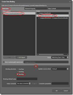
The second and last part of binding goes like this:

  • Click the square behind “CurrentCompassDirection” and select “Data Binding” again in the popup menu
  • Select the “Data Field” tab
  • In the Data Field Tab, select “CompassViewModelDataSource” in the right pane
  • In the left pane, select “CompassDirection : (Int32)
  • Click the down-pointing arrow on the bottom of the dialog – more options appear
  • Select “TwoWay” for “Binding Direction”

You have now selected the CurrentCompassDirection property of the behavior to be bound to the CompassDirection of the CompassViewModel. And that means – you are done! Hit File/Save all and go back to Visual Studio to launch the application on your phone, and you will see compass directions moving through your screen if you move phone.

One for the road

Having a plain black screen to see the compass directions moving over is quite boring. So lets add the behavior to show the Windows Phone 7 camera as background I wrote some time ago as well. Add it to the project, drag it on top of the LayoutRoot grid, and bang – now you don’t only have a heads-up, but a see-trough compass as well!

Some final words

This is all pretty crude in terms of how things move, and there are quite some things eligible for improvement but nevertheless - what we have here is almost like any other old LOB MVVM based application. Business objects bound to the GUI. Only, that GUI happens to be an ItemsControl with a behavior on its template. Which turns the whole app into a dynamic experience. I hope to have tickled your imagination, and showed some useful Blend how-to as well.

MVVM is not limited to just LOB apps. Make something fun. To quote Nokia – make the amazing everyday ;-

Complete sample solution can be found here.

30 January 2011

ViewModel driven animations using the Visual State Manager, DataStateBehavior and Expression Blend

Leon Zandman, fellow member of the Dutch Windows Phone 7 developer community, told me that my MapMania app used too much screen real estate for secondary controls and too little for the actual map, especially in landscape mode. I got the same feedback within 24 hours of app certification from one NY Chua from Singapore, who apparently had bought MapMania (which shows, by the way, that something like the Standard About Page does work very well for user/customer feedback). So it was time to do something.

I decided to make the page title collapsible by the user, using a nice animation. And of course I wanted this to be a setting that could be tombstoned, and I should be able to drive the animation from my ViewModel. Since  Windows Phone 7 does not support DataTriggers, there are some challenges, but they are easy to overcome. I will demonstrate my solution and the technique I used by making a small application from scratch, for I like to give complete examples – so you won’t have to hunt for the missing clues. You will pick up some Blend knowledge long the way as well. I hope.

Start out the usual way:

  • Create a new Windows Phone 7 application – this one I called “ModelDrivenAnimations”
  • Add a Solution Folder “Binaries”
  • Put “GalaSoft.MvvmLight.WP7.dll”, “GalaSoft.MvvmLight.Extras.WP7.dll” and “System.Windows.Interactivity.dll” in it.

And this time add a fourth assembly: Expression.Samples.Interactivity.dll. Get it from CodePlex (or just nick it out of my sample solution). Put it in the Binaries Solution folder as well, make a reference to all four assemblies from the project and we are ready to go.

First of all, muck up the page by putting something in the ContentPanel grid, like this:

<Grid x:Name="ContentPanel" Grid.Row="1" Margin="12,0,12,0">
  <TextBlock TextWrapping="Wrap" FontSize="85"> 
   This is content that could do with some more space
  </TextBlock>
</Grid>

ModelDrivenAnimations1

Which will yield a very pretty *cough* looking application screen similar to the image to the right.

Next is a very simple view model:

using System.Windows.Input;
using GalaSoft.MvvmLight;
using GalaSoft.MvvmLight.Command;

namespace ModelDrivenAnimations
{
  public class SampleViewModel : ViewModelBase
  {
    private string _appName = "ModelDrivenAnimations";
    public string AppName
    {
      get { return _appName; }
      set
      {
        _appName = value;
        RaisePropertyChanged("AppName");
      }
    }

    private bool _isPageTitleVisible = true;
    public bool IsPageTitleVisible
    {
      get { return _isPageTitleVisible; }
      set
      {
        _isPageTitleVisible = value;
        RaisePropertyChanged("IsPageTitleVisible");
      }
    }

    public ICommand TogglePageTitleCollapsed
    {
      get
      {
        return new RelayCommand(() =>
        {
          IsPageTitleVisible = !IsPageTitleVisible;
        });
      }
    }
  }
}

Very basic: a property “IsPageTitleVisible” to control the actual display of the Page Title, a command to fire the actual toggle, and a property with the app name to see if the binding actually works ;-) - normally this would come from a resource file, eh? If you’ve read my blog before, you should be starting to recognize the next part. First, add this to the namespace declarations of MainPage.xaml by adding

xmlns:ModelDrivenAnimations="clr-namespace:ModelDrivenAnimations"

to the namespaces, then declare the SampleViewModel just above the LayoutRoot grid:

<phone:PhoneApplicationPage.Resources>
  <ModelDrivenAnimations:SampleViewModel x:Key="SampleViewModel"/>
</phone:PhoneApplicationPage.Resources>
set the DataContext of your layout root grid to be the SampleViewModel:
<Grid x:Name="LayoutRoot" Background="Transparent" 
  DataContext="{StaticResource SampleViewModel}">

and then change Text="MY APPLICATON" into Text="{Binding AppName}" on the ApplicationTitle TextBlock. Rebuild the application, and even in design time the application name changes to “ModelDrivenAnimations”. Well done. The stage is set. Now proceed to start Expression Blend and open your project. Go on! Contrary to what most developers think, it won’t bite ;-)

First of all, we are going to bind the command. I decided to let the PageTitle disappear as the user taps on the ApplicationTitle, so select the ApplicationTitle on the design pane screen. Then proceed as follows:

  • Top left, select the “Assets” tab, and start to type “EventToCommand” in the search box. Long before you are even halfway done, the “EventToCommand” behavior appears.
  • Drag the EventToCommand command on top of the ApplicationTitle in the “Objects and Timeline” panel about halfway left on the screen.
  • Go to the right top side of the screen. Select the “Properties” tab. In the panel “Trigger” is a dropdown “EventName” which is currently set to “Loaded”. Change that to “MouseLeftButtonDown” – we want the effect appear when the user taps the title, not when it is loaded ;-).
  • Select the tab “Data” at the top right of the screen. Way down below at the bottom right a panel “Data Context” with “SampleViewModel” in it will appear. Expand this, find the “TogglePageTitleCollapsed" (last entry) and drag this onto the EventToCommand.
  • Hit “Ok” on the popup that appears.

You have just created a command binding without even typing a line of code. Expression Blend even added all the namespace prefixes for you.

One little piece of preparation – once again, select the PageTitle and select the “Properties” tab. In the panel “Layout” there is a property “Height” and that is set to “Auto (95.765625)”. This needs to be a fixed value, or else the Visual State Manager cannot infer how to change states. So change this value to “95”.

Now we are going to have some fun with the Visual State Manager itself:

  • Looking back at the top left of the screen you will notice a “States” tab. Select that, and two very small icons will appear.
  • Clicking the first one will create a new Visual State Group and three more icons.
  • Click on the middle one (“Add state”) and add a state “Expanded”. The top of the design pane in the middle will now show a little red button with the text “Expanded state recording is on”.
  • Click the red button to turn off the recording.
  • Add another Visual State called “Collapsed” but don’t turn off the recording now. In stead, select the PageTitle again (either in design view or in the Objects and Timeline panel).
  • Click tab “Properties” on the right top side of the screen.
  • Change the Height property again – this time to 0 (zero). The PageTitle will collapse to a thin blue indicator line.
  • Look down, and find the panel “Transform”. It’s likely to be collapsed at this point, so expand it first. Select the third tab, called “Scale”.
  • Change the Y value to 0 .

Click on visual state “Expanded” in the tab “States” on the left top of the screen and the PageTitle will reappear again. Now turn of the recording for visual states by clicking the red button on top of the design pane, and commence to the last step: connecting the states to the ViewModel by using DataStateBehavior.

  • Select “Assets” again in the top left panel, type “DataState” in the search box and “DataStateBehavior” and “DataSwitchBehavior” will appear.
  • Drag DataStateBehavior on top of “ApplicationTitle” in the “Objects and Timeline” panel.
  • On the right side of the screen, select the Properties tab again, and the properties of the behavior will appear.
  • Click the little grey square behind “Binding”, select “Data binding” in the popup menu, and then “IsPageTitleVisible” in the popup.
  • Click the down pointing arrow on the bottom of the dialog for more options, and select TwoWay.
  • Click OK.
  • Enter “Collapsed” for “FalseState”,
  • Enter “Expanded” for TrueState,
  • Enter “True” for Value.

The odd thing is – sometimes Blend does not let you enter “True” for Value. I am not sure if this is a bug. Please switch to XAML in that case and enter the value manually (use the small button with “< >” on the top right of the design pane to switch to XAML and find the DataStateBehavior; the button above (with the circle) will take you back to design view).

Then hit F5. Yes, hit F5. Even designers need to test stuff runtime, and they can do so by hitting F5, just like a developer. If you’ve done everything right, the Page Title will disappear and reappear when you click on the application title. But that’s hardly an animation. So switch back to Blend one more time:

  • Select the “States” tab once more,
  • Select “Default Transition”
  • Change the “0 s” in the little textbox to the right into “1”.

Then hit F5 again. The Visual State Manager now takes 1 second to change from one state to another, and infers an animation from that. Your PageTitle now appears to fold away in itself. The net effect, as I implemented it in MapMania, looks like this:

Animated header as implemented on MapMania

Notice the little visual cue next to the app name ;-). And this is about the simplest of animations. There are lots of other possibilities – you can even make your own transitions, let things rotate in or out of existence, whatever. I really encourage you to explore the possibilities of Transform tab – I just started doing that myself ;-).


The Visual State Manager is, when all is said and done, nothing more than a State Machine in which you can define states and transitions, that can be easily controlled from your View Model – i.e. code, the developer’s comfort zone  – by using DataStateBehavior. And DataSwitchBehavior – this can handle more states than just true or false, as far as I understood.

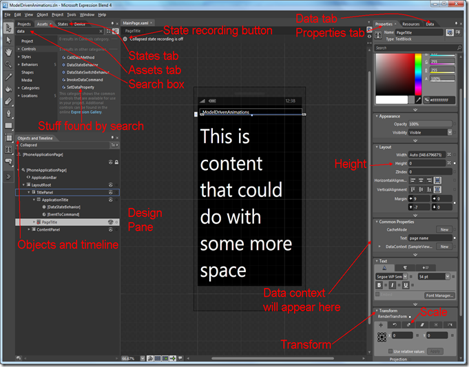
For those who lost the way in text, a little “Blend Road Map” showing everything we have used to get to this result:Blend

A little rant to conclude this post: some of you may have noticed that since we’ve hooked up the ViewModel to the View we did not type a single line of code at all. I can hear some of you think “maybe this dolt should rename his blog “Blend by Example” and leave us alone” ;-)

I am convinced that, as a WPF, Silverlight or Windows Phone developer, you should have at least a basic understanding of what you can do with Blend. First of all, even if you work without a separate designer, it saves you a lot of XAML typing, which I can assure you is not very much fun, and every good developer is a lazy developer. Second, creating things like animations and pretty user interfaces is pretty hard, and Blend helps you a lot with it. Maybe you as a developer like bare-bones GUI’s, but your users don’t, so better use a tool that can help with it. Third, as you do work with a separate designer, you need to know what he or she needs to have to make the application tick. Developer and designer need to communicate and understand each other. Now what do you think is more likely – that a designer understands what you as a developer are doing, or the other way around? And who will be calling the shots in a development process – the one that only understands his own side of the designer/development fence, or the one that can look over the fence and stomp around at the other side, if only a little? So get going and get to grips with Blend. Or else – heaven forbid - have designers commandeering you around ;-)

If something went wrong along the way, please refer to the sample solution.