21 August 2013

A behavior to animate mirroring of GUI elements on Windows Phone

imageIn this third and final installment of my scaling and opacity animation series I am going to show how easy it is to build more behaviors on top of the now existing framework I wrote about in my earlier post about extension methods for animating scales and opacity and the post after that, which showed a behavior to animate folding in and out a GUI element.

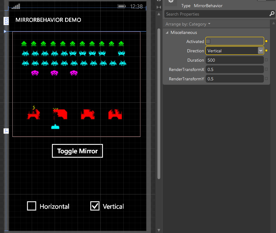
Building on top of the extension methods from the first post and the BaseScaleBehavior of the second post, I made a second behavior called MirrorBehavior. In Blend, it’s property panel looks like the identical twin of UnfoldBehavior. Which is not a coincidence, as it all the properties are in it’s base class.

It’s use case is very simple: suppose you have the completely hypothetical *cough* situation that you have created a game with the controls on the bottom of the screen or near the side of the screen – anyway, very near the back, start and search buttons of the phone. In the heat of the game they regularly strike one of those buttons – end of game. It would be nice to be able to get the controls out of the way.  You can let people rotate the phone, but ‘’upside down” is not supported. So you have the choice of giving your users an option to either rotate or mirror the playing field. This is exactly what I ran into during the building of my last game – of which I am very happy to say that it has passed certification this morning and is now sitting hidden in the Store while it’s availability is being propagated to the various servers. I took the latter approach – mirroring - and this is what happening in this space invaders ‘game as well.

Like I said, this behavior has exactly the same properties as Unfoldbehavior. If “Activated” is true, the object to which the behavior is attached will be mirrored, if its false it is displayed normally. The rest of the properties has the same meaning as in Unfoldbehavior, so see that article for more explanation. How this behavior’s effect work out is displayed in this video.

MirrorBehavior in action

As you see you can also mirror horizontal and vertical at the same time, but that doesn’t make as much sense – the effect isn’t very pretty. The red background is to show the background is staying where it it – just the element (the image) to which the behavior is attached changes.

And like Unfoldbehavior, only the two abstract methods BuildTransform and BuildStoryBoard need to be filled in. Since all the heavy lifting is already done in the previous two posts, all that remains to be written is this code:

using System;
using System.Windows;
using System.Windows.Media;
using System.Windows.Media.Animation;
using Wp7nl.Utilities;

namespace Wp7nl.Behaviors
{
  /// <summary>
  /// Behaviors that mirrors an object via using an animation
  /// </summary>
  public class MirrorBehavior : BaseScaleBehavior
  {
    protected override CompositeTransform BuildTransform()
    {
      return new CompositeTransform
      {
        ScaleX = (Direction == Direction.Horizontal || Direction == Direction.Both) && 
                  Activated ? -1 : 1,
        ScaleY = (Direction == Direction.Vertical || Direction == Direction.Both) && 
                  Activated ? -1 : 1
      };
    }

    protected override Storyboard BuildStoryBoard()
    {
      var storyboard = new Storyboard {FillBehavior = FillBehavior.HoldEnd};
      var transform = BuildTransform();
      var duration = new Duration(TimeSpan.FromMilliseconds(Duration));
      storyboard.AddScalingAnimation(
        AssociatedObject,
        AssociatedObject.GetScaleXProperty(), transform.ScaleX,
        AssociatedObject.GetScaleYProperty(), transform.ScaleY,
        duration);
      return storyboard;
    }
  }
}

BuildTransform is nearly the same – only Activated is not negated, and the values runs from –1 to 1 in stead from 0 to 1. That’s the only trick involved – scaling to –1 ín XAML mirrors an object. Life can be so simple. BuildStoryBoard is even more the same as in UnfoldBehavior, only it now only animates the scale, and not the opacity.

That is all there is to it this time. Stay tuned for my game using this code – and ore that I still have to blog about - which is scheduled for release on Friday August 23, 8pm (or 20:00) CET.

Demo solution, as always, can be found here.

18 August 2013

A behavior to animate folding in and out of GUI elements on Windows Phone

imageLike I wrote in my earlier post about extension methods for animating scales and opacity – those were merely building building blocks for something bigger. Today, as part two of my opacity and scaling animation series, I present you a behavior that kind of automates all the stuff you had to do in code.

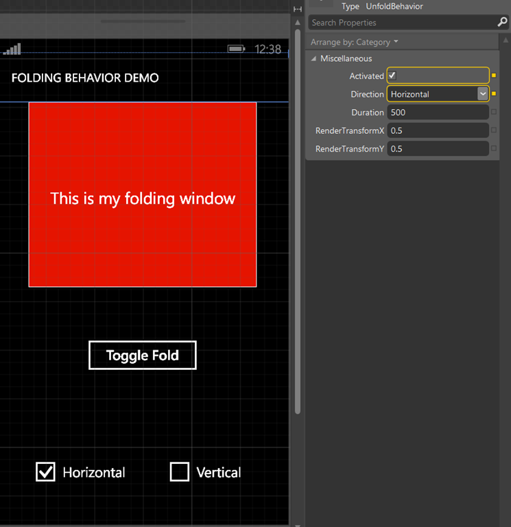
Say hello to UnfoldBehavior, another offspring of the game I have just submitted. All you basically have to do is drag it on top of an element you want to control, bind it’s “Activated” property to a boolean in your view model, and off you go. Activate == true means panel is unfolded (open), Activated == false means panel is closed. Of course, to make stuff more fun, in the demo app that goes with this post I have bound some more properties as well, so you can control how the panel folds and unfolds. How this works, you can see in this video below:


The UnfoldBehavior in action

The view model controlling the demo app is laughingly simple:

using System.Windows.Input;
using GalaSoft.MvvmLight;
using GalaSoft.MvvmLight.Command;
using Wp7nl.Behaviors;

namespace UnfoldBehaviorDemo.Viewmodel
{
  public class DemoViewModel : ViewModelBase
  {
    private bool isUnFolded = true;
    public bool IsUnFolded
    {
      get { return isUnFolded; }
      set
      {
        if (isUnFolded != value)
        {
          isUnFolded = value;
          RaisePropertyChanged(() => IsUnFolded);
        }
      }
    }

    public ICommand FoldCommand
    {
      get
      {
        return new RelayCommand(
            () =>
            {
              IsUnFolded = !IsUnFolded;
            });
      }
    }

    private bool horizontalChecked = true;
    public bool HorizontalChecked
    {
      get { return horizontalChecked; }
      set
      {
        if (horizontalChecked != value)
        {
          horizontalChecked = value;
          RaisePropertyChanged(() => HorizontalChecked);
          RaisePropertyChanged(() => FoldDirection);
        }
      }
    }

    private bool verticalChecked;
    public bool VerticalChecked
    {
      get { return verticalChecked; }
      set
      {
        if (verticalChecked != value)
        {
          verticalChecked = value;
          RaisePropertyChanged(() => VerticalChecked);
          RaisePropertyChanged(() => FoldDirection);
        }
      }
    }

    public Direction FoldDirection
    {
      get
      {
        if (HorizontalChecked && VerticalChecked)
        {
          return Direction.Both;
        }

        if (VerticalChecked)
        {
          return Direction.Vertical;
        }

        return Direction.Horizontal;
      }
    }
  }
} 

A property to control the actual folding and unfolding, a command to toggle that value, two properties for the check boxes where you can choose the fold direction with and one property to bind the behavior to. So how does this work?

It’s actually much more simple than you would expect, as all the heavy lifting is done by the stuff that was put into my wp7nl library on codeplex. But to start at the very bottom, we need an enum to determine direction:

namespace Wp7nl.Behaviors
{
  public enum Direction
  {
    Horizontal,
    Vertical,
    Both
  }
}
and then I defined a base class for this type of behaviors - as there are lots of more fun things to be done with scaling and opacity than just folding and unfolding alone. This base class looks like this and is (of course) built again as a SafeBehavior :
using System.Windows;
using System.Windows.Media;
using System.Windows.Media.Animation;

namespace Wp7nl.Behaviors
{
  /// <summary>
  /// A base class for behaviors doing 'something' with scaling
  /// </summary>
  public abstract class BaseScaleBehavior : SafeBehavior<FrameworkElement>
  {
    protected override void OnSetup()
    {
      base.OnSetup();
      SetRenderTransForm();
      AssociatedObject.RenderTransform = BuildTransform();
    }

    private void Activate()
    {
      if (AssociatedObject != null && 
          AssociatedObject.RenderTransform is CompositeTransform)
      {
        var storyboard = BuildStoryBoard();
        if (storyboard != null)
        {
          storyboard.Begin();
        }
      }
    }

    private void SetRenderTransForm()
    {
      if (AssociatedObject != null)
      {
        AssociatedObject.RenderTransformOrigin = 
new Point(RenderTransformX, RenderTransformY); } } protected abstract CompositeTransform BuildTransform(); protected abstract Storyboard BuildStoryBoard(); // Direction Dependency Property (Direction) ommitted // Duration Property (double) ommitted // Activated Property (bool) ommitted /// <summary> /// Activated property changed callback. /// </summary> public static void ActivatedChanged(DependencyObject d, DependencyPropertyChangedEventArgs e) { var thisobj = d as BaseScaleBehavior; if (thisobj != null && e.OldValue != e.NewValue) { thisobj.Activate(); } } // RenderTransformX Property (bool) ommitted // RenderTransformY Property (bool) ommitted /// <summary> /// RenderTransform X/Y property changed callback. /// </summary> public static void RenderTransformChanged(DependencyObject d, DependencyPropertyChangedEventArgs e) { var thisobj = d as BaseScaleBehavior; if (thisobj != null) { thisobj.SetRenderTransForm(); } } } }

What we have here are five dependency properties, for which I have omitted most of the code because it’s pretty boring repetitive stuff, save for some callback methods that actually do something. The properties are:

  • Direction – in which direction should the object be scaled. Horizontal, Vertical, or Both
  • Duration – the time in milliseconds the animated transition should take.
  • Activated – it’s up to the implementing behavior to what that means (in the case of UnfoldingBehavior, false = invisible, true = visible)
  • RenderTransformX – 0 to 1, the horizontal origin of the animation. See here for more explanation
  • RenderTransformY – 0 to 1, the vertical origin of the animation

We have two abstract methods that should be implemented in by the actual behavior:

  • BuildTransform should build a suitable CompositeTransform for use in the animation
  • BuildStoryBoard should build a suitable Storyboard to perform the actual animation.

All that’s left is the SetRenderTransForm, that sets the RenderTransformOrigin based upon RenderTransformX and RenderTransformY, and the Activate method that checks if the animation can be performed and if so, builds and executes the storyboard. Oh, and the OnSetup does the initial setup. Duh ;). So basically all child classes need to do is fill in those two abstract methods!

Which is exactly what UnfoldBehavior does:

using System;
using System.Windows;
using System.Windows.Media;
using System.Windows.Media.Animation;
using Wp7nl.Utilities;

namespace Wp7nl.Behaviors
{
  /// <summary>
  /// Behavior that unfolds an object using an animation
  /// </summary>
  public class UnfoldBehavior : BaseScaleBehavior
  {
    protected override void OnSetup()
    {
      base.OnSetup();
      AssociatedObject.Opacity = GetOpacity();
      ListenToPageBackEvent = true;
    }

    protected override Storyboard BuildStoryBoard()
    {
      var transform = BuildTransform();
      if (AssociatedObject.GetOpacityProperty() != GetOpacity() ||
          transform.ScaleX != AssociatedObject.GetScaleXProperty() ||
          transform.ScaleY != AssociatedObject.GetScaleYProperty())
      {
        var storyboard = new Storyboard {FillBehavior = FillBehavior.HoldEnd};
        var duration = new Duration(TimeSpan.FromMilliseconds(Duration));
        storyboard.AddScalingAnimation(
          AssociatedObject,
          AssociatedObject.GetScaleXProperty(), transform.ScaleX,
          AssociatedObject.GetScaleYProperty(), transform.ScaleY,
          duration);
        storyboard.AddOpacityAnimation(AssociatedObject, 
                 AssociatedObject.GetOpacityProperty(), 
                 GetOpacity(), duration);
        return storyboard;
      }
      return null;
    }

    protected override CompositeTransform BuildTransform()
    {
      return new CompositeTransform
      {
        ScaleX = (Direction == Direction.Horizontal || Direction == Direction.Both) && 
!Activated ? 0 : 1, ScaleY = (Direction == Direction.Vertical || Direction == Direction.Both) &&
!Activated ? 0 : 1 }; } private double GetOpacity() { return Activated ? 1 : 0; } } }

OnSetup does the necessary extract setup, the BuildTransform is used in BaseScaleBehavior to set the initial state of the element based upon the initial property values, but in this child class also for something else – in BuildStoryBoard is it used to build a transformation base upon the desired new state if anything changes. In the same way works the GetOpacity method – it returns the desired opacity based upon the currrent state of the behavior’s properties. So then the behavior checks if the desired state is different from the AssociatedObject’s current state, and if so, it uses the extension methods described in the previous post to build the actual animation Storyboard.

And that’s (almost) all there’s to it. An attentive reader might have noticed, though, that there are no such things as methods to get the value of  current scaling and opacity of an UI element, which are after all dependency properties too. That is why I have created this little batch of extension methods as a shortcut:

using System;
using System.Windows;
using System.Windows.Media;

namespace Wp7nl.Utilities
{
  /// <summary>
  /// Class to help animations from code using the CompositeTransform
  /// </summary>
  public static class FrameworkElementExtensions2
  {
    public static double GetDoubleTransformProperty(this FrameworkElement fe, 
                            DependencyProperty property)
    {
      var translate = fe.GetCompositeTransform();
      if (translate == null) throw new ArgumentNullException("CompositeTransform");
      return (double)translate.GetValue(property);
    }

    public static double GetScaleXProperty(this FrameworkElement fe)
    {
      return fe.GetDoubleTransformProperty(CompositeTransform.ScaleXProperty);
    }

    public static double GetScaleYProperty(this FrameworkElement fe)
    {
      return fe.GetDoubleTransformProperty(CompositeTransform.ScaleYProperty);
    }

    public static double GetOpacityProperty(this FrameworkElement fe)
    {
      return (double)fe.GetValue(UIElement.OpacityProperty);
    }
  }
}

Nothing special, just a way to extract the date a little easier.

So, with some drag, drop and binding actions in Blend you know have a reusable piece of code that can be easily applied to multiple user interface elements without have to duplicate storyboards and timelines again and again. With this behavior, Blend indeed is your friend ;-). Oh and by the way – this should work in both Windows Phone 7 and 8. For Windows 8 I don’t dare to give any guarantees – just have not tried it out yet.

Demo application of course available here, and I will soon add all this stuff to the wp7nl Nuget package. Stay tuned.

17 August 2013

Extension methods to animate scaling and opacity on Windows Phone

This is the first part of a tree-part series handling animating scaling and opacity. If you kind of wonder how the hell something that simple can require three blog posts – bear with me, it will all become clear in the end.

For a game that – at the moment of this writing – I have just submitted to the Windows Phone Store I have developed a number of extension methods to animate a number of properties of a GUI element. You have already seen extension methods to animate an object over the screen via waypoints –that’s also part of the package that will be added to my wp7nl library on CodePlex, just as the extension methods that below that animate scaling and opacity. They are actually pretty simple, and are built on top of the  translation extension methods I already wrote earlier for animations. If have temporarily added them to a “StoryboardExtensions3” class – in wp7nl all the methods will sit snugly together in “StoryboardExtensions”

First, the class with the scaling methods:

using System.Windows;
using System.Windows.Media;
using System.Windows.Media.Animation;

namespace Wp7nl.Utilities
{
  /// <summary>
  /// Extension methods to add animations to a storyboard
  /// </summary>
  public static class StoryboardExtensions3
  {
    public static void AddScalingAnimation(this Storyboard storyboard,
                                           FrameworkElement fe, double fromX, double toX, 
                                           double fromY, double toY, Duration duration)
    {
      storyboard.AddScalingAnimation(fe, fromX, toX, fromY, toY, duration, null);
    }

    public static void AddScalingAnimation(this Storyboard storyboard,
                                           FrameworkElement fe, double fromX, double toX, 
                                           double fromY, double toY, Duration duration,
                                           IEasingFunction easingFunction)
    {
      storyboard.AddAnimation(fe.RenderTransform,
                  storyboard.CreateDoubleAnimation(duration, fromX, toX, easingFunction),
                     CompositeTransform.ScaleXProperty);
      storyboard.AddAnimation(fe.RenderTransform,
                  storyboard.CreateDoubleAnimation(duration, fromY, toY, easingFunction),
                     CompositeTransform.ScaleYProperty);
    }
  }
}

if you have read the earlier article, there is not much special in there. The heavy lifting has already been done earlier, by making the CreateDoubleAnimation and AddAnimation extension methods. You can use the AddScaling methods to scale an object over Y from 1 to 0 (notice X stays the same), which will effectively let it disappear by folding the object upwards to a horizontal line, by using this code:

myGuiElement.RenderTransform = new CompositeTransform();
var s = new Storyboard();
s.AddScalingAnimation(myGuiElement, 1, 1, 1, 0, TimeSpan.FromMilliseconds(500));
s.Begin();
or letting it mirror itself over the X-axis by changing the 4th line to
s.AddScalingAnimation(myGuiElement, 1, -1, 1, 1, TimeSpan.FromMilliseconds(500));

I made a very similar set of methods for Opacity:

public static void AddOpacityAnimation(this Storyboard storyboard,
                                       UIElement fe, double from, double to, 
                                       Duration duration)
{
  AddOpacityAnimation(storyboard, fe, from, to, duration, null);
}

public static void AddOpacityAnimation(this Storyboard storyboard,
          UIElement fe, double from, double to, Duration duration,
          IEasingFunction easingFunction)
{
  storyboard.AddAnimation(fe,
         storyboard.CreateDoubleAnimation(duration, from, to, easingFunction),
         UIElement.OpacityProperty);
}

Opacity runs from 1 (totally visible) to 0 (totally transparent) so with this code:

var s = new Storyboard();
s.AddOpacityAnimation(myGuiElement, 1, 0, TimeSpan.FromMilliseconds(500));
s.Begin();

”myGuiElement” will fade out in half a second. And even more fun is combining the code to:

myGuiElement.RenderTransform = new CompositeTransform();
var s = new Storyboard();
s.AddScalingAnimation(myGuiElement, 1, 1, 1, 0, TimeSpan.FromMilliseconds(500));
s.AddOpacityAnimation(myGuiElement, 1, 0, TimeSpan.FromMilliseconds(500)); s.Begin();

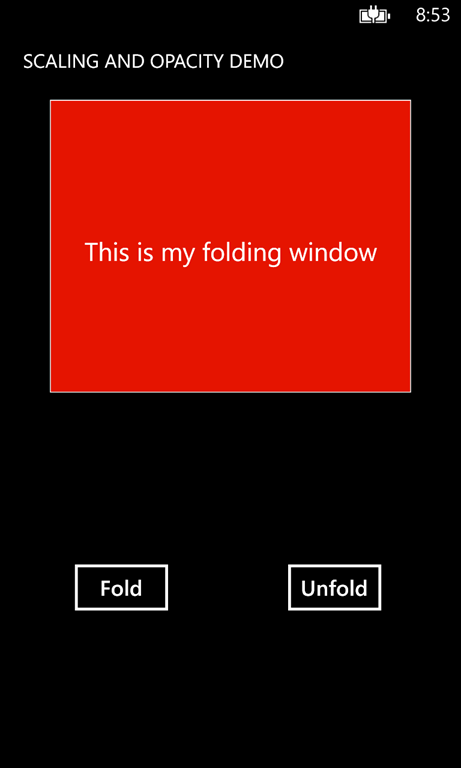
foldingNow the element will fold up and fade out simultaneously. And that’s exactly what happens is this little demo app that contains all the source code. And it shows you how to do the opposite as well – fold the window out again.

I can hear you think now: “So why on earth would you want to do this from code? Animations can be made can be made in Blend, and if you are such a Blend fan, why do you make me do it from code now, huh?”. I am an probably always will be a Blend fan – very much so, as will become clear soon – but the problem with this kind of animations is that they are not reusable. Storyboards tend to become attached to the element they have been created for – they refer by name to it. So I am trying to find a way to make a few common animations reusable. Read the next posts, and it will become clear. In the mean time, enjoy this demo application that demonstrates how to use the stuff.


On more for the road: if you add following line of at the top of both the Button_Click and Button_Click1 in the demo app:

FoldingPanel.RenderTransformOrigin = new Point(0.5, 0.5);

the panel won’t fold up to the top, but it will kind of collapse on its horizontal middle. This way, you set the origin of the animation. By setting it to 0.5, 0.5 you set it in the center point of the window. If you would set it to 1,1 the panel will fold up to its bottom.

And finally – although developed for Windows Phone 8, this this will work in Windows Phone 7 as well. And most likely for Windows 8, which will get some attention from me when this game is finally done. I think ;-)

06 August 2013

Modifying look and feel of your App Studio generated Windows Phone app using Blend and Visual Studio

By now you all probably heard about App Studio, the great new on line tool the Windows Phone team have created to create custom Windows Phone apps based upon a number of templates without any programming. The fact I actually like best is that apart from generating the app and installing it on your phone directly – enabling non-techies to create their own apps in a very easy way – there’s something in it for us techies as well. You can also download the source code of said generated app, and modify it to your heart’s content. So you can go beyond what the tool offers, both in layout and functionality, but without having to start from the ground. The tool even generates code on MVVM.

clip_image002To show you how easy that is, I actually created a small blog post reader for my own blog using the “hobby” template. I deleted everything but the aboutDataSource and the news1DataSource. Fiddled around with the look and feel till it kind of looked like my blog. But the background of my blog is a star field, overlaid by  articles on a white panel. If could have made the text white, but that would not look like my blog (branding is important) and it would get blurry because of the star field.

clip_image004So I decided to make it black text on the star field and adapt the templates in Blend and Visual Studio. My app in App Studio looked like displayed to the right. Black on black doesn’t read that well as I suspected. So I generated the app, downloaded the source code, opened the solution in Visual Studio and first compiled it. That worked. Then I opened it in Blend. It automatically opened about_info.xaml for me. I navigated to News1_NewsListControl.

The following procedure needs to be followed to edit it to make it look like my blog:

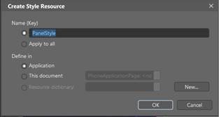
Right-click on News1_NewsListControl , select Edit Additional Templates/Edit Itemtemplate/Edit Current.Then right-click on the Grid, select Edit Style/Create Empty, and enter the following values:

clip_image006


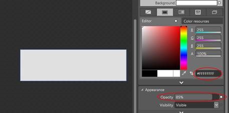
Note this is an APPLICATION Style. Then we modify the background color to white and the opacity to 85%. This will make the blog posts look on a white, just a little transparent background

clip_image008

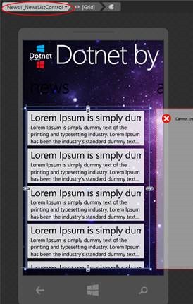
Hit save all, click News1_NewsListControl on the top of the breadcrump – looking good!

clip_image010

Now we want the header white as well. That’s a problem – both the header and the text inside the panels both have the style “CustomApplicationTextBrush”. If we were to set that white, we would get white headers and white text on white panels. We continue in Visual Studio. Open up up App.Xaml (it’s in 1 – UI\Wp8App) and find in the XAML code the following line:

<SolidColorBrush x:Key="CustomApplicationBackgroundBrush" Color="#000000" /> 

Copy it and edit it:

<SolidColorBrush x:Key="CustomApplicationHeaderBrush" Color="#ffffff" /> 

Open about_info.xaml, (it’s in 1 – UI\Wp8App\Views) find the line with the “about” text:

<TextBlock Text="about" Foreground="{StaticResource CustomApplicationTextBrush}"/> 

And change CustomApplicationTextBrush in CustomApplicationHeaderBrush.

Bang! The “about” text changes into white. Find the “news” TextBlock as well and repeat the procedure.

If you run the application, you will the news panel quite OK, but the about panel not looking like it should, and so is the page that appears when you tap on an article

clip_image012clip_image014clip_image016

This can only be done from XAML code view, and is actually pretty simple. Find the ScrollViewer in “Panoramaabout_Info0”, and surround it with a style Grid:

<Grid Style="{StaticResource PanelStyle}"> 
  <ScrollViewer Margin="15,0"> 
    <mytoolkit:FixedHtmlTextBlock FontSize="24" 
               Foreground="{StaticResource CustomApplicationTextBrush}" 
               Html="{Binding Currentabout_InfoHtmlControl}"/> 
</ScrollViewer> 
</Grid> 
Result:

clip_image018

This can only be done from xaml code as the designer is playing up over the FixedHtmlBlock. That’s one. Now open up the news1_Detail.xaml. That’s the page showing the whole article. There’s no literal text here, data is being bound here to the GUI so the same template can be used for every article. There’s also a text block that holds the title:

<TextBlock Text="{Binding CurrentRssSearchResult.Title, Converter={StaticResource SanitizeString}}" Foreground="{StaticResource CustomApplicationTextBrush}"/> 

Here again we have a CustomApplicationTextBrush that needs to be changed into to make the article header white. A little bit lower is the ScrollViewer holding the article, which is conveniently already surround by a grid:

<Grid Margin="10,5,5,5"> 
  <ScrollViewer> 
Just add the style:
<Grid Margin="10,5,5,5" Style="{StaticResource PanelStyle}"> 

And done

clip_image020

Now we want to make extra functionality. We want to be able to mail the author, i.e. yours truly:

clip_image022

We need an extra button in the “about” screen. That is actually pretty simple too. First, we have to define the function. It’s in the “About” screen, so we need the about_InfoViewModel .cs (it’s in 1 – UI\Wp8App\ViewModel). All the way to the end, insert the following the following:

public ICommand SupportQuestionCommand 
{ 
  get 
  { 
    return new RelayCommand(() => 
    { 
      var emailComposeTask = new EmailComposeTask 
      { 
        To = "joostvanschaik@outlook.com", 
        Subject = "Question about DotnetByExample" 
      }; 
      emailComposeTask.Show(); 
    }); 
  } 
}

Now go all the way to the top and add to the using statements:

using Microsoft.Phone.Tasks; 
using MyToolkit.MVVM; 

This is the actual definition. But rather than hard connecting view models to each other, the framework has generated interfaces around it, so the interface belonging to this viewmodel needs to be updated as as well. Open the Iabout_InfoViewModel.cs (it’s in 1 – UI\Wp8App\Interfaces) and add:

ICommand SupportQuestionCommand { get; } 

clip_image024The functionality is now done. Now for the user interface. First, we need an image. For e-mail, let’s use an envelope. Take a 128x128 pixel image – white with a transparent background, that (inverted) – looks like to the right 

Open the directory 1 – UI\WP8App\Images\Icons\Dark directory, and simply drag de image on top of it. It will be automatically added to the solution. Let’s suppose the image is call “mail.png”.

Creating the app bar button and wiring up the command is simple enough: in about_Info.xaml there’s this rather intimidating piece of XAML

<mytoolkitpaging:BindableApplicationBar x:Key="Panoramaabout_Info0AppBar" IsVisible="True" IsMenuEnabled="True" Mode="Minimized" BackgroundColor="{StaticResource CustomApplicationAppBarBackgroundBrush}" Opacity="0.99" ForegroundColor="White"> 
<mytoolkitpaging:BindableApplicationBarIconButton x:Name="Panoramaabout_Info0SetLockScreenBtn" IconUri="/Images/Icons/Dark/SetLockScreen.png" Text="{Binding Path=LocalizedResources.SetLockScreen, Source={StaticResource LocalizedStrings}}" Command="{Binding SetLockScreenCommand}"/> 
</mytoolkitpaging:BindableApplicationBar> 

But it ain’t that difficult. Just before the last line

</mytoolkitpaging:BindableApplicationBar> 

Add

<mytoolkitpaging:BindableApplicationBarIconButton 
    x:Name="Panoramaabout_mail" 
    IconUri="/Images/Icons/Dark/Mail.png" 
    Text="Mail author" 
    Command="{Binding SupportQuestionCommand}"/> 

clip_image026See what’s going on here? You add a button to the application bar, you give it an icon, a text next to the icon, and a command that needs to be fired when the button is clicked. And sure enough, when you click the “Mail author” button, the mail app opens as displayed here

And that’s all that there’s too it. You make Windows Phone 8 from code, you can make them with App Studio, you can do a bit of both. For those who want to learn themselves how this is done: both the generated (before) and the modified code (after) are downloadable, and far all I care you adapt it to your own blog. I would recommend though changing the e-mail address to your own, or else I will get some peculiar mails I fear ;)

Happy clicking!

22 July 2013

Extension methods to animate an object over the screen via waypoints for Windows Phone

A long time ago, before I even was a Microsoft MVP, I wrote an article about a behavior that could make anything draggable and flickable for Windows Phone (then still 7). That article used a few extension methods to FrameworkElement and Storyboard to create the desired effect Those extension methods are a bit limited, because they can only create an animation that move an object from one location to another – there are no possible points in between.

The Windows Phone 8 game I am currently developing needs just that, and as usual, as soon as I created something reusable, I spin it off to my library and start blogging about it. Don’t despair if you don’t get the whole explanation – I explain how I created the code and what it does, but if you don’t care, you can just copy it and use the resulting calls.

The earlier extension methods created a DoubleAnimation. Well actually it created two – one to animate the TranslateX property of a CompositeTransform, the other to animate the TranslateY property, over a certain Duration. But these kinds of ‘simple’ animations are executed in parallel in a Storyboard – and now I want to do consecutive animations. You then need key frames. And since the Translate properties are doubles, you need to create instances of DoubleAnimationUsingKeyFrames :). Luckily, the Microsoft developers creating this API did choose some logical names. There are a few things you should remember:

  • The DoubleAnimationUsingKeyFrames animates the property, so this needs to be used in the SetTarget of the Storyboard
  • For the individual animation frames you need to add LinearDoubleKeyFrame instances to the DoubleAnimationUsingKeyFrames’ KeyFrames collection – with a key time and a value. This is the value which the animated property needs to have at the key time.
  • The duration of the entire DoubleAnimationUsingKeyFrames needs to be equal to the sum of key times of the individual LinearDoubleKeyFrame key times.
  • We need to animate both X and Y, so there needs to be two animations per key time, namely one for X and one for Y

Let’s do that!

using System;
using System.Collections.Generic;
using System.Linq;
using System.Windows;
using System.Windows.Media;
using System.Windows.Media.Animation;

namespace Wp7nl.Utilities
{
  public static class StoryboardExtensions2
  {
    public static Timeline CreateKeyFrameAnimation(this Storyboard storyboard, 
        IList<double> values, IList<Duration>times)
    {
      var keyFrameAnimation = new DoubleAnimationUsingKeyFrames();
      var keyTime = TimeSpan.FromMilliseconds(0);
      for (var i = 0 ; i< values.Count(); i++)
      {
        keyTime += times[i].TimeSpan;
        var frame = new LinearDoubleKeyFrame {Value = values[i], KeyTime = keyTime};
        keyFrameAnimation.KeyFrames.Add(frame);
        keyFrameAnimation.Duration += times[i];
      }
      return keyFrameAnimation;
    }
  }
}

This code is still pretty abstract, but it’s doing exactly what I described – it makes the DoubleAnimationUsingKeyFrames, adds the keyframes (of type LinearDoubleKeyFrame  - I found that out using Blend and basically translated the XAML to C#) and makes the total duration equal to the sum of the durations.The first key frame on key time 0 is the first point – and from then we add more points and new key times.

This, of course, is not very “programmer friendly”. That is where the main extension method comes in:

public static void AddWayPointAnimation(
  this Storyboard storyboard, FrameworkElement fe, 
  IList<Point> points, double speed)
{
  var durations = new List<Duration> {new Duration(TimeSpan.FromSeconds(0))};
  for (var i = 0; i < points.Count - 1; i++)
  {
    durations.Add(points[i].CalculateDuration(points[i + 1], speed));
  }
  var xValues = points.Select(p => p.X).ToList();
  storyboard.AddAnimation(fe.RenderTransform, 
    storyboard.CreateKeyFrameAnimation(xValues, durations), 
       CompositeTransform.TranslateXProperty);
  var yValues = points.Select(p => p.Y).ToList();
  storyboard.AddAnimation(fe.RenderTransform, 
    storyboard.CreateKeyFrameAnimation(yValues, durations), 
      CompositeTransform.TranslateYProperty);
}

So you pass in an empty Storyboard, the GUI element you want to animate, a list of waypoints, and a speed (in pixels per second). And done. You can now simply use the following code:

myGuiElement.RenderTransform = new CompositeTransform();
myGuiElement.RenderTransformOrigin = new Point(0.5, 0.5);
var s = new Storyboard();
s.AddWayPointAnimation(myGuiElement, myListOfPoint, 500);
s.Begin();

And whatever is in myGuiElement will be animated over the waypoints. The first two statements can also be replaced by creating the transform in Blend. You may, by the way, have noticed some odd statements in AddWayPointAnimation. Both the red underlined statements are not part of the standard API. CalculateDuration is part of a few extension methods for Point that I wrote some time ago, and AddAnimation is part of the original article I mentioned before. Both are now part of my #wp7nl library on codeplex (and its accompanying NuGet package) so I won’t go into details about this.

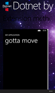
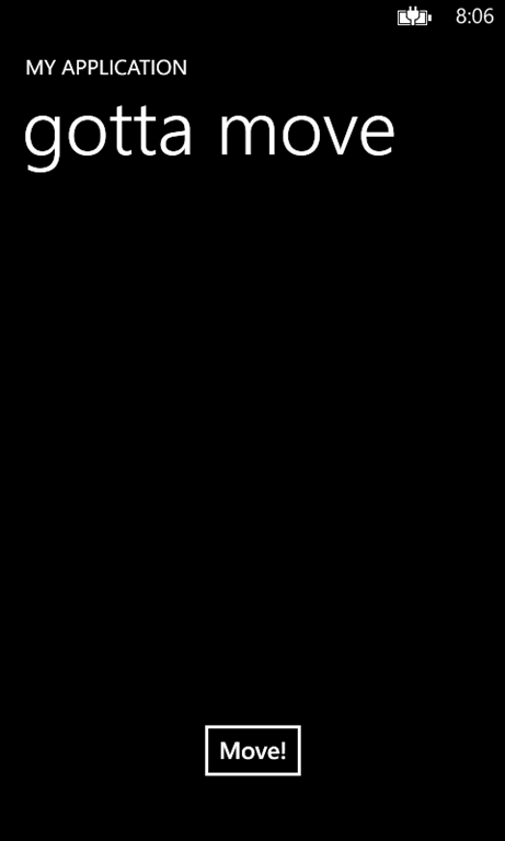
screenshot4To demonstrate this principle I have made the following pinnacle of animation design:

When you hit the button “move”it will move the whole TitlePanel first a bit to the left, then down, then to the right, and finally up to where it came from. Pretty pointless to do this from code, but it proves the point.

Note that what we animate here is a Translation. So the coordinates used are relative coordinates within the container!

As usual, the full demo solution can be downloaded here

03 July 2013

On-the-fly updating of a data template selected by a DataTemplateSelector

It’s really fun when someone contacts you with a Windows Phone development problem and you have already something standing by to solve it – even if it was intended for something completely different. Last week fellow MVP Mark Monster contacted me with the following situation:

  • He had several objects in an ObservableCollection
  • He was using a DataTemplateSelector to determine which template was to be used for an object – I assume he used something like this.

This worked very fine when initially binding the list of objects to the LongListSelector, but he ran into the following problem: the template to be used was determined by an attribute that could be changed while the object was visible. Like, in the example by the article on geekchamp.com that I referred to, you could change the Food Type from healthy to unhealthy after the list was displayed. But if Mark did that, the template stayed the same. The new template was not selected.

This is of course perfectly understandable – the template selector, being a ContentControl, just has as OnContentChanged you can override - but has no knowledge about what is going on in the collection from which its instances are created.

The solution is very simple, albeit a bit crude – reaching back into the last post of my 4-part mapping series, I pulled out this brilliant *cough* piece of coding, originally cobbled together to compensate for a bug I in my own CodePlex library:

using System.Collections.Generic;
using System.Collections.ObjectModel;
using System.Collections.Specialized;

namespace Wp7nl.Utilities
{
  public class ResettableObservableCollection<T> : ObservableCollection<T>
  {
    public ResettableObservableCollection()
    {
    }

    public ResettableObservableCollection(List<T> list)
      : base(list)
    {
    }

    public ResettableObservableCollection(IEnumerable<T> list)
      : base(list)
    {
    }

    public void ForceReset()
    {
      OnCollectionChanged(
       new NotifyCollectionChangedEventArgs(NotifyCollectionChangedAction.Reset));
    }
  }
}

The only thing Mark needed to do was:

  • Change his standard ObservableCollection into a ResettableObservableCollection,
  • Call “ForceReset” on the collection after he had changed the attribute that should trigger the template change.

This will work on Windows Phone 8 as well on Windows Phone 7. It’s crude, but effective. Sometimes life is so simple - so simple in fact that that I hope you will forgive me for omitting a demo solution this time. I hope this helps more people wrestling with the same problem.

Which reminds me I should update my wp7nl library on CodePlex again. The additions are backing up again ;-)

02 July 2013

Behavior to hide UI elements when a bound collection is empty

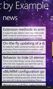
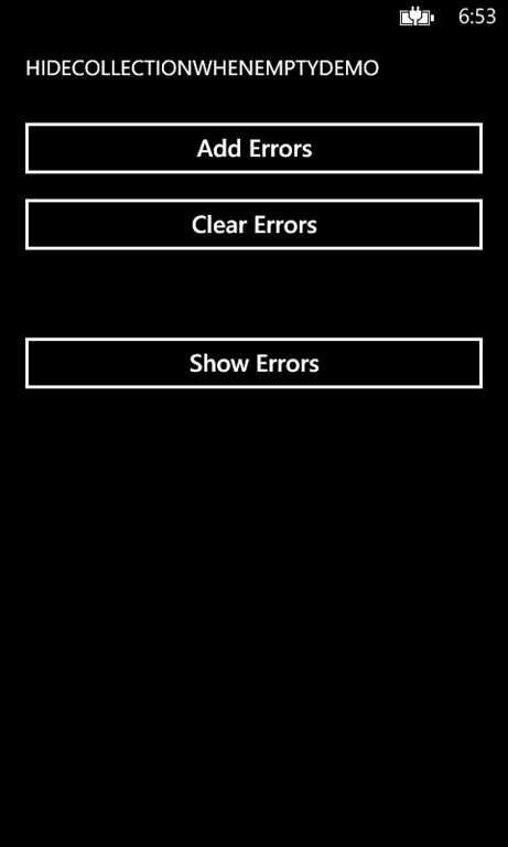
screenshot1This is a fun little thingy I wrote when dealing with error lists. Suppose, you want the user to be able to see there are errors, but not directly fly them the whole detailed error list in his face. So there is, for instance a button “Show errors”, like in the application showed to the right.

But, it’s ugly “Show errors” is always visible, even if there are no errors to display. I actually only want to have this button appear when there are errors indeed, so that it acts as an error indicator, and then the user can decide if she wants to see them or not. Of course you can fix that in your viewmodel – subscribe to the events of an ObservableCollection of errors, and turn visibility on or off when trapping those events, every time you need to do this. Perfectly viable solution. But an even better solution is to encapsulate that behavior – the word just says it – in a simple piece of reusable code.

Meet HideWhenCollectionEmptyBehavior. It sports an INotifyCollectionChanged Collection to which you can bind, and the rest of it is actually so simple I am going to show it in one go:

using System.Collections;
using System.Collections.Specialized;
using System.Windows;

namespace Wp7nl.Behaviors
{
  public class HideWhenCollectionEmptyBehavior : SafeBehavior<FrameworkElement>
  {
    protected override void OnSetup()
    {
      base.OnSetup();
      SetVisibility();
    }

    protected override void OnCleanup()
    {
      base.OnCleanup();
      if (Collection != null)
      {
        Collection.CollectionChanged -= OnCollectionChanged;
      }
    }

    private void OnCollectionChanged(object sender, NotifyCollectionChangedEventArgs e)
    {
      SetVisibility();
    }

    private void SetVisibility()
    {
      var collection = Collection as ICollection;
      AssociatedObject.Visibility = 
        collection != null && collection.Count > 0 ? Visibility.Visible : Visibility.Collapsed;
    }
  }
 }

The behavior is implemented as a SafeBehavior with an attached dependency property “Collection” of type INotifyPropertyChanged to which you can bind the collection that needs to be monitored. The core of the whole behavior is simply the SetVisibility method, which casts the collection to ICollection and checks if it’s null or empty – in that case the Visibility of the object to which this behavior is attached is set to Collapsed – if not, it’s set to Visible.

The attached dependency property is fairly standard, apart from the last part:

#region Collection

public const string CollectionPropertyName = "Collection";

public INotifyCollectionChanged Collection
{
  get { return (INotifyCollectionChanged)GetValue(CollectionProperty); }
  set { SetValue(CollectionProperty, value); }
}

public static readonly DependencyProperty CollectionProperty = DependencyProperty.Register(
    CollectionPropertyName,
    typeof(INotifyCollectionChanged),
    typeof(HideWhenCollectionEmptyBehavior),
    new PropertyMetadata(default(INotifyCollectionChanged), OnCollectionChanged));

public static void OnCollectionChanged(DependencyObject d, DependencyPropertyChangedEventArgs e)
{
  var behavior = d as HideWhenCollectionEmptyBehavior;
  var newValue = (INotifyCollectionChanged)e.NewValue;
  var oldValue = (INotifyCollectionChanged)e.OldValue;
  if (behavior != null)
  {
    if (oldValue != null)
    {
      oldValue.CollectionChanged -= behavior.OnCollectionChanged;
    }
    if (newValue != null)
    {
      newValue.CollectionChanged += behavior.OnCollectionChanged;
    }

    behavior.SetVisibility();
  }
}

#endregion

There’s a lot of plumbing going on ‘just to be on the safe side’ – if the bound collection is replaced, the CollectionChanged event is detached from the old collection and attached to the new collection. Everything to prevent memory leaks:-) - but in reality I think only the newValue will ever be set.But anyway, by making the property of type INotifyCollectionChanged, I am sure to have the lowest common denominator and still have a CollectionChanged that I can trap.

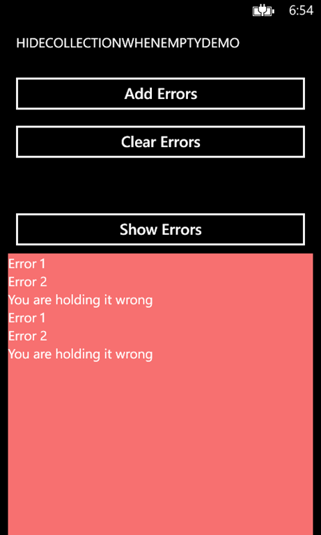
By dragging the behavior on top of the “Show Errors”  button and binding to the collections of errors, my app initially looks like displayed on the left. Only when I click “add errors” the “show errors” button appears (courtesy of HideWhenCollectionEmptyBehavior) and then when I click it, I get to see the actual errors.

screenshot3

screenshot1

screenshot2


Now of course this is a pretty contrived example, but it is a real-word use case. Like I wrote, I actually use it for indicating that there are errors, but I can think of a lot of other scenarios, for instance an UI element that is displayed when an object has child objects (say, an order has order lines) without actually displaying them – only indicating they are present.

I wrote this behavior to act in a Windows Phone application but the code is so generic it will work in other XAML platforms as well, including Windows 8.

The code of the behavior, together with my beautiful *cough* sample app can be found here

For those who’d like me to use “Any()” in stead of “Count > 0 “ I would like to point out that ICollection is just ICollection, not ICollection<T> and that does not seem to support “Any()”