30 March 2016

Xamarin Forms 2.1 upgrade–some surprises (and how to get around it)

Back in June I wrote about a proof-of-concept for view model driven animations using behaviors in Xamarin Forms. This concept made it into my employer’s standard Xamarin library (more about that soon) but after an upgrade I noticed the animation behaviors did not work anymore – at least on Android. I have no idea what happened along the way, but fact is that the the behavior no longer worked after upgrading to Xamarin Forms 2.1. A prolonged debugging session learned me the following:

  1. At the ViewAppearing stage user interface elements don’t have a size allocated yet – whereas they used to have that.
  2. A parent object - especially something a grid – does not does not necessarily has to have it’s size set yet (width and height are still –1)

I will write about this soon in more detail, but what needs to be done to get this working again is:

  1. We need to initialize the behavior on the page’s OnSizeAllocated, not the OnViewAppearing method
  2. We need to go up recursively until we find an element that does not have a size of –1 in stead of blindly taking the parent.

So, in StartPage.xaml.cs:

protected override void OnAppearing()
{
  Context.OnViewAppearing();
  base.OnAppearing();
}

protected override void OnSizeAllocated(double width, double height)
{
  Context.OnViewAppearing();
  base.OnSizeAllocated(width, height);
}

It is a bit of a kludge, but it will do for now. In FoldingPaneBehavior we will first need to add a method to recursively find a parent with a size:

protected VisualElement GetParentView()
{
  var parent = associatedObject as Element;
  VisualElement parentView = null;
  if (parent != null)
  {
    do
    {
      parent = parent.Parent;
      parentView = parent as VisualElement;
    } 
    while (parentView?.Width <= 0 && parent.Parent != null);
  }

  return parentView;
}
And the first line of the Init method neededs to be changed from
var p = associatedObject.ParentView;
to
var p = GetParentView();

And then the behavior will work again.

A second surprise when upgrading to Xamarin Forms 2.1 is that the declaration of Dependency properties using generics is deprecated. It will still work, but not for long. So in stead of

public static readonly BindableProperty IsPopupVisibleProperty =
       BindableProperty.Create<FoldingPaneBehavior, bool>(t => t.IsPopupVisible,
       default(bool), BindingMode.OneWay,
       propertyChanged: OnIsPopupVisibleChanged);
You will know have to use
public static readonly BindableProperty IsPopupVisibleProperty =
       BindableProperty.Create(nameof(IsPopupVisible), typeof(bool), 
       typeof(FoldingPaneBehavior),
       default(bool), BindingMode.OneWay,
       propertyChanged: OnIsPopupVisibleChanged);
And the callback loses its type safety because that becomes
private static void OnIsPopupVisibleChanged(BindableObject bindable, object oldValue, object newValue)
in stead of
private static void OnIsPopupVisibleChanged(BindableObject bindable, bool oldValue, object bool)

and thus you have to cast oldValue and newValue to bool. This makes the code inherently more brittle and harder to read, but I assume there is a good reason for this. I have updated the xadp snippet for creating these properties accordingly.

A typical case of moved cheese, but fortunately not too far. The updated demo solution is still on GitHub

23 March 2016

.NET Native, SilverlightSerializer, MakeGenericType and MissingMetadataException

Recently I have ported my app Map Mania to the  Universal Windows Platform, and at the moment of this writing it is being certified. (that, I least I hope). It’s the first UWP app I actually submit to the Store. I have been doing quite some IoT Core stuff and that does not require much submitting. But it had to happen at one time, if only to dogfood my WpWinNl port to UWP, and it was an educating experience.

I learned the hard way that stuff that does work with debug settings, does not necessarily work when you compile stuff ‘for real’. I ran into quite a serious issue with generics. As soon as I turned my app over to the .NET Native toolchain, it even crashed on startup. Mind you, most of the ‘business code’ in this app and large parts of the XAML were still the same as the original Windows Phone7 and 8 app, as was the WpWinNl base library – all ported to UWP, but largely unchanged.

The root cause of the problem turned out to be SilverlightSerializer. This is a serialization framework made by Mike Talbot that I have been using to store app state since 2011. It’s name quite dates it origins. Unfortunately the link to the original article is dead – actually the whole blog seems to have disappeared - but it’s code has been sitting in WpWinNl and it’s predecessors ever since that time. I have ported it to Windows Phone 8, Windows RT, and now to UWP.

Deep down in the core it uses the Type.MakeGenericType method to make a generic type with two type parameters to store types. So if I have ViewModel with a double property, it makes a GetSetGeneric<ViewModel, double>. This, now, does not go down well with .NET Native. Runtime, it will pop up the following error:

Exception thrown: 'System.Reflection.MissingMetadataException' in System.Private.CoreLib.dll

Additional information: Reflection_InsufficientMetadata_EdbNeeded: WpWinNl.Utilities.GetSetGeneric<BeautyOfMaps.Models.TileMapSource,System.Boolean>. For more information, visit http://go.microsoft.com/fwlink/?LinkId=623485

Now, in your app, in  the “Properties” folder, there is a Default.rd.xml file that allows you to instruct the compiler not to ‘optimize things away’, to make sure this code still works. The insidious part is that this code is in my libary, downloaded from NuGet, and since it uses generics there is no ‘'generic’ way for me to instruct the compiler in the libary’s rd.xml not to optimize away code in the app that is using it.

If I wanted to fix this particular problem, I have to add the following line to the app’s rd.xml:

<Type Name="WpWinNl.Utilities.GetSetGeneric{BeautyOfMaps.Models.ViewModel.MainViewModel,System.Boolean}" Dynamic="Required All"/>

And guess what – then you get the next error. Now it it’s complaining about missing

WpWinNl.Utilities.GetSetGeneric<LocalJoost.Maps.TileSources.Google,
LocalJoost.Maps.TileSources.GoogleType>

So it apparently needs a line like this for every class type and property type combination that goes past MakeGenericType. So while you already defined in code what these properties are, you have to declare (again) in XML which ones you want to keep. I have been in contact with the .NET Native team about the apparent lack of logic behind this, but is seems that according to their date very little people actually use this kind of reflection. While this is true without any doubt – Microsoft telemetry does not lie - I think the critical thinking error that was made here is that those people might be using libraries that do – like mine! - and then they are thoroughly in deep… er, manure.

Trying to add manually all class/property type combinations is where madness lies, my friends. I came to about the 6th type and then I was kind of done. I am a developer, so I am lazy by nature, and in stead of actually doing it manually I added a weird property to SilverlightSerializer called RdXmlEntries. It’s usage is as follows:

  • Run the app in DEBUG (so not .NET Native)
  • Serialize all objects you want to serialize
  • Directly behind the last serialization, add this code:
foreach (var entry in SilverlightSerializer.RdXmlEntries)
{
  Debug.WriteLine(entry);
}
  • Copy and paste the resulting data in your Default.rd.xml
  • Verify your code now runs under .NET Native.

This code is now in WpWinNlBasic version 3.0.5-alpha on NuGet and available for use. You now know why I keep this in the unstable branch – as long as I haven’t had the chance to dogfood all the stuff I have ported and created earlier, I want to thread carefully.

When I showed this solution to the .NET Native team I got feedback that I only needed to provide lines for when the second parameter is a value type, not when it’s a reference type. I have validated that in one case, but I serialize quite a complicated object graph and had spent more than enough time on it already, I did not really feel like experimenting further.

Bottom line – be very, very careful with advanced reflection in UWP apps. Don’t make the same mistake I made – test early under .NET Native and follow guidance provided here to maintain your sanity.

Special thanks to Tom Verhoeff for providing assistance based upon his earlier experience. And sorry, no code sample this time as this is more general guidance that a specific coding issue ;)

28 February 2016

Keeping UI elements above and below the Universal Windows Platform app bars

A little history - or how I messed up

I initially created this behavior  for Windows Phone 8.1, and then ported it to Windows 8.1 store apps. I presume at one point during creating WpWinNl for Universal Windows Platform I found out that whatever I tried back then did not work anymore, and Microsoft seemed to be moving away from the app bar anyway… whatever, I can’t remember. Fact is, the KeepFromBottomBehavior fell by the wayside during the beta times of Windows 10 and I forgot about it. Time moved on, Windows SDKs finalized and the app bar stayed after all… and last week I got an email from Craig Trought who apparently had used this behavior in previous apps and had found out that it was not in the prerelease WpWinNl UWP package, which kind of was a bit unfortunate as he was now trying to make his app run on UWP. Can’t have people being stuck on UWP development because of me dropping a ball, so I took on the challenge to get the behavior to work again. And in the process I discovered that indeed my approach to this solution did not work at all anymore. Apparently the way Microsoft implemented the app bars had changed considerably.I also found out Craig is quite a persistent fellow, who found I had missed a few points in my first two attempts to port it to UWP.

Purpose of the behavior(s)

The idea behind the KeepFromBottomBehavior (and now it’s little brother, KeepFromTopBehavior) is to prevent (parts of) the UI being covered by the app bar, whether it’s in its closed state or being opened. It should also work when the ApplicationView’s DesiredBoundsMode is set to ApplicationViewBoundsMode.UseCoreWindow and take into account that most Windows 10 mobile devices now have a ‘soft keys navigation bar’, that is – there are no separate buttons – either physical or capacitive– on the device anymore, but just a button bar drawn on the  of the screen. To make things more complicated, you can hide this button bar by swiping from bottom to top over it (making the same gesture brings it back, too) to let apps make full use of the screen real estate. Too make a little more clear what I mean, consider these three screen shots of the app in the mobile emulator:
screen1screen2screen3

To the left, you see how the app looks with both app bars closed. In the middle, you see what happens when both app bars are opened – they cover part of the UI. Ugly. The rightmost screenshot shows what happens when the behaviors are applied – key parts of the UI are moved to stay into view.

ApplicationViewBoundsMode? What ApplicationViewBoundsMode?

Usually the  ApplicationView’s DesiredBoundMode is set to  ApplicationViewBoundsMode.UseVisible. In that case, Windows 10 only provides you with the space between the top app bar and the bottom app bar, if those exist – in their closed state. In Windows 10 mobile, if there is no top bar, the area covered by status bar – the thing on top that shows your battery status and stuff like that –  is not available either.

If you, on the other hand, specify ApplicationViewBoundsMode.UseCoreWindow you get all of the screen to draw on, and stuff appears behind app bars, navigation bars and status bars. This mode is best used in moderation, but can be useful if you for instance want to draw a screen filling map (as in my sample) but then it’s your own responsibility to make sure things don’t get covered up. This is one of the use cases of the behavior. The other is to make sure that whenever the app bars get opened, they still don’t cover op part of the UI. To make things extra complicated, it must also support programmatically made changes to the appbar size (from minimal to compact and back) and support navigating back with NavigationCacheMode.Required.

To see how it looks like – more screenshots!

screen4screen5screen6screen7

To the left you see the app with closed app bars, which I intentionally made translucent so you can see what is going on. Although the map nicely covers the whole screen, the rest of the UI looks pretty horrible. The 2nd to left screenshot shows the app with both app bars opened, and that is a complete mess. The 3rd to left shows closed app bars with the behaviors applied, and the rightmost shows both app bars open, also with the behaviors applied. The parts of the UI we want to not be covered by anything, are moved up- and downwards to stay into view. You are welcome ;)

So how does this work?

image

Very differently from the 8.1 era, I can tell you that. Using Microsoft’s new Live Visual Tree explorer (thanks tools team!) I found out something about the innards of the Windows 10 command bars – inside it there’s a popup that appears over the command par when you click the ellipses button. So if the app bar opens, we  only need to move the stuff we want to keep into view a number of pixels equal to the height of the popup minus the height of the app bar’s closed height. That works fine for the ApplicationViewBoundsMode.UseVisible mode, but for the ApplicationViewBoundsMode.UseCoreWindow things are quite a bit more complicated. The base setup of KeepFromBottomBehavior is as follows:

public class KeepFromBottomBehavior : Behavior<FrameworkElement>
{
  protected override void OnAttached()
  {
    if (!Initialize())
    {
      AssociatedObject.Loaded += AssociatedObjectLoaded;
    }
    base.OnAttached();
  }

  private void AssociatedObjectLoaded(object sender, RoutedEventArgs e)
  {
    AssociatedObject.Loaded -= AssociatedObjectLoaded;
    Initialize();
  }

  private bool Initialize()
  {
    var page = AssociatedObject.GetVisualAncestors().OfType<Page>().FirstOrDefault();
    if (page != null)
    {
      AppBar = GetAppBar(page);
      if (AppBar != null)
      {
        OriginalMargin = AssociatedObject.Margin;

        AppBar.Opened += AppBarManipulated;
        AppBar.Closed += AppBarManipulated;
        AppBar.SizeChanged += AppBarSizeChanged;
        UpdateMargin();
        ApplicationView.GetForCurrentView().VisibleBoundsChanged += VisibleBoundsChanged;
        return true;
      }
    }
    return false;
  }

  protected AppBar AppBar { get; private set; }

  protected Thickness OriginalMargin { get; private set; }

  protected virtual AppBar GetAppBar(Page page)
  {
    return page.BottomAppBar;
  }
}

In the AssociatedObjectLoaded I collect the things I am interested in:

  • The current bottom margin of the object that needs to be kept in view
  • The app bar that we are going to watch – if it’s being opened, closed, or changes size we need to act
  • Whether the visible bounds of the current view have changed. This is especially interesting when a phone is being rotated or the navigation bar is being dismissed.

The fact that the app bar is being collected by and overrideable method is to make a child class for keeping stuff from the top more easy. There is more noteworthy stuff: I try to initialize from OnAttached first, then from OnLoading is that fails. This is because if you use NavigationCacheMode.Required, the first time you hit the page OnAttached is called, but the visual tree is not read, so I have to call from OnLoaded. If you move away, then navigate back, OnLoaded is not called, only OnAttached. Navigate away and back again, then both events are called. So it’s “you never know, just try both”. Note also, by the way, the use of GetVisualAncestors – that’s a WpWinNl extension method, not part of the standard UWP API. It finds the page on which this behavior is located, and from that, the app bar we are interested in. So if one of the events we subscribed to fire, we need to recalculate the bottom margin, which is exactly as you see in code:

private void AppBarSizeChanged(object sender, SizeChangedEventArgs e)
{
  UpdateMargin();
}

private void VisibleBoundsChanged(ApplicationView sender, object args)
{
  UpdateMargin();
}

void AppBarManipulated(object sender, object e)
{
  UpdateMargin();
}

private void UpdateMargin()
{
  AssociatedObject.Margin = GetNewMargin();
}

And then we come to the heart of the matter. First we see the simple method GetDeltaMargin, that indeed calculates the difference in height between an opened and closed app bar:

protected double GetDeltaMargin()
{
  var popup = AppBar.GetVisualDescendents().OfType<Popup>().First();
  return popup.ActualHeight - AppBar.ActualHeight;
}

And then comes the real number trickery.

protected virtual Thickness GetNewMargin()
{
  var currentMargin = AssociatedObject.Margin;
  var baseMargin = 0.0;
  if (ApplicationView.GetForCurrentView().DesiredBoundsMode == 
       ApplicationViewBoundsMode.UseCoreWindow)
  {
    var visibleBounds = ApplicationView.GetForCurrentView().VisibleBounds;
    baseHeight = CoreApplication.GetCurrentView().CoreWindow.Bounds.Height - 
                   visibleBounds.Height + AppBar.ActualHeight;

    if(AnalyticsInfo.VersionInfo.DeviceFamily == "Windows.Mobile")
    {
      baseMargin -= visibleBounds.Top;
    }
  }

  return new Thickness(currentMargin.Left, currentMargin.Top, currentMargin.Right,
                          OriginalMargin.Bottom + 
                            (AppBar.IsOpen ? GetDeltaMargin() + baseMargin : baseMargin));

}

Right. If the simple flow is followed ( that is, for ApplicationViewBoundsMode.UseVisible), we simply need to add the difference in height of a closed and an opened app bar to the bottom margin. On the other hand, if ApplicationViewBoundsMode.UseCoreWindow was used, we need to calculate the base margin of the element we need to keep above the app bar, whether this bar is closed or not, for Windows doesn’t take care of that for us now. You wanted the whole window, you get the whole window. So the base margin is the whole height of the AppBar itself plus the difference between the windows height and the visible height -  that is, the height of that portion of the windows that would be used if we were just letting Windows take care of things. In addition, if we are on Windows 10 mobile, we have to subtract the visible top to take care of the status bar.

Also very important – the cleaning up if we leave the page! After all, we might return to a cached version of it! So all events are detached, and the original margin of the UI element handled by this behavior is restored.

protected override void OnDetaching()
{
  AppBar.Opened -= AppBarManipulated;
  AppBar.Closed -= AppBarManipulated;
  AppBar.SizeChanged -= AppBarSizeChanged;
  ApplicationView.GetForCurrentView().VisibleBoundsChanged -= VisibleBoundsChanged;
  ResetMargin();
  base.OnDetaching();
}

private void ResetMargin()
{
  AssociatedObject.Margin = OriginalMargin;
}

KeepFromTopBehavior

Basically we only have to override GetAppBar, GetOrginalMargin and of course GetNewMargin. This is a tiny bit simpler than KeepFromBottomBehavior – as we are setting the top we can now directly relate to the top margin differences, and don’t need to worry about differences between Windows 10 and Windows 10 mobile:

public class KeepFromTopBehavior : KeepFromBottomBehavior
{
  protected override Thickness GetNewMargin()
  {
    var currentMargin = AssociatedObject.Margin;
    var baseMargin = 0.0;
    if (ApplicationView.GetForCurrentView().DesiredBoundsMode ==
       ApplicationViewBoundsMode.UseCoreWindow)
    {
      var visibleBounds = ApplicationView.GetForCurrentView().VisibleBounds;
      baseMargin = visibleBounds.Top - 
        CoreApplication.GetCurrentView().CoreWindow.Bounds.Top + AppBar.ActualHeight;
    }
    return new Thickness(currentMargin.Left,
      OriginalMargin.Top + 
       (AppBar.IsOpen ? GetDeltaMargin() + baseMargin : baseMargin), 
        currentMargin.Right, currentMargin.Bottom);
  }

  protected override AppBar GetAppBar(Page page)
  {
    return page.TopAppBar;
  }
}

Concluding remarks

This is the first time I actually had to resort to checking for device family for UI purposes; the U in UWP makes application development so universal indeed that these kinds of things usually get abstracted pretty much away. As always, you can have a look at the sample solution, which is still the same as in the Windows 8.1 article, only I have added a UWP project. If you want to observe the difference between ApplicationViewBoundsMode.UseVisible and ApplicationViewBoundsMode.UseCoreWindows yourself, go to the App.Xaml.cs and uncomment the line that sets UseCoreWindow (line 68).

Oh by the way, this all works on Windows 10 desktop of course as well but making screenshots for mobile is a bit easier. The code for this is also in WpWinNl on Github already (be sure to head for the UWP branch), but I am still dogfooding the rest of the package so that is still not released as a NuGet package.

I want to thank Craig for being such a thorough tester – although he excused himself for being “such a pain” I would love to have more behaviors being put through the grinder like this, it really improves code quality.

20 February 2016

Fix for “could not connect to the debugger” while deploying Xamarin Forms apps to the Visual Studio Android Emulator

While I was busy developing a cross-platform application for Windows Phone, Android and iOS I wanted to test the Android implementation and ran into a snare – I could no longer debug on the emulator. This kept me puzzled for a while, and only with the combined help of my fellow MVPs Mayur Tendelkar and Tom Verhoeff, who both had pieces of the puzzle, I was able to finally get this working.

As you try to deploy an app to the Visual Studio Android emulator, symptoms are as follows:

  • The app is deployed
  • The app starts on the emulator
  • It immediately stops
  • You get one or more of the following messages in your output window:

AOT module 'mscorlib.dll.so' not found: dlopen failed: library "/data/app/<your app name>.Droid-1/lib/x86/libaot-mscorlib.dll.so" not found

Android application is debugging.
Could not connect to the debugger.

This actually even happens when you do File/New Project and run, which is very frustrating. Oddly enough, when you start the deployed app on the emulator by clicking on it, it runs fine. The issue is solely the debugger not being able to connect.

The first error – the missing libaot-mscorlib.dll.so, which is usually hidden in a plethora of messages - is easy to fix: disable Android fast deployment. Go to the properties of the Android project, hit tab “Android options”, and unselect “Use Fast Deployment”

image

That will usually take care of the libaot-mscorlib.dll.so issue. Not an obvious thing to do, but hey, that’s almost nothing in our field. But still my debugger would not connect. The solution to that takes the following steps, which are even less obvious:

  • Start the Hyper-V manager
  • Select the emulator you are trying to use
  • Right-click, hit settings

image

  • Click processor
  • Click Compatibility
  • Click checkbox “Migrate to a physical computer with a different processor version”

image

And of course, once you know that, you can find people have encountered this problem before, like here in the MSDN forums, on Stackoverflow or even here in comments on the release notes of the emulator. The fact that the solution is hard to find with only the error message made me decide to write a blog post about it anyway.

This issue only seems to be occurring on the newer generation of processors, which explains why I never saw it before – I ran this on a brand new Surface Pro 4, where I used to run the emulators on my big *ss desktop PC, whose i7 processor dates back to 2011. It’s one of ye good olden 970 3.20 Ghz monsters, from the time power efficiency was not quite very high on the Intel agenda yet ;) It’s the 1939 Buick Hot Rod of the i7’s, but as a bonus, I never have to turn on the heating in the study on cold winter days :)

By the way, if the android emulator seems to be stuck in  the “preparing” phase, you might want to check if you have internet connection sharing enabled – it does not seem to like that either.

Thanks Mayur and Tom, you have been a great help, as always.

06 February 2016

An AdaptiveTrigger that works with StateTrigger inside WindowsStateTriggers’ CompositeStateTrigger

Intro

Still working on porting Map Mania to the Universal Windows Platform, I ran into a bit of a snag. It wanted to have a kind of decision-tree Visual State

  • In wide screen, show the UI elements next to each other
  • In narrow screen, show the UI element on top of each other and allow the user to determine which one to show with a kind of menu

And being a stubborn b*st*rd, I felt I should be able to solve by using the Visual State Manager and Adaptive Triggers only, with three Visual States.

  • WideState
  • NarrowState_Red
  • NarrowState_Green

And of course, using MVVM. There is a StateTrigger, which you can bind to a boolean, that will activate upon that boolean being true – using something like a BoolInvertConverter, that will nicely do as flip-flop switch. There is also the well-known AdaptiveTrigger. So for both the narrow state, I can add a StateTrigger and an AdaptiveTrigger. I envisioned something like this:

<VisualState x:Name="NarrowState_Red">
  <VisualState.StateTriggers>
    <AdaptiveTrigger MinWindowWidth="0"></AdaptiveTrigger>
    <StateTrigger IsActive="{x:Bind ViewModel.TabDisplay, Mode=OneWay}"/>
  </VisualState.StateTriggers>
  <VisualState.Setters>
    <!-- -->
  </VisualState.Setters>
</VisualState>

<VisualState x:Name="NarrowState_Green">
  <VisualState.StateTriggers>
    <AdaptiveTrigger  MinWindowWidth="0" ></AdaptiveTrigger>
    <StateTrigger IsActive="{x:Bind ViewModel.TabDisplay, Mode=OneWay, 
         Converter={StaticResource BoolInvertConverter}}"/>
  </VisualState.StateTriggers>
  <VisualState.Setters>
    <!-- -->
  </VisualState.Setters>
</VisualState>

<VisualState x:Name="WideState">
  <VisualState.StateTriggers>
    <AdaptiveTrigger MinWindowWidth="700" ></AdaptiveTrigger>
  </VisualState.StateTriggers>
    <VisualState.Setters>
    <!-- -->
  </VisualState.Setters>
</VisualState>

Unfortunately, that will activate the state if either of one triggers is true. So even in Wide state, I still get one of the Narrow states (and/or the Visual State Manager went belly-up), depending on whether TabDisplay is true or not. I needed something to fire only if all of the triggers are true. Enter…

WindowsStateTriggers to the rescue (sort of)

My smart fellow MVP Morten Nielsen has created a GitHub repo (as well as a NuGet package) containing all kinds of very useful triggers. One of the most awesome is CompositeStateTrigger, which allows you to put a number of triggers inside it, and have them evaluated as one. The default behavior of CompositeStateTrigger is to only fire when all of the triggers inside it are true – exactly what I need! Then I had a bit of a setback discovering the default Microsoft AdaptiveTrigger cannot be used inside the CompositeStateTrigger, but fortunately there was a pull request by one Tibor Tóth in October 2015 that provided an implementation that could. So happy as a clam I pulled all the stuff in, changed my Visual State Manager to this:

<VisualState x:Name="NarrowState_Red">
  <VisualState.StateTriggers>
    <windowsStateTriggers:CompositeStateTrigger>
      <windowsStateTriggers:AdaptiveTrigger  MinWindowWidth="0" />
      <StateTrigger IsActive="{x:Bind ViewModel.TabDisplay, Mode=OneWay}"/>
    </windowsStateTriggers:CompositeStateTrigger>
  </VisualState.StateTriggers>
  <VisualState.Setters>
    <!-- -->
  </VisualState.Setters>
</VisualState>

<VisualState x:Name="NarrowState_Green">
  <VisualState.StateTriggers>
    <windowsStateTriggers:CompositeStateTrigger>
      <windowsStateTriggers:AdaptiveTrigger  MinWindowWidth="0" />
      <StateTrigger IsActive="{x:Bind ViewModel.TabDisplay, Mode=OneWay, 
          Converter={StaticResource BoolInvertConverter}}"></StateTrigger>
    </windowsStateTriggers:CompositeStateTrigger>
  </VisualState.StateTriggers>
  <VisualState.Setters>
    <!-- -->
  </VisualState.Setters>
</VisualState>

<VisualState x:Name="WideState">
  <VisualState.StateTriggers>
    <windowsStateTriggers:AdaptiveTrigger MinWindowWidth="700"/>
  </VisualState.StateTriggers>
  <VisualState.Setters>
    <!-- -->
  </VisualState.Setters>
</VisualState>

And got this – only both Narrow states showed.

And then I felt a bit like this

And about the same age too.

Investigating my issue

The WindowsStateTriggers AdaptiveTrigger is a child class of the default AdaptiveTrigger, and I think the issue boils down to these lines:

private void OnCoreWindowOnSizeChanged(CoreWindow sender, 
  WindowSizeChangedEventArgs args)
{
  IsActive = args.Size.Height >= MinWindowHeight && 
             args.Size.Width >= MinWindowWidth;
}

private void OnMinWindowHeightPropertyChanged(DependencyObject sender, 
  DependencyProperty dp)
{
  var window = CoreApplication.GetCurrentView()?.CoreWindow;
  if (window != null)
  {
    IsActive = window.Bounds.Height >= MinWindowHeight;
  }
}

private void OnMinWindowWidthPropertyChanged(DependencyObject sender, 
  DependencyProperty dp)
{
  var window = CoreApplication.GetCurrentView()?.CoreWindow;
  if (window != null)
  {
    IsActive = window.Bounds.Width >= MinWindowWidth;
  }
}

If you have 4 triggers, for screen sizes 0, 340, 500 and 700, and a screen size of 600 – then the three triggers for 0, 340 and 500 will set IsActive to true, three states will be valid at once, your Visual State Manager barfs and nothing happens. In fact, there is no way in Hades the 0 width trigger will not fire, as there are no ways to make a negative sized active element that I am aware of. I don’t know what Microsoft have done with their implementation, but apparently it ‘magically’ finds sibling-triggers inside the Visual State Manager and proceeds to fire only the one that has the highest value smaller than the screen size, and not all those with lower values. Ironically – by making this AdaptiveTrigger trigger a child class of the Microsoft AdaptiveTrigger, it will function perfectly – as long as you don’t put it into a CompositeTrigger, so it can do the ‘Microsoft Magic’. It’s an insidious trap, and it took me the better part of a day to find out why the hell this was not working.

Now what?

The key thing to understand – and what took quite some for me to have the penny dropped - is that the Visual State Manager will only work if always, under any circumstances, one and only one state is true. Therefore, one and only one set of triggers may be true. So, based upon what I learned from looking at Tibor’s code, I made my own AdaptiveTrigger, which is unfortunately not so elegant.

To a working/workable AdaptiveTrigger

As I don’t have any clue as to how Microsoft does the “looking-up-sibling-triggers-magic”, I have made two major changes to the WindowsStateTrigger’s AdaptiveTrigger:

  1. I did not make a it a child class from the Microsoft AdaptiveTrigger (but from WindowsStateTrigger’s StateTriggerBase)
  2. Next to the properties the Microsoft AdaptiveTrigger has – MinWindowHeight en MinWindowWidth – I added two new properties, MaxWindowHeight and MaxWindowWidth

And then added the following code:

public class AdaptiveTrigger : StateTriggerBase, ITriggerValue
{
  public AdaptiveTrigger()
  {
    var window = CoreApplication.GetCurrentView()?.CoreWindow;
    if (window != null)
    {
      var weakEvent = new WeakEventListener<AdaptiveTrigger, CoreWindow, 
                                            WindowSizeChangedEventArgs>(this)
      {
        OnEventAction = (instance, s, e) => OnCoreWindowOnSizeChanged(s, e),
        OnDetachAction = (instance, weakEventListener) 
          => window.SizeChanged -= weakEventListener.OnEvent
      };
      window.SizeChanged += weakEvent.OnEvent;
    }
  }
  private void OnCoreWindowOnSizeChanged(CoreWindow sender, 
    WindowSizeChangedEventArgs args)
  {
    OnCoreWindowOnSizeChanged(args.Size);
  }

  private void OnCoreWindowOnSizeChanged(Size size)
  {
    IsActive = size.Height >= MinWindowHeight && size.Width >= MinWindowWidth &&
               size.Height <= MaxWindowHeight && size.Width <= MaxWindowWidth &&
               MinWindowHeight <= MaxWindowHeight && MinWindowWidth <= MaxWindowWidth;
  }

  private void OnWindowSizePropertyChanged()
  {
    var window = CoreApplication.GetCurrentView()?.CoreWindow;
    if (window != null)
    {
      OnCoreWindowOnSizeChanged(new Size(window.Bounds.Width, window.Bounds.Height));
    }
  }

  private bool _isActive;

  public bool IsActive
  {
    get
    {
      return _isActive;
    }
    private set
    {
      if (_isActive != value)
      {
        _isActive = value;
        SetActive(value);
        IsActiveChanged?.Invoke(this, EventArgs.Empty);
      }
    }
  }

  public event EventHandler IsActiveChanged;
}

Key part of course is the OnCoreWindowOnSizeChanged method, that not only checks for lower, but also upper boundaries. Usage then is as follows:

<VisualState x:Name="NarrowState_Red">
  <VisualState.StateTriggers>
    <windowsStateTriggers:CompositeStateTrigger>
      <wpwinnltriggers:AdaptiveTrigger  MinWindowWidth="0" MaxWindowWidth="699"/>
      <StateTrigger IsActive="{x:Bind ViewModel.TabDisplay, Mode=OneWay}"></StateTrigger>
    </windowsStateTriggers:CompositeStateTrigger>
  </VisualState.StateTriggers>
  <VisualState.Setters>
    <!-- -->
  </VisualState.Setters>
</VisualState>

<VisualState x:Name="NarrowState_Green">
  <VisualState.StateTriggers>
    <windowsStateTriggers:CompositeStateTrigger>
      <wpwinnltriggers:AdaptiveTrigger  MinWindowWidth="0" MaxWindowWidth="699"/>
      <StateTrigger IsActive="{x:Bind ViewModel.TabDisplay, Mode=OneWay, 
      Converter={StaticResource BoolInvertConverter}}"></StateTrigger>
    </windowsStateTriggers:CompositeStateTrigger>
  </VisualState.StateTriggers>
  <VisualState.Setters>
    <!-- -->
  </VisualState.Setters>
</VisualState>

<VisualState x:Name="WideState">
  <VisualState.StateTriggers>
    <wpwinnltriggers:AdaptiveTrigger MinWindowWidth="700" />
  </VisualState.StateTriggers>
  <VisualState.Setters>
    <!-- -->
  </VisualState.Setters>
</VisualState>

Having to watch for both min and max sizes and having them align closely is a bit cumbersome and not so elegant, but it works for my needs – as the first video on this post shows.

Credits

These go first and foremost to Tibor Tóth for making a good first attempt at making a composable AdaptiveTrigger, teaching me about things like CoreApplication windows that I had previously not encountered. Second of course Morten Nielsen himself, for making WindowsStateTriggers in the first place (it’s quite a popular library by the looks of it) and providing some pointers to improve on my initial code.

Some concluding remarks

A demo project, that sports pages with show both mine and Tibor’s trigger and demonstrates the issue I encountered, can be found here. In fact, the video’s displayed in this post are screencasts of that very app. You will also notice WeakEventListener from WindowsStateTriggers being copied in there – this is because inside WindowsStateTriggers the WeakEventListener is not publicly accessible. The fun thing about open source is that, well, it’s open, and it allows things like copying out internal classes and making use of them anyway. There are several ways to do open source – I tend to make open extensible tool boxes, other people make libraries with a surface as small as possible. Both are valid.

In any case, I hope I have given people who want to do some more advanced Visual State Manager magic some things to reach their goal.

30 January 2016

Using a style replacing behavior for making UWP adaptive layouts – REVISED

Preface to revision

imageThis post was updated significantly on February 13, 2016 as I realized I had once again not adhered to the advice my late Math teacher, Mr. Rang, gave my class somewhere in the 80’s – “do not try to be clever”. My previous attempt at doing this used a clever mechanism indeed to find and replace styles based upon the style names – names which you had to supply as a string. This limited the use to local resources, and also gave some stability issues. It took me some two weeks to realize I don’t need code for looking up styles by name - XAML has a perfectly built-in mechanism for that. It’s been there for ages. It’s called StaticResource. Yeah. Indeed. For current status – see image on the right. Anyway, I have adapted my behavior, sample code, and now this post. 

Intro

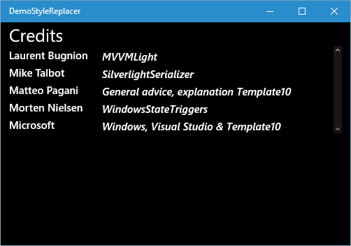
As I was in the process of porting my app Map Mania to the Universal Windows Platform, I of course extensively used Adaptive Triggers. Now that works pretty darn well, unless you have a whole lot of elements that need to be changed. The credits page of my app looks like this

image

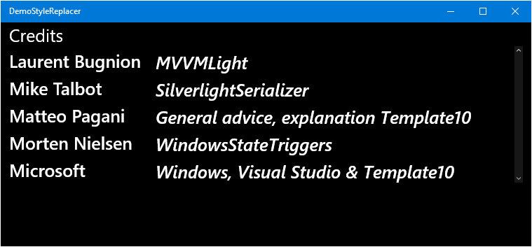
that is to say, that is what is looks on a narrow screen. When I have a wider screen, like a Surface Pro, I want it to look like this:

image

The font size of all the texts need to increase. This is rather straightforward, but also a rather cumbersome experience when there are a lot of elements to change. To get this done with the normal Adaptive Triggers in a VisualStateGroup, you have to:

  • Give all elements an x:Name
  • Refer to them by name into your trigger’s setter
  • For every element you have set the change to the font size.

This very quickly becomes a copy & paste experience, especially if you have a lot of elements and states. And of course, when you add a new element (adding new credits, for example translators), you might forget to add it to the VSM, so you have to go back again… Don’t get me wrong, the Adaptive Trigger is an awesome idea, but in some situations it’s a lot of work to get things done. If you have been reading this blog for some time you already know what is coming: my castor oil for all XAML related challenges – a behavior.

Introducing StyleReplaceBehavior

I have created a simple behavior that, in a nutshell, does the following:

  • You supply the StyleReplaceBehavior with the names of styles you want to have ‘observed’. For instance “MySmallStyle”, “MyMediumStyle”, “MyBigStyle”. This is the property ObservedStyles.
  • From the Visual State Manager, you set the behavior’s CurrentState property to the style you want to be activated. For instance, “MyMediumStyle”
  • The StyleReplaceBehavior traverses the whole visual tree from it’s location and finds every element that has an observed style that is not the currently wanted style, and changes it’s style to the wanted style. So following with the example I just used, if finds everything that is “MySmallStyle” or “MyBigStyle” and changes it to “MyMediumStyle”.

Usage example

As usual, I have supplied a demo project, but I will explain in more detail how it works. About halfway down in the MainPage.Xaml you will find the XAML that defines the credits grid:

<Grid x:Name="ContentPanel" Height="Auto" VerticalAlignment="Top" >
  <Grid.RowDefinitions>
    <RowDefinition Height="Auto"/>
    <RowDefinition Height="Auto"/>
    <RowDefinition Height="Auto"/>
    <RowDefinition Height="Auto"/>
    <RowDefinition Height="Auto"/>

  </Grid.RowDefinitions>
  <Grid.ColumnDefinitions>
    <ColumnDefinition Width="Auto"/>
    <ColumnDefinition Width="Auto"/>
  </Grid.ColumnDefinitions>

  <HyperlinkButton Content="Laurent Bugnion" Tag="http://www.twitter.com/lbugnion"
                   Style="{StaticResource CreditHyperlinkButtonStyle}" 
                   Click="HyperlinkButtonClick" />
  <TextBlock Text="MVVMLight" Grid.Row="0" Grid.Column="1 " 
             Style="{StaticResource CreditItemStyle}" />

  <HyperlinkButton Content="Mike Talbot" Tag="http://whydoidoit.com/" Grid.Row="1" 
                   Style="{StaticResource CreditHyperlinkButtonStyle}" 
                   Click="HyperlinkButtonClick"  />
  <TextBlock Text="SilverlightSerializer" Grid.Row="1" Grid.Column="1" 
             Style="{StaticResource CreditItemStyle}" />

  <HyperlinkButton Content="Matteo Pagani" Tag="http://www.twitter.com/qmatteoq" 
                   Grid.Row="2" 
                   Style="{StaticResource CreditHyperlinkButtonStyle}" 
                   Click="HyperlinkButtonClick"  />
  <TextBlock Text="General advice, explanation Template10" Grid.Row="2" Grid.Column="1" 
             Style="{StaticResource CreditItemStyle}" />

  <HyperlinkButton Content="Morten Nielsen" Tag="http://www.twitter.com/dotmorten" 
                   Grid.Row="3" 
                   Style="{StaticResource CreditHyperlinkButtonStyle}" 
                   Click="HyperlinkButtonClick" />
  <TextBlock Text="WindowsStateTriggers" Grid.Row="3" Grid.Column="1" 
             Style="{StaticResource CreditItemStyle}" />

  <HyperlinkButton Content="Microsoft" Tag="http://www.microsoft.com/" Grid.Row="4" 
                   Style="{StaticResource CreditHyperlinkButtonStyle}" 
                   Click="HyperlinkButtonClick"   />
  <TextBlock Text="Windows, Visual Studio & Template10" Grid.Row="4" Grid.Column="1" 
             Style="{StaticResource CreditItemStyle}" />

</Grid>

This may look impressive, but I can assure you it is not – it’s only a bunch of texts and buttons, and the only interesting thing is the usage of CreditHyperlinkButtonStyle and CreditItemStyle. A little but further up, in the page’s resources, you will see the actual styles that are used getting defined:

<Style x:Key="PageTextBaseStyle" TargetType="TextBlock" 
       BasedOn="{StaticResource BaseTextBlockStyle}">
  <Setter Property="FontSize" Value="15"/>
</Style>

<Style x:Key="CreditItemStyle" TargetType="TextBlock" 
       BasedOn="{StaticResource PageTextBaseStyle}" >
  <Setter Property="FontStyle" Value="Italic"/>
  <Setter Property="VerticalAlignment" Value="Center"/>
  <Setter Property="TextWrapping" Value="Wrap"/>
  <Setter Property="Margin" Value="20,5,0,0"/>
</Style>

<Style x:Key="CreditItemStyleBig" TargetType="TextBlock" 
       BasedOn="{StaticResource CreditItemStyle}">
  <Setter Property="FontSize" Value="25"/>
</Style>

<Style x:Key="HyperlinkTextStyle" TargetType="TextBlock"  
       BasedOn="{StaticResource PageTextBaseStyle}" >
</Style>

<Style x:Key="HyperlinkTextStyleBig" TargetType="TextBlock"
       BasedOn="{StaticResource PageTextBaseStyle}" >
  <Setter Property="FontSize" Value="25"/>
</Style>

And basically the only difference between the normal and the –Big styles is that their font size is not 15 but 25.

The behavior – which needs to be attached to the page itself - is used as follows:

<interactivity:Interaction.Behaviors>
  <behaviors:StyleReplaceBehavior x:Name="CreditItemStyler">
    <behaviors:StyleReplaceBehavior.ObservedStyles>
      <behaviors:ObservedStyle Style="{StaticResource CreditItemStyle}"/>
      <behaviors:ObservedStyle Style="{StaticResource CreditItemStyleBig}"/>
    </behaviors:StyleReplaceBehavior.ObservedStyles>
  </behaviors:StyleReplaceBehavior>

  <behaviors:StyleReplaceBehavior x:Name="HyperlinkTextStyler">
    <behaviors:StyleReplaceBehavior.ObservedStyles>
      <behaviors:ObservedStyle Style="{StaticResource HyperlinkTextStyle}"/>
      <behaviors:ObservedStyle Style="{StaticResource HyperlinkTextStyleBig}"/>
    </behaviors:StyleReplaceBehavior.ObservedStyles>
  </behaviors:StyleReplaceBehavior>
</interactivity:Interaction.Behaviors

In fact, you see that there are two, each for every style pair that needs to be changed. Also note the behaviors have names. This we need to be able to address them from the Visual State Manager:

<VisualStateManager.VisualStateGroups>
  <VisualStateGroup x:Name="WindowStates">

    <VisualState x:Name="NarrowState">
      <VisualState.StateTriggers>
        <AdaptiveTrigger MinWindowWidth="0"></AdaptiveTrigger>
      </VisualState.StateTriggers>
      <VisualState.Setters>
        <Setter Target="CreditItemStyler.CurrentStyle" 
                Value="{StaticResource CreditItemStyle}"/>
        <Setter Target="HyperlinkTextStyler.CurrentStyle" 
                Value="{StaticResource HyperlinkTextStyle}"/>
      </VisualState.Setters>
    </VisualState>

    <VisualState x:Name="WideState">
      <VisualState.StateTriggers>
        <AdaptiveTrigger MinWindowWidth="700"></AdaptiveTrigger>
      </VisualState.StateTriggers>
      <VisualState.Setters>
        <Setter Target="CreditItemStyler.CurrentStyle" 
                        Value="{StaticResource CreditItemStyleBig}"/>
        <Setter Target="HyperlinkTextStyler.CurrentStyle" 
                        Value="{StaticResource HyperlinkTextStyleBig}"/>
      </VisualState.Setters>
    </VisualState>
  </VisualStateGroup>

</VisualStateManager.VisualStateGroups>

Which is, apart from that it is setting behavior properties in stead of element properties, as bog standard as you can think of. And that is all. An Adaptive Trigger and some settings.

Caveats and limitations

The behavior is not very forgiving. If you use a style that is not applicable to the element you want to change, it will probably hard crash on you. It does the job, but it’s not intended to catch all your mistakes. Intentionally, by the way, because it might become silently defunct if you change style names and you forget to edit the behavior’s use. The revised version, though, is no longer limited to local resources. It can use any resource that can be identified by StaticResource.

A little peek behind the curtains

The behavior itself pretty simple – two dependency properties, ObservedStyles and CurrentStyle, but those are not interesting in itself. There is one little method that actually does all the work when the behavior initializes, or CurrentStyle changes:

private void ReplaceStyles(Style newStyle)
{
  if (!Windows.ApplicationModel.DesignMode.DesignModeEnabled)
  {
    // Find all other styles observed by this behavior
    var otherStyles = ObservedStyles.Where(
        p => p.Style != newStyle).Select(p=> p.Style);
    // Find all the elements having the other styles
    var elementsToStyle = AssociatedObject.GetVisualDescendents().Where(
        p => otherStyles.Contains(p.Style));
    // Style those with the new style
    foreach (var elementToStyle in elementsToStyle)
    {
      elementToStyle.Style = newStyle;
    }
  }
}

Four lines of code – that is basically all there is to it. And since nearly every line has comments to describe it, I will refrain from further detailing, except for one thing – GetVisualDescendents is not a normal method, but an extension method sitting in WpWinNl – the one and only reason I attached my package to it.

Conclusion

I realize this is huge overkill if you have only two or three elements to change, but when it becomes a lot, this may help you to you make your UWP apps even more awesome pretty easily. For me it saved a lot of work. Once again, the link to the demo project, where you can see everything running.

An additional conclusion is that Mr. Rang – may he rest in peace – once again was right. Don’t try to be clever. Simply using the tools that are already there usually works better.

23 January 2016

What themeresources are available for Windows 10 UWP apps?

If you use Blend, and what to color your elements using a system resource, you get a depressing number of resources in the pop-up. So much, that you actually have no idea what you are looking at. image
If you want to see what resources are actually available, go to the following directory:
C:\Program Files (x86)\Windows Kits\10\DesignTime\CommonConfiguration\Neutral\UAP\<framework version>\Generic
So for instance
C:\Program Files (x86)\Windows Kits\10\DesignTime\CommonConfiguration\Neutral\UAP\10.0.10586.0\Generic

You will see two files:
  • generic.xaml
  • themeresources.xaml
Themeresources.xaml actually contains all of the theme resources, colors and whatnot, and generic.xaml the implementation of the various themes (default, high contrast and light).
Of course, once you know that, you can easily find some documentation on that, like this one on MSDN. It was not immediately obvious to me, and I then assume it won’t be for others, so I thought it best to jot this down quickly – if only for future reference.