06 July 2016

HoloLens CubeBouncer application part 1 - setting up the Unity part

Preface

Ever since I knew the HoloLens was coming to my company I have been digging into all the online resources I could find. And ever since the devices arrived on June 8th, I have been more or less pleading insanity with my wife, as I spent quite some spare time just trying to get ever deeper into HoloLens development with Unity3D and C#. What surprised me most was how easy it was to actually get started and get on with it, and get a pretty functional app within a quite short amount of time – with shockingly little code.
I will write the way I created the app as a series of blog posts (and not a single one) to prevent individual posts from becoming too long. They will serve both as an educational piece for those interested in HoloLens programming (as working examples with explanations are still pretty rare) and for myself – to remember how I actually came to this.
  • In this first part I will describe the app, write how to create an app in Unity3D, and how to design some basic characteristics of a 3D object
  • In Part 2 I will describe the basic setup – how the grid is created with respect to user’s view angle
  • In Part 3 I will add basic manipulation (air tapping the cubes and making them bounce) as well as the first spatial sound
  • Part 4 will introduce speech recognition and he first two speech commands – “create new grid” and “go to start”
  • Part 5 will describe the use of gravity via the speech commands “drop”, “drop all”; we will implement “total recall”, add missing sounds, and do some fit & finish.

Description and features of the app

The app creates a grid of cubes floating in the air. Up and sideways it’s a fixed number of cubes (4x4), the number in depth is determined by the space available between you and a wall or object you are gazing at. The grid is also rotated in space according to your head’s position, so if you tilt your head a and gaze up to the left, so will the grid be tilted and stacked up to the upper left. In other words – you will always look at a grid that is exactly aligned with your gaze – when the grid is created. After that you can walk around it and manipulate it to your hearts content:
  • Air tapping while the gaze cursor is on the cube will push it away from you as if you had poked it with a stick that comes directly out of your eyes. Cubes will move away from you, rotate and bounce off each other - and any physical objects HoloLens has detected. When they hit each other, the make a kind of clicking sound, when they hit a physical object, a kind of low boom sounds. And of course, all from the right direction. Spatial Sound FTW.
  • When you gaze at a cube and say “go to start” it will move back to it’s original position, emitting a kind of whistling sound while doing so. And bump out of the way any other cubes being in the way ;)
  • Gazing at a cube while saying “drop” will let the cube drop to the floor
  • Saying  “drop all” will make all cubes drop to the floor (you don’t need to gaze at a particular cube)
  • Saying “total recall” will make all cubes return to their initial original position. More or less. Unless they hit each other on the way ;) 
  • Saying “create new grid” will create a new grid of cubes – once again it’s direction following your gaze.
An additional feature, handy for demo’s – if HoloLens cannot find a point on a wall or object while trying to create a grid in 10 seconds (because it’s still scanning the room, or there simply is nothing in front of it) it will pick a place in front of you about 3.5 meters before you and assume that to be the wall. You get a fairly small grid then.
I have shown some intermediate stages of the app – here it is in it’s final form.

And I am going to show you how to build it. It’s 90% Unity3D stuff, and very little custom code. And part of it is nicked from Microsoft, too. Actually I only wrote three  classes all by myself.

Suggested material before starting

If you are totally new to Unity3D (like I was) I would strongly suggest doing some introductory stuff first. Otherwise, I will be talking mostly nonsense to you. Start out with the Creative Coding series by the brilliant Rick Barraza. I found it very enlightening, although it is slightly off target when you are a hard core coder like me – Rick is talking at length at things you will find elementary as a coder, while some Unity3D concepts go by at a speed that made me pause and go back a few times ;). But it is a very good series to make you feel comfortable with Unity3D editor and the basic concepts. I would also suggest a few lessons on the Holographic Academy to get you familiar with HoloLens interaction programming. I would particularly suggest lessons 101 and 101 (or 101E, if you don’t have a HoloLens). It’s rather amusing to see that the Academy series is heavily slanted toward coders, while Rick is more slanted toward designers, so together they make a good introduction.
For editor layout, I took Rick’s suggestion of taking the “tall” layout (Window/layouts/tall) so that is what you will see in the screenshots. It is not the default Unity3D layout.

Create a new Unity3D project

The most important part – think of a good name, as it’s not easy to change it. I would strongly suggest following a few steps as described in my fellow MVP Morten Nielsen’s blog, most notably:
I tend to do a few things different:
  • With regards to the HoloToolkit, I only copy all the files under “Assets” from the zip file in a folder “HoloToolkit” under “Assets” in my Unity3D project as I like to keep the things I make and import as a whole differently.
  • I put the cursor at root level, in stead of inside a ‘Managers’ game object (although I do create it, but for other purposes)
  • I set the Near Clipping Plane of the Camera to 0.1, unlike Morten, but do whatever you like.
At the moment of this writing, I got some errors importing the HoloToolkit in the Sharing subfolder. As we don’t need this anyway, I deleted it completely.
I also add a few things up front:
  • To enable speech recognition, we have to enable the Microphone. That’s done by File/Build Settings/Player Settings, then opening the “Publishing settings”, scrolling all the way to the bottom to Capabilities, then checking “Microphone”
  • To prevent a horribly magenta painted surroundings, I set the occlusion material of the SpatialMappingRender to, indeed. occlusion. I have described this procedure in an earlier blog post.
So, if you are done following Morten’s steps and my additions/changes, you should end up with the following:
image
When you are done with this, hit “File/Save Scene” and choose a name you like. I tend to choose “MainScene”.

A little organization up front

I like to keep things a bit organized, so I keep stuff I made myself and/or is part of my app) apart from 'the rest', that is, the HoloLens toolkit. This makes updating easier. So I created a folder "Custom" in my assets and added a number of sub folders to it:
image

Creating the cube looks

imageClick “HologramCollection” in the hierarchy pane, right-click, select 3D-object and then “Cube”. Done ;). You get a white 1x1 cube, that’s a bit big and a bit boring. So what we are going to do next is get a material for it that has a more interesting look. I guess I wanted to impress our CTO (hi Danny ;) ) so I took a Wortell company logo - that is conveniently square. But of course you can take any image you like. In Unity3D terminology, that’s a texture, so I dragged that image into my newly created textures folder. But you cannot directly use a texture on a 3D element – you need a material.
So inside our Assets/Custom/Materials folder we right-click, select Create, then click “Material”. In the top of the inspector, a drop down box is shown labeled “Shader”. Change that to Mobile/Bumped diffuse. The UI below it will change – you will see two grey areas. Hit the “select” button from the top one, select the image you want from the popup, and you are done. Alternatively, you can also drag it from the textures folder on top of the grey area. Either way, the net result should be this:
image
It gives some warning for better performance – people who understand Unity3D better than me will no doubt have suggestions to fix this. For now, it will work. But your material is now still called “New Material” – I renamed it to “WortellLogo”.
Now select the cube in the Hierarchy pane, open the Assets Custom/Materials folder and drag the new Material on top of the Inspector pane, just below the Material
image
Your result should be this (if you zoom in a little on the Scene)
image
One cube, with logo, nearly done. We will need only need change one more thing – the cube is a wee bit big. Under transform (on top of the inspector) change the Scale to 0.1 for X, Y and Z.

Adding some physics (and other) components to the cube

imageTo be able to make the cube be moved and controlled by the Unity3D physics engine, we will need a component that describes it’s physical characteristics. That component is called a “Rigidbody”. So hit the “Add Component” button to the right in the cube Inspector, type “rig” in the search box to make finding the right component easier, and select Rigidbody. I have changed some default settings, but you are free to play with your own – the most important thing is to turn off “Use Gravity”
image
A second part of the physical characteristics is defined by the physical material. This, apparently, defines how things collide – how bouncy they are, and how smooth. You can image two ice cubes sliding over each other showing different behavior than two rugged wood cubes. Anyway – select folder “PhysicMaterials’', right-click, and select Physic Material. I have called it “BouncyStuff”, but you may call it whatever you like. I have given it the following settings:
image
To apply this material, you will need to drag this material on top of the “Material” box of the “Box Collider” inside your cube, that was created by default.
image
Finally, to make the cube be able to emit sound from the right direction we have to add an Audio Source. You can find an article here on enabling spatial sound in your project. I tend to do things a bit different in this project, because I found it sounded better in my case. Anyway – once more, hit “Add Component” and select “Audio Source”. Expand it, then change the settings as follows:
  • Uncheck “Play on awake”
  • Set “Volume” to 0.5
  • Drag the slider “Spatial Blend” all the way to 3D
  • Under “3D Sounds settings”, set Max Distance to 15
Net result should be this
image
Our Cube is now done.

Looking at the result so far

image
As you may have noticed, we still have not written a single line of code. Yet, we already have a working application. Hit File/Build Settings/Build, build the app and deploy to the HoloLens or an emulator. The “Made with Unity” logo will pop up, and then nothing. Or so it seems. We have positioned our cube at 0,0,0 which seems to be the location of the HoloLens as the application starts up. Anyway – get up, turn around, look to where your head was, and there it is….

Concluding remarks

The solution so far can be found here. If you are impatient, and want to play with the already finished app directly, download an app package here and install it on your HoloLens. Beware of the dependencies you will need to install as well!
Apart from the people already mentioned in this article, I want to particularly say thanks to András Velvárt (aka vbandi) who, apart from being a smart, friendly and very accessible person, gave me some particular good advice on some issues with the spatial mapping, and the HoloLens environment scanning rate. He also pointed me to the Creative Coding series.

02 July 2016

Gotcha–”The associated script could not be loaded” on all C# scripts in a HoloLens Unity3D project

When I work on a HoloLens project, I alternate a lot between the Unity editor and Visual Studio, but I tend to spend a lot more time in the latter. I am a coder after all, and if you set the development checkmarks as I explained in an earlier post, you can directly edit (and more importantly, debug) your code from Visual Studio. After a particular fruitful day I closed off my PC (it’s a desktop PC so yes, it actually shuts down). Next morning I wanted to work on some assets, so I opened the Unity editor and was greeted by this:

image

On every bloody script in the project. Even the standard scripts in the HoloLens toolkit by Microsoft were broken. Quickly I opened Visual Studio. No syntax errors, nothing. App compiled as normal and deployed. The only clue was this all the way to the left bottom of the screen in Unity was this very vague error message:

image

Unexpected symbol ‘<internal>’? All that was on line 95 of CubeManipulator was a simple Debug statement in the OnCollisionEnter method:

void OnCollisionEnter(Collision coll)
{
    Debug.Log($"{coll.contacts.Length}");   
    

What can be wrong with that?

Well, it’s using string interpolation, and that’s C# 6, that’s what wrong with that. While this is perfectly valid in your UWP app compiled by Visual Studio, running on a Windows platform, Unity is built to be cross-platform. It’s particular interpretation of C# is based on Mono and it’s runtime is still a bit behind – at least to the extent that it’s not understanding this fancy string interpolation thingy.So all I had to do was remove this line – and restart the Unity editor, as changing the script alone does not do the trick.

Now I understand Unity is getting a new runtime in the future and this will all be moot in the end but until that moment – beware of fancy C# 6 constructs in your HoloLens apps. If you get any odd error messages in perfectly valid code from the Unity editor – this is your prime suspect.

29 June 2016

Gotcha - changing a HoloLens app’s name as it appears on the tile

I am currently finishing up a nice little demo app for the HoloLens but ran into a weird problem. Originally the app was called ‘Gazer’, as I only wanted to test Gaze Input, but it turned out to become a lot more. So I wanted to call it “CubeBouncer”.

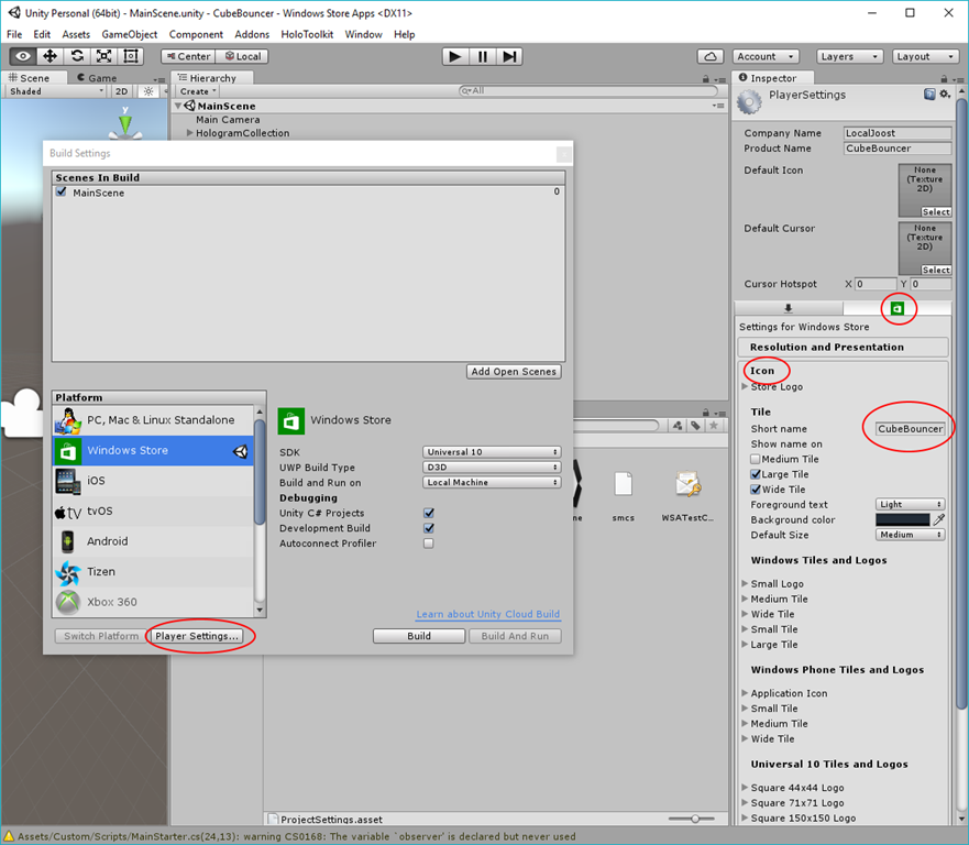
It’s not so hard to do, you got File/Build settings, then go to “Player Settings”, and in the inspector on the right hand side you see a Store logo. Click that, select the Icon tab, and under “Short name” you will see the name that will be displayed on the HoloLens app tile. You can also select on what types of tiles it needs to appear. It quite reflects the Visual Studio UWP Manifest editor, which is logical, as this is what the manifest is generated from.

image

Build the app by hitting the Build button as usual when you have made changes in Unity, Visual Studio will say the project has changed and prompts to reload it, you build and deploy it to the HoloLens or the emulator, pin your app to the start screen – and you will see nothing has changed. The old name is still displayed.

Turns out that Unity UWP generation is a bit too clever when it comes to generating the UWP – apparently it updates not everything, but only the things that have changed. And I think it fails to take changes into the manifest into account.

The solution is very simple: don’t overwrite the generated UWP app. Close Visual Studio, delete the generated UWP app entirely (warning – only the generated app code, not your entire Unity project), only then hit Build in Unity (you will notice that takes quite a bit longer, as it needs to restore NuGet packages and stuff too), open Visual Studio again and then if you deploy your app to HoloLens, the short name will have changed.

Possibly there are smarter ways to do this, like only deleting the Manifest file – I have not tried this – but this is a sure fire way to fix this. It’s a bit cumbersome, but changing the name of an app or a tile isn’t exactly something you do ten times a day, so it’s not that much of a problem. But it’s a nice gotcha, so I thought it best to document it.

11 June 2016

Floating ‘text balloons’ for context relevant information in Xamarin Forms

Picking the challenge apart

An Italian proverb says that a fool can ask more questions than seven wise men can answer – a modern variant could be that a designer can think up more things than a developer can build. I don’t pretend to be the proverbial wise man, and neither do I want to call my designer colleague a fool, and when he came up with the idea of introducing text balloons with context relevant information, floating on top on the rest of the UI, cross-platform, and preferably appearing with a nice animation, I indeed had to do some head scratching.

What he meant was this, and this is exactly how I created it

The issues I had to tackle, were:

  1. How do I create a text balloon in the first place, with a kind of pointy bit pointing to the UI element it belongs to?
  2. How do I get the absolute position of a UI element - that is, the one the user taps?
  3. How do I show the text balloon in situ?

Text balloon 101

tekstballon

This text balloon consists of a translucent grid that ties the components together. It contains two grids, one of them containing the label. The first grid is the bit that points up. This actually is a 15 by 15 square, rotated 45⁰, and moved a little bit to the left using the new Margins property that has finally made it to Xamarin Forms. The second and biggest grid is the green rectangle actually containing the text you want to show. Because it’s in XAML after the square, drawing precedence rules make that it be drawn on top of the first one. You would not see it at all, if is wasn’t for the fact this grid also has a margin - of 7 on the top so about half of the rotated square. The net result, as you can see, is a triangle sticking out of the rectangle, making the optical illusion of a kind of text balloon. In XAML, this looks like this

<Grid x:Name="MessageGridContainer" xmlns="http://xamarin.com/schemas/2014/forms"
           xmlns:x="http://schemas.microsoft.com/winfx/2009/xaml"
           x:Class="XamarinFormsDemos.Views.Controls.FloatingPopupControl" 
           BackgroundColor="#01000000">
  <Grid.ColumnDefinitions>
    <ColumnDefinition Width="75*"></ColumnDefinition>
    <ColumnDefinition Width="25*"></ColumnDefinition>
  </Grid.ColumnDefinitions>
  <Grid x:Name="MessageGrid" HorizontalOptions="Start" VerticalOptions="Start" >
    <Grid BackgroundColor="{StaticResource  AccentColor}" HeightRequest="15" WidthRequest="15" 
          HorizontalOptions="End" VerticalOptions="Start" Rotation="45" 
          Margin="0,0,4,0" InputTransparent="True"/>
    <Grid Padding="10,10,10,10" BackgroundColor="{StaticResource AccentColor}" Margin="0,7,0,0" 
          HorizontalOptions="FillAndExpand" InputTransparent="True">
      <Label  x:Name="InfoText" TextColor="{StaticResource ContrastColor}" 
             HorizontalOptions="Center" VerticalOptions="Center" 
             InputTransparent="True"/> 
    </Grid>
  </Grid>
</Grid>

The complete text balloon is contained in the “MessageGrid” grid; the pointy bit upward is emphasized using red and underlining. The complete control is contained within yet another grid “MessageGridContainer”, that fills the whole screen – or at least the part in which the text balloons appear. Is has three functions:

  • It provides a canvas to place the actual text balloons on
  • It is an event catcher – as the user taps ‘anywhere on the screen’ the text balloon disappears
  • It makes sure the text balloon never gets wider than 75% of the screen (this was a designer requirement) – hence the columns.

Some important details to take note of:

  • A few elements have set the property “InputTransparent”  to true. This means they will never receive any events (like tap) but those will be received by the elements lying ‘below’ them. In other words, they don’t block events. This makes the text balloon disappear even when you tap on the text balloon itself, as the events goes downwards and is processed by MessageGridContainer
  • MessageGridContainer itself is not opaque but has BackgroundColor "#01000000", that is, 1% black. For all intents and purposes it is opaque in the sense that you don’t see it, but if you leave it totally opaque is will also be opaque to events - on Windows 10 UWP. A little concession to a cross platform issue.
  • This whole contraption is called “FloatingPopupControl” – this is the control that handles showing, displaying and eventually removing the text balloon. ‘Something’ has to call it’s ShowMessageFor method to tell it what the balloon should contain, and under which control it should appear.We will come to that later

Determining absolute position of the ‘anchor element’

The anchor-element is the element under which the text balloon appear should appear when it’s tapped – in this sample, the i-symbol. It is actually pretty to simple to find the absolute position of a relatively placed element: this is achieved by going recursively upwards via the “Parent” propertie and get the sum of all X values and the sum of all Y values. You can actually find hints to this in the Xamarin developer forumsin the Xamarin developer forums, and I have put this into the following extension method:

using Xamarin.Forms;

namespace Wortell.XamarinForms.Extensions
{
  public static class ElementExtensions
  {
    public static Point GetAbsoluteLocation(this VisualElement e)
    {
      var result = new Point();
      var parent = e.Parent;
      while (parent != null)
      {
        var view = parent as VisualElement;
        if (view != null)
        {
          result.X += view.X;
          result.Y += view.Y;
        }
        parent = parent.Parent;
      }
      return result;
    }
  }
}

Positioning, showing, animating and removing text balloons

If you look at the code in the ShowMessageFor method - in the FloatingPopupControl code behind – you’ll see the code is only deferring to FloatingPopupDisplayStrategy. This is done because it’s not wise to put much code into a user control if you want to re-use part of that intelligence easily. It also makes adapting and changing animations easier. FloatingPopupDisplayStrategy has the following constructor:

public class FloatingPopupDisplayStrategy
{
  private readonly Label _infoText;
  private readonly View _overallView;
  private readonly View _messageView;

  public FloatingPopupDisplayStrategy(Label infoText, View overallView, View messageView)
  {
    _infoText = infoText;
    _overallView = overallView;
    _messageView = messageView;

    _overallView.GestureRecognizers.Add(new TapGestureRecognizer
    { Command = new Command(ResetControl) });
    _overallView.SizeChanged += (sender, args) => { ResetControl(); };
  }
}
  • infoText the text balloon name 
  • overallView is the canvas in which the text ballon is placed; it also receives the tap to remove the text balloon again
  • messageView is het containing grid of the text balloon itself

ShowMessageFor, and it’s little helper ExecuteAnimation, are implemented like this:

public virtual async Task ShowMessageFor(
  VisualElement parentElement, string text, Point? delta = null)
{
  _infoText.Text = text;
  _overallView.IsVisible = true;

  // IOS apparently needs to have some time to layout the grid first
  // Windows needs the size of the message to update first
  if (Device.OS == TargetPlatform.iOS || 
      Device.OS == TargetPlatform.Windows) await Task.Delay(25);
  _messageView.Scale = 0;

  var gridLocation = _messageView.GetAbsoluteLocation();
  var parentLocation = parentElement.GetAbsoluteLocation();

  _messageView.TranslationX = parentLocation.X - gridLocation.X -
                              _messageView.Width + parentElement.Width +
                              delta?.X ?? 0;
  _messageView.TranslationY = parentLocation.Y - gridLocation.Y +
                              parentElement.Height + delta?.Y ?? 0;

  _messageView.Opacity = 1;
  ExecuteAnimation(0, 1, 250);
}

private void ExecuteAnimation(double start, double end, uint runningTime)
{
  var animation = new Animation(
    d => _messageView.Scale = d, start, end, Easing.SpringOut);

  animation.Commit(_messageView, "Unfold", length: runningTime);
}
  • First the text that should be displayed in the text balloon is set
  • Next, the canvas in which the text balloon is placed is made visible. As stated before, it’s nearly invisible, but effectively it intercepts a tap
  • Windows and iOS now need a short timeout for some layout events. This feels a bit VB6’ey, doevents, right?
  • The text balloon is scaled to 0, effectively making it infinitely small (and invisible) 
  • Next, we calculate the text balloon’s current absolute location, as well as the anchor element’s(‘parentElement’) absolute location.
  • X and Y translation of the text balloon are calculated to position the text balloon at a location that will make the pointy bit end up just under the blue i-symbol
  • De message grid’s opacity is set to 1, so now the text balloon is visible (but still infinitely small)
  • A 250 ms bouncy animation (Easing.SpringOut) blows up the text balloon to scale 1 – it’s normal size.

Note: the delta uses in the calculation is a value intended to use as a correction value, in case the standard calculation does not yield the desired result (i.e. location). This will be explained later on.

And finally, the user must be able to dismiss the text balloon. This is done using the ResetControl methods. As we have seen in de constructor, this method gets called in case the user types at the invisible canvas, or if the canvas’ size changes.

private void ResetControl()
{
    if (_messageView.Opacity != 0)
    {
      _messageView.Opacity = 0;
      _overallView.IsVisible = false;
    }
}

This method does not need to be called explicitly at initialization, since he invisible grid changes size at the start of the app (because it gets child elements – the MessageGrid and its children), and the event wiring makes this call happen anyway. Another important reason to attach this method to the SizeChanged event is that in Windows 10 UWP apps windows sizes actually can be changed by the user. This may cause text balloons ending up in what is no longer being the right place, so they need to be removed as well. After all, as long as the text balloon is visible, the invisible background blocks any input, so as soon as the user starts working with the app, in any way, the text balloon needs to disappear and the app needs to be ready again.

Behavior intercepting tap event and relay to control

The only thing missing now is something to get the whole process going – respond to the tap on the i-symbol, providing the text balloon contents, and provide some optional positioning correcting for the text balloon. This is done by FloatingPopupBehavior:

using Wortell.XamarinForms.Behaviors.Base;
using Wortell.XamarinForms.Controls;
using Xamarin.Forms;

namespace Wortell.XamarinForms.Behaviors
{
  public class FloatingPopupBehavior : BindableBehaviorBase<View>
  {
    private IGestureRecognizer _gestureRecognizer;

    protected override void OnAttachedTo(View bindable)
    {
      base.OnAttachedTo(bindable);
      _gestureRecognizer = new TapGestureRecognizer {Command = new Command(ShowControl)};
      AssociatedObject.GestureRecognizers.Add(_gestureRecognizer);
    }

    protected override void OnDetachingFrom(View bindable)
    {
      base.OnDetachingFrom(bindable);
      AssociatedObject.GestureRecognizers.Remove(_gestureRecognizer);
    }

    private void ShowControl()
    {
      if (AssociatedObject.IsVisible && AssociatedObject.Opacity > 0.01)
      {
        PopupControl?.ShowMessageFor(AssociatedObject, MessageText, new Point(Dx, Dy));
      }
    }

    #region PopupControl Attached Dependency Property      
    public static readonly BindableProperty PopupControlProperty =
      BindableProperty.Create(nameof(PopupControl), 
      typeof (IFloatingPopup), typeof (FloatingPopupBehavior),
        default(IFloatingPopup));


    public IFloatingPopup PopupControl
    {
      get { return (IFloatingPopup) GetValue(PopupControlProperty); }
      set { SetValue(PopupControlProperty, value); }
    }
    #endregion

    //MessageText Attached Dependency Property omitted

    //region Dx Attached Dependency Property omitted     

    //region Dy Attached Dependency Property omitted     

  }
}

This behavior is actually rather simple – as soon as the control tot which is attached is tapped, it calls the ShowMessageFor method of the control referenced in de PopupControl property. There are three additional property for determining which text is actually displayed, and two optional properties for a delta X and delta Y which, as we have seen, are included by the control when it actually places the text balloon on the right place.

Bringing it together in XAML

A simplified excerpt from FloatingPopupPage :

<ScrollView Grid.Row="1"  VerticalOptions="Fill" 
   HorizontalOptions="Fill" Margin="10,0,10,0" >
  <Grid>
    <Grid VerticalOptions="Start">
      <Grid.RowDefinitions>
        <RowDefinition Height="Auto"></RowDefinition>
        <RowDefinition Height="Auto"></RowDefinition>
        <RowDefinition Height="*"></RowDefinition>
      </Grid.RowDefinitions>
      <StackLayout Orientation="Horizontal" HorizontalOptions="Fill" >
        <ContentView  HorizontalOptions="FillAndExpand" VerticalOptions="Start">
          <Entry x:Name="NameEntry" Placeholder="Name" 
                  TextColor="{StaticResource AccentColor}" 
                  PlaceholderColor="{StaticResource SoftAccentColor}" />
        </ContentView>
        <ContentView>
          <Image Source="{extensions:ImageResource info.png}" VerticalOptions="Center"
                 HorizontalOptions="End" 
                 HeightRequest="{Binding Height, Source={x:Reference NameEntry}}">
            <Image.Behaviors>
              <behaviors:FloatingPopupBehavior MessageText="Fill in your name here"
                                               PopupControl="{x:Reference PopupControl}" 
                                               Dx="-6" Dy="4"/>
            </Image.Behaviors>
          </Image>
        </ContentView>
      </StackLayout>

    </Grid>
    <controls:FloatingPopupControl x:Name="PopupControl" VerticalOptions="Fill" 
                                   HorizontalOptions="Fill" />
  </Grid>
</ScrollView>

In red the actual i-symbol with the behavior attached to it, in green the popup control (including the label) itself. In the behavior’s properties we actually specify the text to be displayed as well the PopupControl reference, indicating this is the UI control that should actually handle the displaying of the text balloon. In addition it sports an optional extra delta x and delta y. Of course this could be hard coded into the control, but to have this extra flexibility in design time makes for an easier ‘constructable ’UI. As you can see, as soon as the parts are in place, actually using and re-using the components is pretty easy, making adding floating text balloons with contextual relevant information very easy indeed.

Also notice a neat trick to make sure that especially nice in Android, that sports a great rage of resolutions. I took an intentionally too big picture for the i-symbol, which is automatically sized to the height of the entry by using  HeightRequest="{Binding Height, Source={x:Reference NameEntry}}"

Some consequences of this approach

As stated repeatedly, a (nearly) invisible grid covers the whole screen, or at least part of the screen, while a text balloon is displayed – to give the text balloon space to be placed in, and to intercept a tap so it will be removed as soon as the user starts interacting with the app. The flip side is that the app is effectively blocked until the user taps, and this tap will not do anything but removing the text balloon. A plainly visible button will not respond while the text balloon is visible – that requires yet another tap. This may seem annoying, but I don’t think this will put off the user in any significant amount, as it;s likely he will stop using this functionality pretty soon as he/she has gotten the hang of the app. This is only an onboarding/adopting thing. You read the car’s manual only once (if you do it at all, and then never again unless in very extraordinary circustances)

Conclusion

Using only some pretty basic means, a few nifty tricks and a clear architectural approach it appears to be pretty simple to build a kind of re-usable infrastructure enabling the fast and flexible addition of context relevant information, which is displayed in a visually attractive way. It’s very easy to add text balloons this way, and it’s a useful tool to make onboarding and adoption of an app easier.

As usual, a sample project containing this (and previous code) can be found on GitHub

01 June 2016

Default HoloLens Toolkit occlusion script turns magenta

After following some on-line video’s and snooping through some other’s people code I felt I had to start bottom-up to get at least a feeling for how you setup a HoloLens app – even though I don’t have a HoloLens. Call it my natural curiosity. So I followed my fellow MVP Morten Nielsen’s blog – highly recommended – as he starts with the real basics. Very good if you hardly have a clue what you are doing ;)

In his third post, I ran into a snag. According to his second post, I had unzipped the HoloLens toolkit into the assets folder as instructed, and started to add occlusion to my project. Morten explains in detail what this is – it makes holograms disappear behind physical objects like a wall when they are ‘in front’ of the holograms (which, in reality, they never can be as they are projected on a screen not 2 inch from your eyes, but that is the magic of HoloLens).

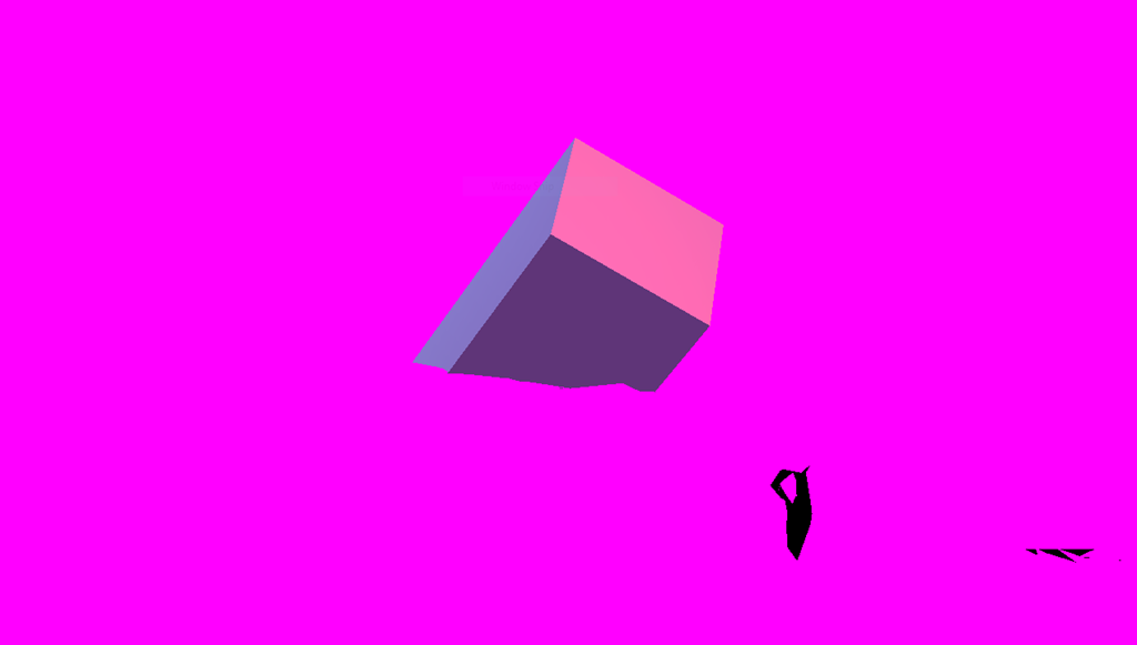
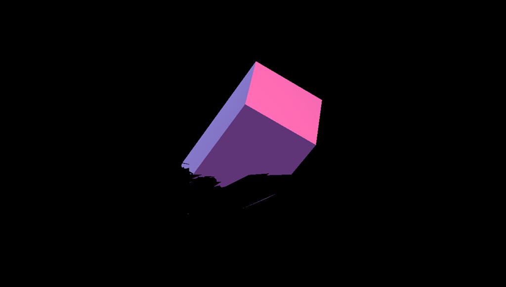
So I added a rectangular box as a Hologram, having it stick out of a wall like halfway, so I was supposed only to see the front part. That I did, but I did also see something else:

image

Yikes – that is my box all right, but where did that horrible magenta color come from? To this moment, I still don’t know, but I found out how to fix it.

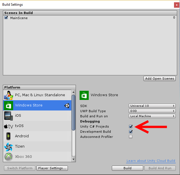
First of all, it really helps if, in addition to making the settings to your project that Morten describes in his first post, you tick at least “Unity C# project” as well in Build Settings:

image

I do the “Development Build” as well, although I don’t really know if this is neccesary).

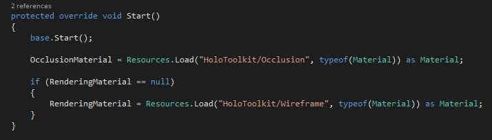
This makes all the scripts end up in your Visual Studio solution as well, and what is more, you can debug them. Thus I learned that the script “SpatialMappingRenderer.cs” (in folder Assets\HoloToolkit\SpatialMapping\Scripts\SpatialMappingComponent) looks for materials “Occlusion” and “WireFrame” that are clearly not there.

image

If you debug this script (you can now thanks to the setting above) you will see both OcclusionMaterial and RenderingMaterial end up as null. The materials are in HoloToolkit/SpatialMapping/Materials but changing “HoloToolkit” to “HoloToolkit/SpatialMapping/Materials” does not have any effect.

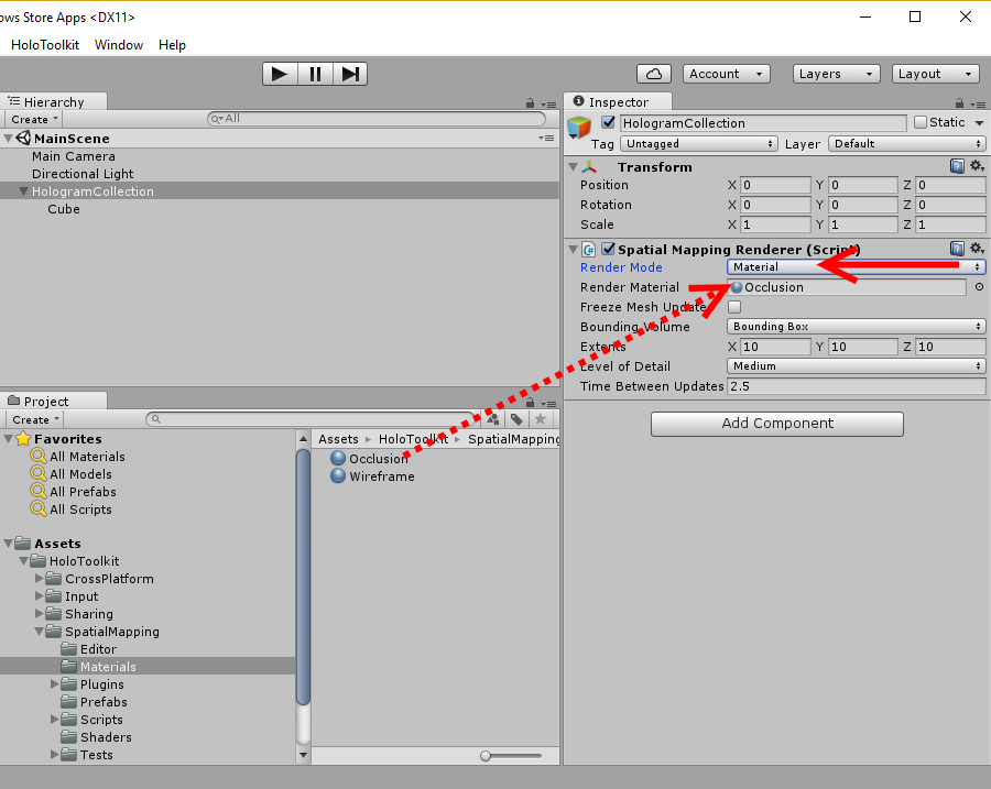
So I went back to the Unity editor, selected the Spatial Mapping Renderer script again, changed the dropdown “Render mode” from “Occlusion” to “Material”, and that made the property “Render Material” pop up. I found the Occlusion Material on top of it, and it was accepted.

image

If I now debug the code, the Occlusion material is still null, but RenderingMaterial is set, and lo and behold:

image

Now I am seeing what I expect to see – a box sticking out of a wall.

Disclaimer – I am just happily stumbling along trough Unity3D and HoloLens, not hampered by much knowledge of either. I found a problem (that I maybe caused myself) and I fixed it. I hope it helps someone. If I messed up, maybe someone can enlighten me. Unlike some other people, I am not afraid to look a n00b because in this case, that’s just what I am.

The project itself can be found in a good old-fashioned ZIP file as I don’t want to clutter up my GitHub account with every little thing I try at this stage. I am still in the stage of ‘programming by changing things and observing their effects’, so I hope you will humor me. And maybe this will help someone, who knows.

18 May 2016

Generic databinding for MapIcons in Universal Windows Apps

Preface

Ever since I introduced databinding for the UWP map control (and it’s previous incarnations for Windows Phone 8.x and Windows 8.x) I have been asked to write ‘real’ data binding for map shapes. I have patiently tried to explain that the very nature of the map control makes this impossible as the map shapes are not templated controls drawn by the XAML renderer, but drawn by the map control itself – and that is what makes it so fast. So I encouraged people to write their own MapShapeDrawer child classes that converted a view model into a map shape. How hard can it be, I thought. Judging by the number of requests I got, apparently it is hard, indeed, or too inflexible. So I decided to take a shot at creating a more or less generic class for converting view models to MapIcons – the most commonly used scenario. Thus GenericMapIconDrawer was created.

If the previous paragraphs made no sense at all to you, because this is the first time you ever have encountered my map binding library, I encourage you to read this article first.

Demo

image

I have once again updated the demo application that goes with the WpWinNl project. If you first hit Show Area, then hit “Flags” a number of time, you will see the map slowly getting covered with round flags of Belgium, Germany, Italy, Netherlands, Sweden and the UK. Don’t ask me why I choose this particular group of countries – I just did. If you then hit the “Pirate!” button, one of the nation’s flags will turn into Jolly Rogers, the descriptive label will change in “Arrrr!” and the icon will seem to jump upward a little. If you press the “Pirate!” button again, the current Jolly Roger flags will disappear, and another nation is selected to turn into pirates. Unless it selects a nation that has already turned pirate, then nothing will happen. If you press the “Pirate!” button long enough, all nations will turn into pirates and then disappear. Crime does not pay, in the end. At least in this demo. See video below.

The purpose of this – admittedly – rather peculiar demo, which I created when I was entirely sober indeed, is to show that by merely changing properties things change on the map. So even when it is not strictly data binding, it sure acts like data binding is happening. By the way, on my Surface Pro 4 you hardly see the flickering – it seems like my trusted old 2011 i7 970 machine that I used for recording this video is finally showing it’s age.

How the demo works (aka how you should use the new library feature)

There is actually way more code to the demo than the actual changes to the WpWinNl.Maps package comprise. First of all, the base class for my geometry providing view models has been changed so that it's name property is an actual view model property raising a NotifyPropertyChanged, using the standard MVVMLight syntax

public class GeometryProvider : ViewModelBase
{
  private string _name;
  public string Name
  {
    get { return _name; }
    set { Set(() => Name, ref _name, value); }
  }
}

Then there is the FlagList class, a child class of GeometryProvider, that provides a list of randomly located flags from a randomly selected nation within a rectangle defined by two Geopoints

using System;
using System.Collections.Generic;
using Windows.Devices.Geolocation;
using Windows.Foundation;

namespace WpWinNl.MapBindingDemo.Models
{
  public class FlagList : GeometryProvider
  {
    public static readonly string[] Countries =
      { "Belgium", "Germany", "Italy", "Netherlands", "Sweden", "UK" };


    private Uri _iconUri;
    public Uri Icon
    {
      get { return _iconUri; }
      set { Set(() => Icon, ref _iconUri, value); }
    }

    private BasicGeoposition _point;
    public BasicGeoposition Point
    {
      get { return _point; }
      set { Set(() => Point, ref _point, value); }
    }

    private Point _anchorPoint = new Point(0.5, 0.5);
    public Point AnchorPoint
    {
      get { return _anchorPoint; }
      set { Set(() => AnchorPoint, ref _anchorPoint, value); }
    }

    private bool _isVisible = true;
    public bool IsVisible
    {
      get { return _isVisible; }
      set { Set(() => IsVisible, ref _isVisible, value); }
    }

    public static IEnumerable<FlagList> GetRandomFlags(
                          Geopoint point1, Geopoint point2, int nrOfPoints)
    {
      var flags = new List<FlagList>();
      var points = PointList.GetRandomPoints(point1, point2, nrOfPoints);
      var r = new Random(DateTime.Now.Millisecond * 2);
      foreach (var point in points)
      {
        var flagIdx = (int)Math.Round(r.NextDouble() * 5);
        flags.Add(new FlagList
        {
          Name = Countries[flagIdx],
          Icon = new Uri($"ms-appx:///Assets/{Countries[flagIdx]}.png"),
          Point = point.Point
        });
      }
      return flags;
    }
  }
}

Notice here, as well, that all properties are raising INotifyPropertyChanged, that IsVisible is true by default and that we have a default icon anchor point of 0.5, 0.5 – that is, the center of the icon falls on the location specified by "Point". 

On the MapBindingViewModel there is a new public property ObservableCollection<FlagList> Flags that only gets loaded up with initial data in the LoadFlags method

public void LoadFlags()
{
  Flags.AddRange(FlagList.GetRandomFlags(new Geopoint(_area.NorthwestCorner),
    new Geopoint(_area.SoutheastCorner), 50));
}
Which is called when you press the "Flags" button. It add 50 icons every time you press it. Then there is the method that changes a random flag into pirate flags
public void ChangeToPirate()
{
  foreach (var flag in Flags.Where(p => p.Name == "Arrr!").ToList())
  {
    flag.IsVisible = false;
  }

  var r = new Random(DateTime.Now.Millisecond * 2);
  var flagIdx = (int)Math.Round(r.NextDouble() * 5);
  var flagName = FlagList.Countries[flagIdx];)
  foreach (var flag in Flags.Where(p => p.Name == flagName).ToList())
  {
    flag.Name = "Arrr!";
    flag.Icon = new Uri("ms-appx:///Assets/JollyRoger.png");
    flag.AnchorPoint = new Point(0.5, 1);
  }
}

Any existing pirate flags are made invisible first, then new ones are created by setting the Name, the Icon and the AnchorPoint property. Thus the label changes, the icon, and the icon on the map seems to jump up about half it’s size as it’s anchor point is now center/bottom in stead of center/center (boy does that terminology bring back memories of my very first job)

In XAML, things are more or less still the same, with some additions:

<maps:MapControl x:Name="MyMap" Grid.Row="0" 
   ZoomLevel="{x:Bind ViewModel.ZoomLevel, Mode=OneWay}" 
   Center="{x:Bind ViewModel.Center, Mode=OneWay}">
  <interactivity:Interaction.Behaviors>
  
    <mapbinding:MapShapeDrawBehavior LayerName="Flags" 
      ItemsSource="{x:Bind ViewModel.Flags, Converter={StaticResource MapObjectsListConverter}}" 
                    PathPropertyName="Point">
      <mapbinding:MapShapeDrawBehavior.EventToHandlerMappers>
        <mapbinding:EventToHandlerMapper EventName="MapElementClick" 
                                         CommandName="SelectCommand" />
      </mapbinding:MapShapeDrawBehavior.EventToHandlerMappers>
      
      <mapbinding:MapShapeDrawBehavior.ShapeDrawer>
        <mapbinding:GenericMapIconDrawer 
           ImageUriPropertyName="Icon" 
           AnchorPropertyName="AnchorPoint" 
           TitlePropertyName="Name" 
           IsVisiblePropertyName="IsVisible" 
           CollisionBehaviorDesired="RemainVisible"/>
      </mapbinding:MapShapeDrawBehavior.ShapeDrawer>
      
    </mapbinding:MapShapeDrawBehavior>
  </interactivity:Interaction.Behaviors>

</maps:MapControl

As drawer we have the new GenericMapIconDrawer that has a boatload of new properties, basically instructing the GenericMapIconDrawer from which view model properties to get the values that should be applied to the MapIcon it is creating. So, technically, this is still not data binding – the properties are pulled from the view model using reflection. Which means that you really should test this using .NET Native tooling to see if those properties are not pulled out by the compiler – or else suffer the pain I suffered when I tried to publish my app.

How the code works

The GenericMapIconDrawer is surprisingly simple. It's basic setup is like this: a few properties and a CreateShape method that actually creates the Icon from the viewmodel:

using Windows.Devices.Geolocation;
using Windows.Foundation;
using System;
using System.Reflection;
using Windows.Storage.Streams;
using Windows.UI.Xaml.Controls.Maps;

namespace WpWinNl.Maps
{
  public class GenericMapIconDrawer : MapShapeDrawer
  {
    protected object ViewModel;

    protected MapIcon Icon;

    public string TitlePropertyName { get; set; }

    public string AnchorPropertyName { get; set; }

    public string ImageUriPropertyName { get; set; }

    public string IsVisiblePropertyName { get; set; }

    public MapElementCollisionBehavior CollisionBehaviorDesired { get; set; }

    public override MapElement CreateShape(object viewModel, BasicGeoposition pos)
    {
      ViewModel = viewModel;

      Icon = new MapIcon
      {
        Location = new Geopoint(pos),
        CollisionBehaviorDesired = CollisionBehaviorDesired,
        ZIndex = ZIndex
      };

      SetPropertyValuesFromViewModel();

      return Icon;
    }
  }
}

The SetPropertyValuesFromViewModel is pull the additional four properties from the view model (the position is already being taken care of by the MapShapeDrawBehavior itself)

private void SetPropertyValuesFromViewModel()
{
  string title = null;
  if (TryGetPropertyValue(ViewModel, TitlePropertyName, ref title))
  {
    Icon.Title = title;
  }

  Point anchorPoint;
  if (TryGetPropertyValue(ViewModel, AnchorPropertyName, ref anchorPoint))
  {
    Icon.NormalizedAnchorPoint = anchorPoint;
  }

  Uri imageUri = null;
  if (TryGetPropertyValue(ViewModel, ImageUriPropertyName, ref imageUri))
  {
    Icon.Image = RandomAccessStreamReference.CreateFromUri(imageUri);
  }

  bool isVisble = true;
  if (TryGetPropertyValue(ViewModel, IsVisiblePropertyName, ref isVisble))
  {
    Icon.Visible = isVisble;
  }
}

And because I am a lazy b*****d I wrote a little helper method do to the repetitive heavy lifting for that

private static bool TryGetPropertyValue<T>(object obj, string propertyName, 
                                           ref T outValue)
{
  if (!string.IsNullOrWhiteSpace(propertyName))
  {
    var prop = obj.GetType().GetRuntimeProperty(propertyName);
    var result = prop?.GetValue(obj);
    if (result is T)
    {
      outValue = (T) prop.GetValue(obj);
      return true;
    }
  }
  return false;
}

Note, however, that only the position, label text, icon uri, anchor point and visibility are pulled from the view model. Z-index and collisionbehavior are not. Deep down in the MapShapeDrawBehavior, in the CreateShape method, there is another change that I want to draw your attention to:

var evt = viewModel.GetType().GetRuntimeEvent("PropertyChanged");
if (evt != null)
{
  var observable = Observable.FromEventPattern<PropertyChangedEventArgs>(
     viewModel, "PropertyChanged")
    .Subscribe(se =>
    {
      if (!LegacyMode || se.EventArgs.PropertyName == PathPropertyName)
      {
        ReplaceShape(se.Sender);
      }
    });

  TrackObservable(viewModel, observable);
}

Previously, the shape would only be replaced if the geometry changed. Now, unless the new property LegacyMode is set to true, this will happen at every PropertyChanged event. If you look carefully at the video, you will actually see the Jolly Rogers flickering, which is correct – since three properties are changed (Name, Icon and AnchorPoint) each flag is redrawn three times. This is quite inefficient, but unfortunately the way it works. You cannot change an Icon, only replace it. So for every property change it actually gets replaced indeed, and to that extent I also had to make a little change to ReplaceShape itself.

private void ReplaceShape(object viewModel)
{
  var shape = AssociatedObject.MapElements.FirstOrDefault(p => p.ReadData() == viewModel);
  if (shape != null)
  {
    var shapeLocation = AssociatedObject.MapElements.IndexOf(shape);
    if (shapeLocation != -1)
    {
      var newShape = CreateShape(viewModel);
      if (newShape != null)
      {
        // Previous code
        // AssociatedObject.MapElements[shapeLocation] = CreateShape(viewModel); 
        AssociatedObject.MapElements.RemoveAt(shapeLocation);
        AssociatedObject.MapElements.Insert(shapeLocation, newShape);
      }
    }
  }
  else
  {
    AddNewShape(viewModel);
  }
}

So this experiment did not only bring new (or at least easier to use) functionality – it also instilled a bug fix. Of course, you can work around the repeated drawing/flickering by making a view model that does not fire PropertyChanged on every property change, but handle this manually when you are done. But that kind of performance tweaking is outside of the scope of this article.

Concluding remarks

Data binding shapes in the classical way still is not possible, so I had to resort to something that acts like it. I hope this makes using this package for mapping a bit easier. Be advised that for massive changes to large datasets this may not be the most efficient way to get things done, but for your average project it makes things way easier.

It’s now downloadable from NuGet as version 3.0.6, and you can find the sources of the demo app here.

13 May 2016

Keeping input fields above the keyboard in UWP apps

Before you all think I am stark raving mad – it appears that it is actually possible to create XAML constructions that confuse the UWP renderer to such an extent that although it moves the user interface upwards - as it should - it does not always move it up far enough. This can be observed in the video below - as well as the fact that it is fixable.

A user observed this on my app Map Mania (it has been fixed since). I have only been able to repro this on Windows 10 mobile. Apparently it has something to do with going rampant on adaptive triggers, and another key part is the use of an bottom app bar.

The XAML is a simplified version of what I used for the post about a CompositeTrigger-enabled AdaptiveTrigger – basically, I use a simple viewmodel and VisualStateGroup with some Triggers to change what I see on the screen. The XAML is not too complicated:

<Grid >
  <Grid.RowDefinitions>
    <RowDefinition Height="Auto"></RowDefinition>
    <RowDefinition Height="*"></RowDefinition>
  </Grid.RowDefinitions>
  <controls:PageHeader Text="Fix" FontSize="30" VisualStateNarrowMinWidth="0" 
            VisualStateNormalMinWidth="700"></controls:PageHeader >
  <Grid Grid.Row="1" Margin="12" x:Name="TopGrid">
    <Grid.ColumnDefinitions>
      <ColumnDefinition Width="*"></ColumnDefinition>
    </Grid.ColumnDefinitions>
    <Grid>
      <Grid.RowDefinitions>
        <RowDefinition Height="60"></RowDefinition>
        <RowDefinition Height="*"></RowDefinition>
        <RowDefinition Height="Auto"></RowDefinition>
      </Grid.RowDefinitions>

      <Grid Margin="0,6,0,6" x:Name="NarrowMenu" >
        <Grid.RowDefinitions>
          <RowDefinition Height="Auto"></RowDefinition>
          <RowDefinition Height="Auto"></RowDefinition>
        </Grid.RowDefinitions>
        <Grid.ColumnDefinitions>
          <ColumnDefinition Width="Auto"></ColumnDefinition>
          <ColumnDefinition Width="Auto"></ColumnDefinition>
        </Grid.ColumnDefinitions>
        <TextBlock Text="Green" Grid.Row="0"  FontSize="20"
                   Margin="0,0,6,0" Tapped="{x:Bind ViewModel.ToggleDisplay}" >
        </TextBlock>

        <TextBlock Text="Red" Grid.Row="0" Grid.Column="1"  FontSize="20"
                   Margin="6,0,0,0" Tapped="{x:Bind ViewModel.ToggleDisplay}">
        </TextBlock>
        <Grid Height="2" Background="White" Grid.Row="1" Grid.Column="0" Margin="0,0,6,0" 
        x:Name="GreenUnderline"/>
        <Grid Height="2" Background="White" Grid.Row="1" Grid.Column="1" Margin="6,0,0,0" 
        x:Name="RedUnderline"/>
      </Grid>

      <Grid Background="Green" Grid.Row="1" x:Name="GreenArea"></Grid>
      <Grid Background="Red" Grid.Row="1" x:Name="WideRedArea"></Grid>

      <StackPanel Grid.Row="2" Orientation="Vertical" HorizontalAlignment="Stretch" 
         VerticalAlignment="Bottom" >
        <TextBlock  Text="Some label" x:Uid="MapName"  Margin="0,0,0,6"/>
        <TextBox TextWrapping="NoWrap"/>
      </StackPanel>
    </Grid>
  </Grid>
</Grid>

This stuff is based on Template10, but the actual usage is very limited. So first we have some heading, then the menu, then the two areas (green and red) that are used to fill the middle of the screen – it stands in for actual content – and then all the way below, in red and bold, the stackpanel that has some problems, as displayed in the video. When you click on the menu text(“Red” and “Green”) a command in the view model is called that flips a property “TabDisplay”. This triggers the VisualStateManager, which is in fact

The VisualStateManager is actually pretty simple:

<VisualStateManager.VisualStateGroups>
  <VisualStateGroup x:Name="WindowStates" >
    <VisualState x:Name="NarrowState_Red">
      <VisualState.StateTriggers>
        <StateTrigger IsActive="{x:Bind ViewModel.TabDisplay, Mode=OneWay}"/>
      </VisualState.StateTriggers>
      <VisualState.Setters>
        <Setter Target="WideRedArea.Visibility" Value="Visible"></Setter>

        <Setter Target="GreenUnderline.Visibility" Value="Collapsed"></Setter>
      </VisualState.Setters>
    </VisualState>

    <VisualState x:Name="NarrowState_Green">
      <VisualState.StateTriggers>
        <StateTrigger 
          IsActive=
"{x:Bind ViewModel.TabDisplay, Mode=OneWay,Converter={StaticResource BoolInvertConverter}}"/> </VisualState.StateTriggers> <VisualState.Setters> <Setter Target="WideRedArea.Visibility" Value="Collapsed"></Setter> <Setter Target="RedUnderline.Visibility" Value="Collapsed"></Setter> </VisualState.Setters> </VisualState> </VisualStateGroup> </VisualStateManager.VisualStateGroups

So far, so good but when you use a construction like this, and you put anything below it, your might run into issues as I described. Unless you add a little something to the stackpanel:

<StackPanel Grid.Row="2" Orientation="Vertical" HorizontalAlignment="Stretch"
   VerticalAlignment="Bottom" >
  <interactivity:Interaction.Behaviors>
    <behaviors:KeepAboveInputPaneBehavior/>
  </interactivity:Interaction.Behaviors>
  <TextBlock  Text="Some label" x:Uid="MapName"  Margin="0,0,0,6"/>
  <TextBox TextWrapping="NoWrap"/>
</StackPanel

And people who know me won’t be surprised is it actually a behavior again :)

using Windows.UI.ViewManagement;
using Windows.UI.Xaml;
using Microsoft.Xaml.Interactivity;

namespace WpWinNl.Behaviors
{
  public class KeepAboveInputPaneBehavior : Behavior<FrameworkElement>
  {
    private Thickness _originalMargin;

    protected override void OnAttached()
    {
      base.OnAttached();
      AssociatedObject.Loaded += AssociatedObjectLoaded;
      _originalMargin = AssociatedObject.Margin;
    }

    private void AssociatedObjectLoaded(object sender, RoutedEventArgs e)
    {
      AssociatedObject.Loaded -= AssociatedObjectLoaded;
      InputPane.GetForCurrentView().Hiding += InputPaneHiding;
      InputPane.GetForCurrentView().Showing += InputPaneShowing;
    }

    protected override void OnDetaching()
    {
      InputPane.GetForCurrentView().Hiding -= InputPaneHiding;
      InputPane.GetForCurrentView().Showing -= InputPaneShowing;
    }

    private void InputPaneShowing(InputPane sender, InputPaneVisibilityEventArgs args)
    {
      AssociatedObject.Margin = 
        new Thickness(_originalMargin.Left, _originalMargin.Top, 
        _originalMargin.Right, _originalMargin.Bottom + args.OccludedRect.Height);
    }

    private void InputPaneHiding(InputPane sender, InputPaneVisibilityEventArgs args)
    {
      AssociatedObject.Margin = _originalMargin;
    }
  }
}

When the attached object is loaded, it’s original margins are recorded. When the input pane is showing, the height of the ‘OcculedRect’ is added to it, moving the attached object op to exactly above the input bar.

This is possibly a bug, or the SDK team just never imagined people doing odd things with the Visual State Manager – “A fool may ask more questions in an hour than a wise man can answer in seven years”, right ;). Whatever – I like I tell people: you can moan about things like this or cry foul at Microsoft, but I find it much more fun to try and fix them. QED

A sample solution, with the behavior, can be found here.