22 February 2012

Behavior to show a MessageBox from a ViewModel

Since I am a very lazy programmer and I not always want to register or define services and whatnot for showing a simple message I created this extremely simple behavior for showing a MessageBox from a ViewModel. I wrote the code for Windows Phone 7, but I suppose it could be used in Silverlight as well.

The behavior itself is as simple as this:

using System.Windows;
using System.Windows.Interactivity;

namespace Wp7nl.Behaviors
{
  public class MessageBoxDisplayBehavior : Behavior<FrameworkElement>
  {
    public const string MessagePropertyName = "Message";

    public string Message
    {
      get { return (string)GetValue(MessageProperty); }
      set { SetValue(MessageProperty, value); }
    }

    public static readonly DependencyProperty MessageProperty =
      DependencyProperty.Register(
        MessagePropertyName,
        typeof(string),
        typeof(MessageBoxDisplayBehavior),
        new PropertyMetadata(string.Empty, MessageChanged));

    public static void MessageChanged(DependencyObject d, 
      DependencyPropertyChangedEventArgs e)
    {
      var msg = e.NewValue as string;
      if (!string.IsNullOrEmpty(msg))
      {
        MessageBox.Show(msg);
      }
    }
  }
}

Easiest way to use it is to just drag it onto about any control in your Page using Blend, as long as it has the right data context, and select a string property to bind it to. In XAML, it usage looks something like this:

<Grid DataContext="{Binding ChooserViewModel}">
 <i:Interaction.Behaviors>
  <Wp7nl_Behaviors:MessageBoxDisplayBehavior 
    Message="{Binding MessageBoxMessage, Mode=TwoWay}"/>
 </i:Interaction.Behaviors>

Just one the one thing you might want to consider is how you define “MessageBoxMessage” in your ViewModel. I defined it as follows:

private string messageBoxMessage;
public string MessageBoxMessage
{
  get { return messageBoxMessage; }
  set
  {
    messageBoxMessage = value;
    RaisePropertyChanged(() => MessageBoxMessage);
  }
}
as opposed to what you would normally do, which is
private string messageBoxMessage;
public string MessageBoxMessage
{
  get { return messageBoxMessage; }
  set
  {
    if (messageBoxMessage != value)
    {
      messageBoxMessage = value;
      RaisePropertyChanged(() => MessageBoxMessage);
    }
  }
}
I intentionally left out the value check (in red), so RaisePropertyChanged always fires. This gives the real stupid mentally challenged users that make the same error multiple times multiple message boxes as well ;-)

06 February 2012

JSON deserialization with JSON.net: class hierarchies

In part 1 of this series I described the basics of creating classes from a JSON string and then simply deserializing the string into a (list of) classes. That way, you don’t have all the hooplah of SOAP, but still have strongly-typed classes in your client app. But beware, there is no formal contract either, so on a beautiful morning you might start to think that either you had too much of a drink yesterday evening, or that the company providing the data feed for your app indeed has started to sell Windows Phone 7 devices made by Sony, with a 65” screen.

Looking at the JSON string you now see something like this:

[
  {
    "Brand": "Nokia","Type" : "Lumia 800", "Device" : "Phone",
    "Specs":{"Storage" : "16GB", "Memory": "512MB","Screensize" : "3.7"}
  },
  {
    "Brand": "Sony", "Type" : "KDL-65HX920","Device" : "TV",
    "Specs":{"Screensize" : "65", "FullHD" : "Yes", "ThreeD" : "Yes" }
  },  
  { "Brand": "Nokia","Type" : "Lumia 900","Device" : "Phone",
    "Specs":{"Storage" : "8GB", "Memory": "512MB","Screensize" : "4.3" }
  },
  {
    "Brand": "Samsung", "Type" : "UE55C9000","Device" : "TV",
    "Specs":{"Screensize" : "55", "FullHD" : "Yes", "ThreeD" : "Yes" }
  },  
]
None of the two options mentioned before appear to be true: apparently the company has diversified. They are now selling TV's as well. Of course you could run this trough json2csharp, which will give you this:
public class Specs
{
    public string Storage { get; set; }
    public string Memory { get; set; }
    public string Screensize { get; set; }
    public string FullHD { get; set; }
    public string ThreeD { get; set; }
}

public class RootObject
{
    public string Brand { get; set; }
    public string Type { get; set; }
    public string Device { get; set; }
    public Specs Specs { get; set; }
}

This will work, but not for the purpose of what I’d like to show. We refactor the whole stuff into an object structure like this:

CodeScheme

Or, in code (put into a single file for the sake of brevity)

namespace JsonDemo
{
  public abstract class Device
  {
    public string Brand { get; set; }
    public string Type { get; set; }
  }
  
  public class Phone : Device
  {
    public PhoneSpecs Specs { get; set; }
  }
  
  public class Tv : Device
  {
    public TvSpecs Specs { get; set; }
  }
  
  public abstract class Specs
  {
    public string Screensize { get; set; }
  }
  
  public class PhoneSpecs : Specs
  {
    public string Storage { get; set; }
    public string Memory { get; set; }
  }
  
    public class TvSpecs: Specs
  {
    public string FullHd { get; set; }
    public string ThreeD { get; set; }
  }
}

If you think this is a ludicrous complicated way to store such a simple data structure I think you are quite right, but a) they don’t call me a Senior Software Architect for nothing, making things complicated is what I am told Architects do for a living, so I try to be a Good Boy ;-) and b) this is just for the purpose of the sample, so bear with me, right?

If you remember the crux of part 1: it all came down to one line of code, namely:

JsonConvert.DeserializeObject<List<Phone>>(r.EventArgs.Result);

This method actually has a second parameter: params Newtonsoft.Json.JsonConverter[] converters, which allows you to provide your own custom converters. Making those is pretty easy, and it becomes even more easy when you use the JsonCreationConverter<T> class that’s floating around the internet in various permutations. I nicked it from StackOverflow here.

using System;
using Newtonsoft.Json;
using Newtonsoft.Json.Linq;

namespace JsonDemo
{
  public abstract class JsonCreationConverter<T> : JsonConverter
  {
    protected abstract T Create(Type objectType, JObject jsonObject);

    public override bool CanConvert(Type objectType)
    {
      return typeof(T).IsAssignableFrom(objectType);
    }

    public override object ReadJson(JsonReader reader, Type objectType, 
      object existingValue, JsonSerializer serializer)
    {
      var jsonObject = JObject.Load(reader);
      var target = Create(objectType, jsonObject);
      serializer.Populate(jsonObject.CreateReader(), target);
      return target;
    }

    public override void WriteJson(JsonWriter writer, object value, 
   JsonSerializer serializer)
    {
      throw new NotImplementedException();
    }
  }
}

To make a converter, you subclass this object into a templated converter for the base class, override the “Create” method and off you go. Writing a converter for the Device/Phone/Tv hierarchy is pretty easy: you just have to check the value of the “Device” property, which you do like this:

using System;
using Newtonsoft.Json.Linq;

namespace JsonDemo
{
  public class JsonDeviceConverter : JsonCreationConverter<Device>
  {
    protected override Device Create(Type objectType, JObject jsonObject)
    {
      var typeName = jsonObject["Device"].ToString();
      switch(typeName)
      {
        case "TV":
          return new Tv();
        case "Phone":
          return new Phone();
        default: return null;
      }
    }
  }
}

For the Specs/PhoneSpecs/TvSpecs you do more or less the same, only now you have to check for the existence of certain properties, not the value. I decided that if an object has a “Storage” property it’s a PhoneSpecs, and if it has “FullHD” it’s a TVSpecs.

using System;
using Newtonsoft.Json.Linq;

namespace JsonDemo
{
  public class JsonSpecsConverter : JsonCreationConverter<Specs>
  {
    protected override Specs Create(Type objectType, JObject jsonObject)
    {
      if(jsonObject["Storage"] != null)
      {
        return new PhoneSpecs();
      }

      if (jsonObject["FullHD"] != null)
      {
        return new TvSpecs();
      }

      return null;
    }
  }
}

Finally, to get these converters being used by the deserializer you have to slightly modify the deserialization line:

var deserialized = JsonConvert.DeserializeObject<List<Device>>(r.EventArgs.Result, 
  new JsonDeviceConverter(), new JsonSpecsConverter());

And sure enough, if you put a breakpoint behind this line, you can place a watch on “deserialized” and see that the data structure has been deserialized in our artfully crafted class structure.

Deserialized

And that’s all there is to it. Demo solution with full code can be found here.

The third and final part of this series shows how to cache results and can be found here

01 February 2012

Behavior to force TextBox model update to prevent trouble with the ApplicationBar

A small quicky this time:

Problem:

  • TextBox, Text property bound to a string in my ViewModel
  • I type text in the TextBox
  • I click a “Save” button on my ApplicationBar
  • The string in my ViewModel is not updated. It never gets updated. WTF???

It appears the TextBox only updates it’s value to a bound string when it loses focus. And a TextBox does not lose focus when you click an ApplicationBar Button. Meh.

I have found a few solutions and workarounds, and in the end rolled my own:  a very small behavior that updates the binding every time you type something in your textbox. That’s a bit wasteful, but it works for me. It builds on the SafeBehavior pattern I wrote about earlier, and it’s so small I post it in one go:

using System.Windows.Controls;

namespace Wp7nl.Behaviors
{
  /// <summary>
  /// A behavior to for text box model update when text changes
  /// </summary>
  public class TextBoxChangeModelUpdateBehavior : SafeBehavior<TextBox>
  {
    protected override void OnSetup()
    {
      AssociatedObject.TextChanged += AssociatedObjectTextChanged;
    }

    protected override void OnCleanup()
    {
      AssociatedObject.TextChanged -= AssociatedObjectTextChanged;
    }

    void AssociatedObjectTextChanged(object sender, TextChangedEventArgs e)
    {
      var binding = AssociatedObject.GetBindingExpression(TextBox.TextProperty);
      if (binding != null)
      {
        binding.UpdateSource();
      }
    }
  }
}

I have read amongst other things Prism has a UpdateTextBindingOnPropertyChanged behavior. Well this one will be in the next version of my #wp7nl library on codeplex 

29 January 2012

Templating a XAML CheckBox to a thumbs-up/down control using Expression Blend

Preface
The checkbox has been been around in the Graphical User Interface for as long as I can remember doing GUI – since the early 90’s I guess. You know what, let’s make that “it’s been around for longer than I care to remember” ;). For my newest Windows Phone project I wanted something different. In stead of boring old 
checkbox 
 
I wanted something like this:
thumbsupdown
Turns out you can do this in pure XAML. And almost entirely in Expression Blend, too. I could just post the XAML and be done with it, but I like to document the track I took, not only to educate you, but also to remember myself how the hell I got here in the first place ;-).
Setting the stage
  • Open Visual Studio 2010
  • Create a new Windows Phone 7 (7.1 of course!) project,
  • Make a folder “icons”build actions
  • Download this image to your computer
  • Paste it in the “icons” folder in Visual Studio
  • Double check the image’s properties, they should be as showed to the right.
  • Save the project
Creating style and control template
  • Open the project in Expression blend
  • Put one (or more, for all I care) CheckBoxes on the phone page.
  • Select one of them, then click in the main Blend menu “Object/Edit Style/Create Empty”.
  • In the dialog that follows, enter “Thumbupdowncheckboxstyle” for a name and select “Application” under “Define in”
  • You will get a screen with a single CheckBox. Right click it, select “Edit template/Create Empty”.
  • In the dialog that follows, enter “Thumbupdowncheckboxtemplate” for a name and select “Application” under “Define in”
First thing you will notice is that the selected CheckBox completely disappears from your design surface. That’s because basically you have replaced the entire look for the CheckBox by an empty template, which is essentially well, pretty empty indeed. It only contains a grid, and even that’s gonna go.
  • Delete the Grid
  • Add a Rectangle to the template by double clicking on the Rectangle button from the Assets toolbar on the left
This is a good moment to turn on Split View in the designer, because that shows you what the designer is actually doing. Right-click the rectangle in the Objects and Timeline panel, and select “View XAML”. At this point you will see only this:
<Application.Resources>

  <ControlTemplate x:Key="Thumbupdowncheckboxtemplate" TargetType="CheckBox">
    <Rectangle Fill="#FFF4F4F5" Stroke="Black"/>
  </ControlTemplate>

  <Style x:Key="Thumbupdowncheckboxstyle" TargetType="CheckBox">
    <Setter Property="Template" Value="{StaticResource Thumbupdowncheckboxtemplate}"/>
  </Style>

</Application.Resources>
And the design surface will only show a horizontal white rectangle with a black border.
Default control size
ResourcesFirst and foremost, set the default size of your control. To get this done, look right top, select the Resources tab and expand App.Xaml. Then proceed as follows:
  • Right-click Thumbupdowncheckboxstyle
  • Select “Edit”
  • Select the “Properties” tab left of the “Resources” tab
  • Locate the “Width” and “Height” fields and enter 40 for both.
Your XAML now should look like this:
<Application.Resources>

  <ControlTemplate x:Key="Thumbupdowncheckboxtemplate" TargetType="CheckBox">
    <Rectangle Fill="#FFF4F4F5" Stroke="Black"/>
  </ControlTemplate>

  <Style x:Key="Thumbupdowncheckboxstyle" TargetType="CheckBox">
    <Setter Property="Template" Value="{StaticResource Thumbupdowncheckboxtemplate}"/>
    <Setter Property="Width" Value="40"/>
    <Setter Property="Height" Value="40"/>
  </Style>

</Application.Resources>
Propagate default size to template
Now go back to editing the Control template again:
  • Once again go to the “Resources” tab left top
  • Right-click Thumbupdowncheckboxtemplate
  • Select “Edit”.
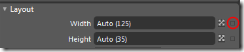
  • Select the Rectangle and Click the tab “Properties” top left againwidth
  • Click the little square all the way to the right behind the field “Width”
  • This will popup a menu. Select “Template Binding/Width”
  • Click the little square behind “Height” and Select “Template Binding/Height”
This will set the width and height of the rectangle to the full width and height of the control. If the user does not set a specific width and height, the values in the default Setters (both 40) will be used. XAML at this point:
<Application.Resources>

  <ControlTemplate x:Key="Thumbupdowncheckboxtemplate" TargetType="CheckBox">
    <Rectangle Fill="#FFF4F4F5" Stroke="Black" Width="{TemplateBinding Width}" 
    Height="{TemplateBinding Height}"/>
  </ControlTemplate>

  <Style x:Key="Thumbupdowncheckboxstyle" TargetType="CheckBox">
    <Setter Property="Template" Value="{StaticResource Thumbupdowncheckboxtemplate}"/>
    <Setter Property="Width" Value="40"/>
    <Setter Property="Height" Value="40"/>
  </Style>

</Application.Resources>
Initial colors
Next steps:
  • ColorClick the white white rectangle behind “Fill”
  • Don’t bother to select a color: simply type in “Green” in the text box and Blend will make a pretty hex string of it ;-)
  • After that, click the little white square behind “Stroke”
  • From the popup-menu, select “Reset”
The design surface now shows a green rectangle. Oh wow ;-) but bear with me, we will get there in the end. Your XAML should now look like this:
<Application.Resources>

  <ControlTemplate x:Key="Thumbupdowncheckboxtemplate" TargetType="CheckBox">
    <Rectangle Fill="Green" Width="{TemplateBinding Width}" Height="{TemplateBinding Height}"/>
  </ControlTemplate>

  <Style x:Key="Thumbupdowncheckboxstyle" TargetType="CheckBox">
    <Setter Property="Template" Value="{StaticResource Thumbupdowncheckboxtemplate}"/>
    <Setter Property="Width" Value="40"/>
    <Setter Property="Height" Value="40"/>
  </Style>

</Application.Resources>
Including the image as an ‘opacity mask’
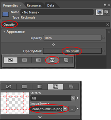
OpacityBlend’s greatest asset – it’s enormous capabilities – unfortunately is also sometimes its Achilles’ heel: there’s a bewildering set of options that’s not always easy to find your way in. Fortunately, at the top of the Properties there’s a Search box that helps you find that hard-to-find-options. Which is extremely helpful – if you happen to know what to look for ;-). In this case:
  • Enter “Opacity” in the Search box
  • Click “No Brush”
  • Select “Tile Brush” – that’s the 2nd icon from the left
  • That produces a drop-down where you can select “icons/thumbsup.png”
your XAML should now look like this:
<Application.Resources>

  <ControlTemplate x:Key="Thumbupdowncheckboxtemplate" TargetType="CheckBox">
  <Rectangle Fill="Green" Width="{TemplateBinding Width}" Height="{TemplateBinding Height}">
    <Rectangle.OpacityMask>
    <ImageBrush Stretch="Fill" ImageSource="icons/thumbsup.png"/>
    </Rectangle.OpacityMask>
  </Rectangle>
  </ControlTemplate>

  <Style x:Key="Thumbupdowncheckboxstyle" TargetType="CheckBox">
  <Setter Property="Template" Value="{StaticResource Thumbupdowncheckboxtemplate}"/>
  <Setter Property="Width" Value="40"/>
  <Setter Property="Height" Value="40"/>
  </Style>

</Application.Resources>
desing2designYour design surface should now looks like to the image to the left, which is kinda crummy. You can use the little triangle on the right bottom, and the two little lines on the right and the bottom, to resize the design surface. This will have no effect on the control template itself, it will make just make it look better (see right image) .
You can also manually add the attributes d:DesignWidth="75" and d:DesignHeight="75" to the Rectangle.
Defining Visual States
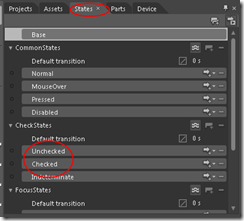
statesA CheckBox has certain states, the most obvious being Checked and Unchecked. Actually there are quite a lot more, and you can see them by clicking on the “States”  tab. Now all these states are defined, but there are no visuals connected to it anymore, since you have replaced the control template by something empty and started filling in yourself. This next step will bring a bit of those visual states back. To prepare for that:
  • Make sure the Rectangle is selected in the “Objects and Timeline”  panel left
  • In the Properties panel to the right of the screen, scroll down to “Transform”
  • Expand the Transform panel if it’s collapsed
  • Selected the leftmost tab
  • Enter 0.5 in both X and Y boxes
transformXAML at this point:
<Application.Resources>

  <ControlTemplate x:Key="Thumbupdowncheckboxtemplate" TargetType="CheckBox">
    <Rectangle Fill="Green" Width="{TemplateBinding Width}" Height="{TemplateBinding Height}" 
       d:DesignWidth="75" d:DesignHeight="75" RenderTransformOrigin="0.5,0.5">
      <Rectangle.RenderTransform>
        <CompositeTransform TranslateX="0.5" TranslateY="0.5"/>
      </Rectangle.RenderTransform>
      <Rectangle.OpacityMask>
        <ImageBrush Stretch="Fill" ImageSource="icons/thumbsup.png"/>
      </Rectangle.OpacityMask>
    </Rectangle>
  </ControlTemplate>

  <Style x:Key="Thumbupdowncheckboxstyle" TargetType="CheckBox">
    <Setter Property="Template" Value="{StaticResource Thumbupdowncheckboxtemplate}"/>
    <Setter Property="Width" Value="40"/>
    <Setter Property="Height" Value="40"/>
  </Style>

</Application.Resources>
In the “States”  panel, click on the “Checked” state. This will add quite some XAML code: you will see a “VisualStateManager.VisualStateGroups” tag appear, defining all three states of the “CheckStates”  group, i.e. “Checked”, “Unchecked”  and “Indeterminate”.
  • Now Select the “Unchecked”  state
  • Make sure the “Rectangle” still is selected in the “Objects and Timeline”  panel
  • Select the “Properties” tab on the top right again
  • Select the (now green) “Fill” Rectangle again.
  • In the box where you previously typed “Green” (which will say ”#FF008000” now), type “Red”. The thumbs-up image will now turn red
  • flipScroll down to “Transform” again
  • Select the right most tab
  • Select the “Flip Y-axis” button, in the middle. The thumbs-up image will now flip vertically and turn into a thumbs-down picture.
  • recordingLocate the little red button on top of the design pane that says “Unchecked state recording is on”. Click it and the text should change into “Unchecked state recording is off”.
If you press F5, the project will compile and run (yes, that works from Blend as well), and you will see that the checkbox shows a green thumbs-up image when selected, and a red thumbs-down image when unselected.
Now, for a finale to make things a little more visually appealing:
  • AnimateGo back to the “States” tab again
  • Select the Textbox with “0 s” in the “Default transition” panel above state “Unchecked”
  • Type 0.5 in the text box
  • And press F5 again.
You will now see the thumbs not simply flip: now it rotates in half a second and change color from red via orange to green. By simply specifying a time you tell the application to actually infer an animation. And there you are. A completely customized, animated, thumb-up-thumbs-down control with just some clicking around. Code-wise it behaves just like a normal checkbox. And if you want to make more of these checkboxes, just select a standard CheckBox, right click it, Select “Edit template/Apply Resources/Thumbupdowncheckboxstyle” and boom – yet another Thumbup-thumbsdown control.
Final XAML:
<Application.Resources>

  <ControlTemplate x:Key="Thumbupdowncheckboxtemplate" TargetType="CheckBox">
    <Rectangle x:Name="rectangle" Fill="Green" Width="{TemplateBinding Width}" 
               Height="{TemplateBinding Height}" 
               d:DesignWidth="75" d:DesignHeight="75" RenderTransformOrigin="0.5,0.5">
      <Rectangle.RenderTransform>
        <CompositeTransform TranslateX="0.5" TranslateY="0.5"/>
      </Rectangle.RenderTransform>
      <Rectangle.OpacityMask>
        <ImageBrush Stretch="Fill" ImageSource="icons/thumbsup.png"/>
      </Rectangle.OpacityMask>
      <VisualStateManager.VisualStateGroups>
        <VisualStateGroup x:Name="CheckStates">
          <VisualStateGroup.Transitions>
            <VisualTransition GeneratedDuration="0:0:0.5"/>
          </VisualStateGroup.Transitions>
          <VisualState x:Name="Indeterminate"/>
          <VisualState x:Name="Unchecked">
            <Storyboard>
              <DoubleAnimation Duration="0" To="-1" 
                    Storyboard.TargetProperty="(UIElement.RenderTransform).(CompositeTransform.ScaleY)" 
                    Storyboard.TargetName="rectangle" d:IsOptimized="True"/>
              <ColorAnimation Duration="0" To="Red" 
                   Storyboard.TargetProperty="(Shape.Fill).(SolidColorBrush.Color)" 
                   Storyboard.TargetName="rectangle" d:IsOptimized="True"/>
            </Storyboard>
          </VisualState>
          <VisualState x:Name="Checked"/>
        </VisualStateGroup>
      </VisualStateManager.VisualStateGroups>
    </Rectangle>
  </ControlTemplate>

  <Style x:Key="Thumbupdowncheckboxstyle" TargetType="CheckBox">
    <Setter Property="Template" Value="{StaticResource Thumbupdowncheckboxtemplate}"/>
    <Setter Property="Width" Value="40"/>
    <Setter Property="Height" Value="40"/>
  </Style>
</Application.Resources>
You could of course go on and define all other states, but this already works pretty well IMHO ;-). Oh and by the way: this should work on any XAML platform, not just on Windows Phone. And for those who don’t like typing or copy-and-pasting, here is, as always, the complete demo solution.
Thanks to Willem Meints for helping me out via twitter on default setters for styles.

22 January 2012

JSON deserialization with JSON.net: basics

I’ve been contemplating an article about handling JSON for some time now, but it turned out to be a rather long article. So I’d thought to try something new, and write a short series in three parts.

  • Part 1 handles the basics
  • Part 2 handles advanced deserialization with class hierarchies
  • Part 3 handles a caching-and-updating scenarios.

And this is part 1 ;-)

This whole article actually boils down to one line of code, but I need to go trough some hooplah to show you how to use it. It all begins with the data. Consider this piece of quite readable JSON, describing a few recent Windows Phone models.

[
  {
    "Brand": "Nokia","Type" : "Lumia 800",
    "Specs":{"Storage" : "16GB", "Memory": "512MB","Screensize" : "3.7"}
  },
  {
    "Brand": "Nokia", "Type" : "Lumia 710",
    "Specs":{"Storage" : "8GB","Memory": "512MB","Screensize" : "3.7"}
  },  
  { "Brand": "Nokia","Type" : "Lumia 900",
    "Specs":{"Storage" : "8GB", "Memory": "512MB","Screensize" : "4.3" }
  },
  { "Brand": "HTC ","Type" : "Titan II",
    "Specs":{"Storage" : "16GB", "Memory": "512MB","Screensize" : "4.7" }
  },
  { "Brand": "HTC ","Type" : "Radar",
    "Specs":{"Storage" : "8GB", "Memory": "512MB","Screensize" : "3.8" }
  }
]

JSON is rather compact, which is a great feature when you are developing for mobile devices. It has also a few downsides as far as client programming is concerned:

  • generating client code for it that does all the parsing and calling, as for SOAP, is not a standard feature of Visual Studio,
  • it’s almost impossible to read for an ordinary human being,
  • deciphering it into classes is a lot of work,
  • hand coding a parser for it is not fun.

Which is why you don’t. There are several ways of generating classes from JSON, the simplest way is this website: json2csharp by Jonathan Keith. You copy a JSON result into the upper textbox, hit the “Generate” button and out come your classes:Json2Csharp

There are more sites that do the same, by the way, but this is what I use. Next steps:

  • Fire up Visual Studio
  • Create a new Windows Phone project (for instance JsonDemo)
  • Plonk the classes generated above in the project. Bonus cookies if you split them in separate files and add namespaces to them. Bonus donut if you, like me, think “RootObject” is actually a pretty ugly name for an object - so change it to "Phone".
  • Click Tools/Library Package Manager/Manage NuGet Packages for Solution (you do have the NuGet Package Manager installed, don’t you? If not, stop whatever you are doing now and get it right this instance, you hear me ;)? )
  • Search for JSON.Net
  • Click install. This will add a reference to NewtonSoft.Json.dll to your product.
  • Add references to Microsoft.Phone.Reactive and System.Observable because they are going to be needed in the next step.

To make the result visible, add some XAML to the default content panel in Mainpage.Xaml – just a button and a templated ListBox, no rocket science here:

<StackPanel>
  <Button Name="Load"
      VerticalAlignment="Top"
      Content="Load phones" Click="Load_Click" />
  <ListBox x:Name="PhoneList" Height="532">
    <ListBox.ItemTemplate>
      <DataTemplate>
        <StackPanel Orientation="Horizontal">
          <TextBlock Text="{Binding Brand}" 
                 Margin="0,0,12,0" />
          <TextBlock Text="{Binding Type}"/>
        </StackPanel>
      </DataTemplate>
    </ListBox.ItemTemplate>
  </ListBox>
</StackPanel>

Finally, open MainPage.Xaml.cs and add the method Load_Click as displayed below.

using System;
using System.Collections.Generic;
using System.Net;
using System.Windows;
using Microsoft.Phone.Controls;
using Microsoft.Phone.Reactive;
using Newtonsoft.Json;

namespace JsonDemo
{
  public partial class MainPage : PhoneApplicationPage
  {
    // Constructor
    public MainPage()
    {
      InitializeComponent();
    }

    private void Load_Click(object sender, RoutedEventArgs e)
    {
      var w = new WebClient();
      Observable
        .FromEvent<DownloadStringCompletedEventArgs>(w, "DownloadStringCompleted")
        .Subscribe(r =>
        {
          var deserialized = 
            JsonConvert.DeserializeObject<List<Phone>>(r.EventArgs.Result);
          PhoneList.ItemsSource = deserialized;
        });
      w.DownloadStringAsync(
        new Uri("http://www.schaikweb.net/dotnetbyexample/JSONPhones1.txt"));
    }
  }
}

JsonSerializerAnd there it is, the one line of code that this is all about. Call the DeserializeObject method, template it with the return type you want, and stuff the JSON string in it. Result: a list of objects with their properties filled, even if there are things like nested objects (specs in these case) and arrays in there.

If you run the demo solution you get the result displayed in the image on the right. Keep in mind this code is by no means Windows Phone specific. There are JSON.Net implementations for virtually all frameworks available. So should you feel the need to use this from Silverlight or full .NET: it’s there.

You should, by the way, pay attention to the structure of the JSON. The code I show works for a list. A list in JSON starts with a square bracket: [. If your JSON starts with a curly brace: { then you get returned a single object - a so called root object. In that case, your deserialization should code return a single object in stead of a list as well, i.e. something like

var deserialized = 
     JsonConvert.DeserializeObject<Phone>(r.EventArgs.Result);

Finally, a ninja tip:

  • Click Tools/Library Package Manager/Manage NuGet Packages for Solution  again
  • Search for SharpGIS.GZipWebClient
  • Click install
  • Change “WebClient” in the Load_Click method to SharpGIS.GZipWebClient

This plug-in replacement for WebClient by Morten Nielsen adds support for GZIP compressed web requests – this reduces network traffic even further, apparently boosting load performance significantly. You won’t really notice the difference on such a small data files as used in this sample, but as your JSON return values get larger, so will be the impact of using this library.

For the record: I am not ill nor do I have forsaken MVVM, but I tried to make the example as simple as possible so yes, I used a little code behind, as to not to cloud the solution in architectural frills. ;-)

Thanks to Matthijs Hoekstra for putting me on track to this, and to fellow #wp7nl developer Leon Zandman for correcting some annoying typos.

31 December 2011

A Windows Phone 7 behavior to show an image background for a search string

Note: an update to this article has been written here

On New Year’s Eve I can’t help but writing this last bit of 2011: yesterday on a #wp7nl developer’s meet up, which was basically a free-for-all fun hacking event organized by Matthijs Hoekstra, I wrote a little thingy for Windows Phone 7 that accepts a string, tries to find an image for it using Bing Image search and displays it as a background. Of course it’s a behavior – I write behaviors a dozen, because the concept of reusable dynamic behavior is something that fits very well with the way I think. Call me the behaviornator if you like ;-)

It’s very simple, it’s quite fun, demonstrates a little Rx usage, makes quite unusual use of the Bing Image Search api - and it will play a supporting act in my newest Windows Phone 7 app. The basic structure of the behavior is set up utilizing the #wp7nl library SafeBehavior that I described earlier:

using System;
using System.Linq;
using System.Net;
using System.Windows;
using System.Windows.Controls;
using System.Windows.Media;
using System.Windows.Media.Imaging;
using System.Xml;
using System.Xml.Linq;
using Microsoft.Phone.Reactive;
 
namespace Wp7nl.Behaviors
{
  /// <summary>
  /// A behavior that puts an image on the background of the Attched object
  /// using Bing Image Search
  /// </summary>
  public class DynamicBackgroundBehavior : SafeBehavior<Panel>
  {
    private ImageBrush backgroundBrush;
    
    public DynamicBackgroundBehavior()
    {
      Opacity = 1.0;
    }

    #region SearchString
    public const string SearchStringPropertyName = "SearchString";

    /// <summary>
    /// The search string to be used on Bing Maps
    /// </summary>
    public string SearchString
    {
      get { return (string)GetValue(SearchStringProperty); }
      set { SetValue(SearchStringProperty, value); }
    }

    public static readonly DependencyProperty SearchStringProperty = 
        DependencyProperty.Register(
        SearchStringPropertyName,
        typeof(string),
        typeof(DynamicBackgroundBehavior),
        new PropertyMetadata(String.Empty, SearchStringChanged));

    public static void SearchStringChanged(DependencyObject d, 
                                           DependencyPropertyChangedEventArgs e)
    {
      var behavior = d as DynamicBackgroundBehavior;
      if (behavior != null)
      {
        behavior.StartGetFirstImage((string)e.NewValue);
      }
    }
    #endregion

    /// <summary>
    /// Bing search key
    /// </summary>
    public string BingSearchKey { get; set; }

    /// <summary>
    /// Stretch used for the image
    /// </summary>
    public Stretch Stretch { get; set; }

    /// <summary>
    /// Opacity used for the image
    /// </summary>
    public double Opacity { get; set; }
  }
}

In short, this behavior has four properties:

  • Opacity
  • Stretch
  • BingSearchKey
  • SearchString

BingSearchApiOpacity and Stretch are just simple properties for the images that is going to be displayed. SearchString is the string that’s going to be used to find an image for. This is a dependency property – so it can be used in data binding. Note the SearchStringChanged method – this is called when the SearchString property changes. That in turn is firing the method StartGetFirstImage, that will start the actual search.

BingSearchKey is a 40-character long string identifying your application. You have to create a key for your application on the Bing Developer portal. Click the left button (“Sign in – Bing Search API”) and fill in the form depicted to the right(click for larger image).

Note: the behavior references Microsoft.Phone.Reactive – so the project holding this should Microsoft.Phone.Reactive.dll and System.Observable.dll

Moving on to the setup of the behavior, which is very simple now since we are building upon the SafeBehavior:

/// <summary>
/// Setup the behavior
/// </summary>
protected override void OnSetup()
{
  backgroundBrush = new ImageBrush
  {
    Stretch = Stretch,
    Opacity = Opacity
  };

  // Set the image brush to the background of the Panel 
  AssociatedObject.Background = backgroundBrush;
}

Simply put: create an Image brush using the property settings, and put it as background on the GUI element to which the behavior is attached.

The method that’s called from SearchStringChanged (which is fired as the SearchString dependency property changes) is implemented as showed below:

/// <summary>
/// Start the image request using Bing Serach
/// </summary>
/// <param name="searchString"></param>
protected void StartGetFirstImage(string searchString)
{
  var queryUri = 
    string.Format(
      "http://api.bing.net/xml.aspx?Appid={0}&query={1}&sources=image",
      BingSearchKey, searchString);
  var request = WebRequest.Create(queryUri) as HttpWebRequest;
  var response = 
    Observable.FromAsyncPattern<WebResponse>(
      request.BeginGetResponse, request.EndGetResponse)();
  response.Subscribe(WebClientOpenReadCompleted, WebClientOpenReadError);
}

An Uri is formed using the BingSearchKey and the actual search string – and the clause “sources=image”, telling Bing to return images. That Uri is fed to a standard WebRequest. And then the Rx framework comes into play to easily process the async read process. The Observable.FromAsyncPattern and Subscribe usage has the distinct advantage of not having to attach all kind of event handlers, trap errors with try-catch blocks, and not forgetting to detach the event handlers when the reading is done. The Rx framework handles this all, so I don’t have to worry about that.

The final piece of the behavior – the actual processing of the image:

/// <summary>
/// Called when image search returns
/// </summary>
/// <param name="result"></param>
private void WebClientOpenReadCompleted(WebResponse result)
{
  using (var stream = result.GetResponseStream())
  {
    using (var reader = XmlReader.Create(stream,
       new XmlReaderSettings { DtdProcessing = DtdProcessing.Ignore }))
    {
      var doc = XDocument.Load(reader);

      // Get the first image from the result
      XNamespace ns = "http://schemas.microsoft.com/LiveSearch/2008/04/XML/multimedia";
      if (doc.Root != null)
      {
        var firstImage = doc.Root.Descendants(ns + "MediaUrl").FirstOrDefault();
        if (firstImage != null)
        {
          Deployment.Current.Dispatcher.BeginInvoke(() =>
            {
              var bi = new BitmapImage
                {
                  UriSource = new Uri(firstImage.Value),
                  CreateOptions = BitmapCreateOptions.BackgroundCreation
                };
              backgroundBrush.ImageSource = bi;
            });
        }
      }
    }
  }
}

/// <summary>
/// Called upon a search error (not used)
/// </summary>
/// <param name="ex"></param>
private void WebClientOpenReadError(Exception ex)
{
}

Since the xml.aspx page is referenced, Bing returns the result as a xml document. If you are interested in the details of the Bing Search result, feel free to explore the xml document – this code basically just finds the first “MediaUrl” tag, makes a BitMapImage from it, and puts the result into the backgroundBrush. And we’re done.

carrotdemoPut this behavior on a descendant of Panel (a Grid, for instance), fill the BingSearchKey property with a valid key, databind the “SearchString” property to a string in a ViewModel and as soon as the value of SearchString changes, the behavior will show the first available image returned by Bing Image search as a background on that grid.

I’ve put together a small demo application containing and demonstrating the behavior. It deviates in two ways from my usual mode of operation. First, does not run out of the box – you will have to get your own Bing Search API key first. Second: it does not use MVVM – I’ve data bound the behavior’s SearchString property directly to a TextBox’s Text property, which makes the behavior start to search for background immediately as you start typing, as showed to the left. So if you type “carrot” in the textbox you get, well – an image showing carrots ;-)


Well, that’s all for 2011. A very special year from me with some ups and downs, with getting a Windows Phone Development MVP award definitely being the top event in the "ups" category. Now onwards to 2012, which I think will prove to be a very exciting year indeed. I hope you all will continue to enjoy this blog as I did - and you apparently did in 2011 as well.

03 December 2011

Re-imagining the behavior to show the Windows Phone 7 camera as background

This blog turns out not only to be a collection of how-to samples but also a record of my evolution as a Windows Phone 7 developer. At the end of my previous post, Safe event detachment base class for Windows Phone 7 behaviors, I promised a usage example and I decided to re-implement the behavior to show the Windows Phone 7 camera as background using the SafeBehavior as a base class. This makes the code considerable easier.

The base setup of the re-implemented behavior is pretty simple:

using System.Windows.Controls;
using System.Windows.Media;
using System.Windows.Navigation;
using Microsoft.Devices;
using Microsoft.Phone.Controls;

namespace Wp7nl.Behaviors
{
  /// <summary>
  /// A behavior that shows a camera view on the background of a panel
  /// </summary>
  public class CameraViewBackgroundBehavior : SafeBehavior<Panel>
  {

    private PhotoCamera camera;
    private VideoBrush backgroundBrush;

    public CameraViewBackgroundBehavior()
    {
      ListenToPageBackEvent = true;
    }
  }
}

Note this behavior needs to detect the user navigating back to the page – this in necessary because we need to do something with the camera.

In stead of all the song and dance for attaching and detaching events using the snippet I published earlier, it’s now a matter of overriding the OnSetup and OnCleanup methods to initialize the camera:

protected override void OnSetup()
{
  if (camera == null)
  {
    camera = new PhotoCamera();
    ParentPage.OrientationChanged += ParentPageOrientationChanged;
  }

  // Create a video brush with the right parameters
  backgroundBrush = new VideoBrush
                      {
                        Stretch = Stretch.UniformToFill,
                        AlignmentX = AlignmentX.Left,
                        AlignmentY = AlignmentY.Top
                      };

  // Set the video brush to the background of the panel 
  // and and do an initial display
  AssociatedObject.Background = backgroundBrush;
  backgroundBrush.SetSource(camera);
  SetVideoOrientation(ParentPage.Orientation);
}

protected override void OnCleanup()
{
  ParentPage.OrientationChanged -= ParentPageOrientationChanged;
  camera.Dispose();
  camera = null;
}

This behavior also needs to do some action when the user actually navigates back to the page, which you can do by override the OnParentPageNavigated method - in this case, re-initializing the whole behavior

/// <summary>
/// Fired whe page navigation happens
/// </summary>
/// <param name="sender"></param>
/// <param name="e"></param>
protected override void OnParentPageNavigated(object sender, NavigationEventArgs e)
{
  // Re-setup when this page is navigated BACK to
 if( IsNavigatingBackToBehaviorPage(e))
 {
   if (camera != null)
   {
     OnCleanup();
     OnSetup();
   }
  }
}

The actual implementation of showing the camera background has hardly changed, and is only mentioned here for the sake of completeness:

private void ParentPageOrientationChanged(object sender, OrientationChangedEventArgs e)
{
  SetVideoOrientation(e.Orientation);
}

/// <summary>
/// Sets background video brush parameters based upon page orientation
/// </summary>
/// <param name="orientation"></param>
private void SetVideoOrientation(PageOrientation orientation)
{
  System.Diagnostics.Debug.WriteLine("Switching to {0}", orientation);
  switch (orientation)
  {
    case PageOrientation.PortraitUp:
      backgroundBrush.Transform = 
        new CompositeTransform { Rotation = 90, TranslateX = 480 };
      break;
    case PageOrientation.LandscapeLeft:
      backgroundBrush.Transform = null;
      break;
    case PageOrientation.LandscapeRight:
      if (Microsoft.Phone.Shell.SystemTray.IsVisible )
      {
        backgroundBrush.Transform = 
          new CompositeTransform { Rotation = 180, TranslateX = 728, TranslateY = 480 };
      }
      else
      {
        backgroundBrush.Transform = 
            new CompositeTransform { Rotation = 180, TranslateX = 800, TranslateY = 480 };
      }
      break;
  }
}

As this post demonstrated, using the SafeBehavior as a base class makes life a lot easier than implementing the whole pattern over and over again, even when using a snippet.

Code is part of the the #wp7nl library on codeplex and can be found here