Leon Zandman, fellow member of the Dutch Windows Phone 7 developer community, told me that my MapMania app used too much screen real estate for secondary controls and too little for the actual map, especially in landscape mode. I got the same feedback within 24 hours of app certification from one NY Chua from Singapore, who apparently had bought MapMania (which shows, by the way, that something like the Standard About Page does work very well for user/customer feedback). So it was time to do something.
I decided to make the page title collapsible by the user, using a nice animation. And of course I wanted this to be a setting that could be tombstoned, and I should be able to drive the animation from my ViewModel. Since Windows Phone 7 does not support DataTriggers, there are some challenges, but they are easy to overcome. I will demonstrate my solution and the technique I used by making a small application from scratch, for I like to give complete examples – so you won’t have to hunt for the missing clues. You will pick up some Blend knowledge long the way as well. I hope.
Start out the usual way:
- Create a new Windows Phone 7 application – this one I called “ModelDrivenAnimations”
- Add a Solution Folder “Binaries”
- Put “GalaSoft.MvvmLight.WP7.dll”, “GalaSoft.MvvmLight.Extras.WP7.dll” and “System.Windows.Interactivity.dll” in it.
And this time add a fourth assembly: Expression.Samples.Interactivity.dll. Get it from CodePlex (or just nick it out of my sample solution). Put it in the Binaries Solution folder as well, make a reference to all four assemblies from the project and we are ready to go.
First of all, muck up the page by putting something in the ContentPanel grid, like this:
<Grid x:Name="ContentPanel" Grid.Row="1" Margin="12,0,12,0">
  <TextBlock TextWrapping="Wrap" FontSize="85">
   This is content that could do with some more space
  </TextBlock>
</Grid>
Which will yield a very pretty *cough* looking application screen similar to the image to the right.
Next is a very simple view model:
using System.Windows.Input;
using GalaSoft.MvvmLight;
using GalaSoft.MvvmLight.Command;

namespace ModelDrivenAnimations
{
  public class SampleViewModel : ViewModelBase
  {
    private string _appName = "ModelDrivenAnimations";
    public string AppName
    {
      get { return _appName; }
      set
      {
        _appName = value;
        RaisePropertyChanged("AppName");
      }
    }

    private bool _isPageTitleVisible = true;
    public bool IsPageTitleVisible
    {
      get { return _isPageTitleVisible; }
      set
      {
        _isPageTitleVisible = value;
        RaisePropertyChanged("IsPageTitleVisible");
      }
    }

    public ICommand TogglePageTitleCollapsed
    {
      get
      {
        return new RelayCommand(() =>
        {
          IsPageTitleVisible = !IsPageTitleVisible;
        });
      }
    }
  }
}
Very basic: a property “IsPageTitleVisible” to control the actual display of the Page Title, a command to fire the actual toggle, and a property with the app name to see if the binding actually works ;-) - normally this would come from a resource file, eh? If you’ve read my blog before, you should be starting to recognize the next part. First, add this to the namespace declarations of MainPage.xaml by adding
xmlns:ModelDrivenAnimations="clr-namespace:ModelDrivenAnimations"
to the namespaces, then declare the SampleViewModel just above the LayoutRoot grid:
<phone:PhoneApplicationPage.Resources>
  <ModelDrivenAnimations:SampleViewModel x:Key="SampleViewModel"/>
</phone:PhoneApplicationPage.Resources>
set the DataContext of your layout root grid to be the SampleViewModel:
<Grid x:Name="LayoutRoot" Background="Transparent"
  DataContext="{StaticResource SampleViewModel}">
and then change Text="MY APPLICATON" into Text="{Binding AppName}" on the ApplicationTitle TextBlock. Rebuild the application, and even in design time the application name changes to “ModelDrivenAnimations”. Well done. The stage is set. Now proceed to start Expression Blend and open your project. Go on! Contrary to what most developers think, it won’t bite ;-)
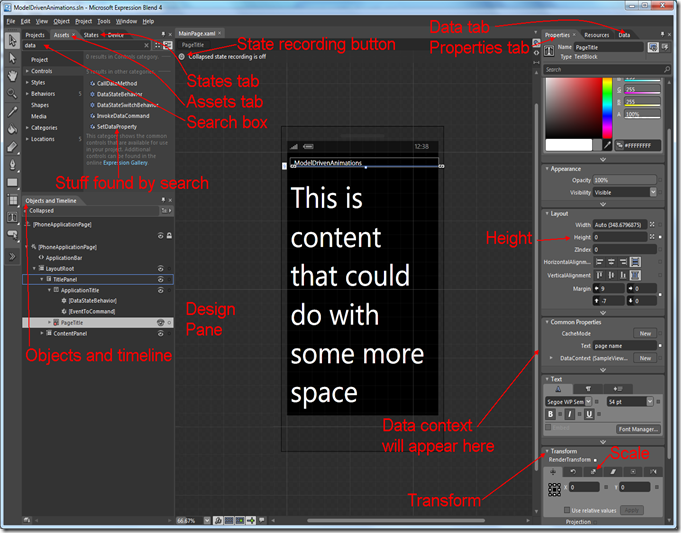
First of all, we are going to bind the command. I decided to let the PageTitle disappear as the user taps on the ApplicationTitle, so select the ApplicationTitle on the design pane screen. Then proceed as follows:
- Top left, select the “Assets” tab, and start to type “EventToCommand” in the search box. Long before you are even halfway done, the “EventToCommand” behavior appears.
- Drag the EventToCommand command on top of the ApplicationTitle in the “Objects and Timeline” panel about halfway left on the screen.
- Go to the right top side of the screen. Select the “Properties” tab. In the panel “Trigger” is a dropdown “EventName” which is currently set to “Loaded”. Change that to “MouseLeftButtonDown” – we want the effect appear when the user taps the title, not when it is loaded ;-).
- Select the tab “Data” at the top right of the screen. Way down below at the bottom right a panel “Data Context” with “SampleViewModel” in it will appear. Expand this, find the “TogglePageTitleCollapsed" (last entry) and drag this onto the EventToCommand.
- Hit “Ok” on the popup that appears.
You have just created a command binding without even typing a line of code. Expression Blend even added all the namespace prefixes for you.
One little piece of preparation – once again, select the PageTitle and select the “Properties” tab. In the panel “Layout” there is a property “Height” and that is set to “Auto (95.765625)”. This needs to be a fixed value, or else the Visual State Manager cannot infer how to change states. So change this value to “95”.
Now we are going to have some fun with the Visual State Manager itself:
- Looking back at the top left of the screen you will notice a “States” tab. Select that, and two very small icons will appear.
- Clicking the first one will create a new Visual State Group and three more icons.
- Click on the middle one (“Add state”) and add a state “Expanded”. The top of the design pane in the middle will now show a little red button with the text “Expanded state recording is on”.
- Click the red button to turn off the recording.
- Add another Visual State called “Collapsed” but don’t turn off the recording now. In stead, select the PageTitle again (either in design view or in the Objects and Timeline panel).
- Click tab “Properties” on the right top side of the screen.
- Change the Height property again – this time to 0 (zero). The PageTitle will collapse to a thin blue indicator line.
- Look down, and find the panel “Transform”. It’s likely to be collapsed at this point, so expand it first. Select the third tab, called “Scale”.
- Change the Y value to 0 .
Click on visual state “Expanded” in the tab “States” on the left top of the screen and the PageTitle will reappear again. Now turn of the recording for visual states by clicking the red button on top of the design pane, and commence to the last step: connecting the states to the ViewModel by using DataStateBehavior.
- Select “Assets” again in the top left panel, type “DataState” in the search box and “DataStateBehavior” and “DataSwitchBehavior” will appear.
- Drag DataStateBehavior on top of “ApplicationTitle” in the “Objects and Timeline” panel.
- On the right side of the screen, select the Properties tab again, and the properties of the behavior will appear.
- Click the little grey square behind “Binding”, select “Data binding” in the popup menu, and then “IsPageTitleVisible” in the popup.
- Click the down pointing arrow on the bottom of the dialog for more options, and select TwoWay.
- Click OK.
- Enter “Collapsed” for “FalseState”,
- Enter “Expanded” for TrueState,
- Enter “True” for Value.
The odd thing is – sometimes Blend does not let you enter “True” for Value. I am not sure if this is a bug. Please switch to XAML in that case and enter the value manually (use the small button with “< >” on the top right of the design pane to switch to XAML and find the DataStateBehavior; the button above (with the circle) will take you back to design view).
Then hit F5. Yes, hit F5. Even designers need to test stuff runtime, and they can do so by hitting F5, just like a developer. If you’ve done everything right, the Page Title will disappear and reappear when you click on the application title. But that’s hardly an animation. So switch back to Blend one more time:
- Select the “States” tab once more,
- Select “Default Transition”
- Change the “0 s” in the little textbox to the right into “1”.
Then hit F5 again. The Visual State Manager now takes 1 second to change from one state to another, and infers an animation from that. Your PageTitle now appears to fold away in itself. The net effect, as I implemented it in MapMania, looks like this:
Notice the little visual cue next to the app name ;-). And this is about the simplest of animations. There are lots of other possibilities – you can even make your own transitions, let things rotate in or out of existence, whatever. I really encourage you to explore the possibilities of Transform tab – I just started doing that myself ;-).
The Visual State Manager is, when all is said and done, nothing more than a State Machine in which you can define states and transitions, that can be easily controlled from your View Model – i.e. code, the developer’s comfort zone – by using DataStateBehavior. And DataSwitchBehavior – this can handle more states than just true or false, as far as I understood.
For those who lost the way in text, a little “Blend Road Map” showing everything we have used to get to this result:
A little rant to conclude this post: some of you may have noticed that since we’ve hooked up the ViewModel to the View we did not type a single line of code at all. I can hear some of you think “maybe this dolt should rename his blog “Blend by Example” and leave us alone” ;-)
I am convinced that, as a WPF, Silverlight or Windows Phone developer, you should have at least a basic understanding of what you can do with Blend. First of all, even if you work without a separate designer, it saves you a lot of XAML typing, which I can assure you is not very much fun, and every good developer is a lazy developer. Second, creating things like animations and pretty user interfaces is pretty hard, and Blend helps you a lot with it. Maybe you as a developer like bare-bones GUI’s, but your users don’t, so better use a tool that can help with it. Third, as you do work with a separate designer, you need to know what he or she needs to have to make the application tick. Developer and designer need to communicate and understand each other. Now what do you think is more likely – that a designer understands what you as a developer are doing, or the other way around? And who will be calling the shots in a development process – the one that only understands his own side of the designer/development fence, or the one that can look over the fence and stomp around at the other side, if only a little? So get going and get to grips with Blend. Or else – heaven forbid - have designers commandeering you around ;-)
If something went wrong along the way, please refer to the sample solution.


1 comment:
Looks like a nice tutorial using Blend for animations and other things Blend is best at. Guess I will actually be following it to try and get the hang of it myself. Thanks for another pageview magnet. ;-)
Post a Comment