Last updated November 10 2011
You know that band you used to love when you were in your teens? They really rocked your adolescent years. They rocked like hell. Their concerts where one great party. I would never end. ….except you grew up, the times changed, so did the music, but the band stuck to what made them great. Fame faded, and slowly they disappeared from your sight. Maybe even their CD’s did not make it into your MP3 collection. They lost their mojo. Sometimes they still performed, but you did not know and even less cared. Sic transit gloria mundi. We all have such a band. If you ask politely and promise to keep it a secret, I’ll tell you mine ;-) .
Now suppose, just for the sake of this analogy, after years and years this band of yours got back together. Not to do a ‘one more time for old times’ sake or a Live Aid gig, no: they kick out the drug-addicted drummer, recruit two new young guitar players, a few cool babes as extra singers, and team up with a new song writer. They reinvent themselves, make a new album – totally different music than what they did before, but still keeping what made them great – a beautiful performance. They bring out their new album and they TOTALLY rock the charts.
Now if you try to imagine the WTF feeling this would give you, you get an idea what I had for a few moments when I first booted up the Nokia Lumia 800 that was delivered on November 4. My first four mobile phones were all Nokia – and now this! Enough poetic mesmerizing, down to business. My thoughts on the Nokia Lumia 800. I’ll just follow the format I used for my HTC 7 Pro to make a fair comparison
The phone itself
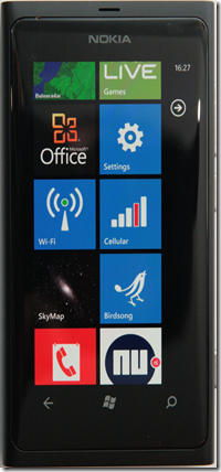
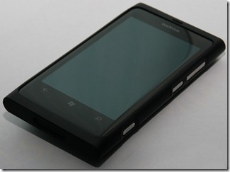
It’s physical dimensions are 11.5 x 6 x 1 cm according to my own measurements, although I have to allow for a bit of uncertainty on the latter two because a cross-section on this phone would basically be an oval. The back side is convex, and so is the front side, i.e. the screen. This gives a very beautiful result. It weights 142 grams, which I don’t think is very much but it feels heavy – although I think solid would be a better way to describe it. The first thing that strikes – this phone is different from what I am used to in the Windows Phone arena. It’s beautiful. It has a smooth, streamlined look. And it feels that way, too. Its polycarbonate unibody design feels soft and it has nothing of this plasticy feel so common for these kind of devices. The hardware buttons are freakin’ made of metal – having used the Lumia for only a short time makes the camera button of the HTC 7 Pro feel like a wobbly piece of plastic on a cheap bubble contact. See below how this looks. Click for larger picture – as with all pictures in this post
The USB port is on the top, which I initially thought was very stupid for in-car use. When I attach a charger the plug would stick out of the top of the phone. Turned out I had not thought long enough about it. More about that later.
Screen

Another thing about the screen – it is very sensitive. So much actually that I had a little trouble getting the hang of it – I accidently kept selecting messages in the People hub when I just wanted to scroll trough them. But this extreme sensitivity has a rather unexpected bonus for me – combined the convex screen and the enhanced Mango keyboard I can actually touch type on it. I only managed this with the HTC Titan before – because that is simply big enough to accommodate my big carpenter’s son hands.
I am told the screen is made out of gorilla glass. This is supposed to be pretty scratch resistant. I did not try any destructive tests on it. I will report later on its durability.
Phone calls
Made one phone call with my wife. She said I sounded very crisp and and it was better than the HTC 7 Pro. Hello world, welcome to the smartphone that is actually able to make decent phone calls. Well phooey, is anyone impressed? Nokia were already making phones when I was just coming from college so if they had not figured out how to do this after all this time, they had best started making rubber boots again a long time ago.
The camera

I also took a few pictures of flowers close by but that did not work out at all. Only later I found out that this probably has to do with the default Focus mode – that’s Macro, and then apparently it does not want to focus on things close by.
Sound

Miscellaneous

The headphones are kinda cheap and don’t to the phone’s music playing capabilities much justice. For those who want better sound quality, Nokia makes these amazing Monster headsets that are a much better match for the phone.
Software and extra’s
No review of a Lumia 800 would be complete without the on-board extra’s. First of all – we got the genuine iconic, nay, legendary Nokia ringtone and SMS alert. Played on a xylophone. Very nice. For now I selected all the Nokia sounds as a default, just for the heck of it.
Then we have Nokia Drive. Say hello to free turn-by-turn navigation with downloadable maps and voice directions. I don’t know if it’s actually completely world wide, but if I select Manage Maps/Install, I first have to select which continent I want maps to install for: Africa, America, Asia, Australia/Oceania and Europe. Drilling down reveals Russia is in there. China is in there. South America is in there too - including Argentina which does not even have a Marketplace, and the Cayman Islands for heavens’ sake. If works way better than Bing Maps directions, and it’s free! And what’s even better – it supports landscape mode, so you can turn your phone sideways and have wide angle navigation. And then the penny dropped – maybe this is why the USB port is on top, for if you use it for navigation you rotate it 90° and then the USB port is conveniently pointing sideways for the car charger.
The current version of Nokia Drive still needs an online connection for finding addresses and Points of Interest, but at the Tweakers event at November 9 in Amsterdam Nokia revealed an update that supports total offline navigation will be available very soon. So I guess it's time to kiss my old TomTom goodbye. The Germans have a very good saying about this, attributed to Mikhail Gorbachev: “Wer zu spät kommt, den bestraft das Leben” (life punishes those who are too late)
Nokia Maps – can’t say much about this; what I currently have on my phone is a very early beta that is obviously not ready yet, but it seems to be a non-driver’s map application for finding your way around. You know? Like Local Scout, but one that does work in Europe? As a GIS developer I very much wonder if this can be extended and used like the Bing maps control in custom applications. I am not sure if this will eventually work completely offline as well.
Nokia Music – reminds me of what I saw from Pandora before us Europeans got kicked out. Stream music from a multitude of pre-defined ‘stations’ and you can buy and download stuff from Nokia’s MP3 store if you like. Yesterday I just turned it on “80’s rock” and let it go for hours on end. You can skip a limited number of songs you don’t like. The price of listening: zilch. Nada. Nothing. No pass required, no subscription required. Booya Nokia! Does this compete with Zune? Like hell it does – if we could get Zune here. Zune is available in like, 8 countries? Nokia music in a little short of 40, if I am correct. In the mean time – this is great news for all people outside the Zune coverage area. But beware – this eats a lot of data. Don’t run this over your 3G connection unless your unlimited plan is really unlimited. The software specifically warns you for that on first startup.
Room for improvement
Nokia have gone out on a limb to make the ultimate Windows Phone 7 and I think they came pretty far – but there is still room for improvement. From a hardware standpoint, it lacks two features, which by now everyone has heard of:
- No front facing camera
- No gyro
Now the gyro is a feature that the proverbial Iowa soccer mom ain’t gonna miss – the camera is going to hurt if indeed Skype comes to Windows Phone 7. Although I also wonder how much it will actually hurt – I’ve had a video call capable phone for 2.5 years and only used this feature it 3 times – to demo it. I have no idea how much iPhone users actually use FaceTime all the time.
I think Nokia could also look into bringing out a model with more storage aboard. It now ‘only’ has 16GB of storage, which is more than enough for my podcasts, photo’s and music (I may be just weird but I don’t go carrying around enormous music libraries) but apparently there are people need more these days.
Personally I would like also like to have seen a somewhat larger screen.
The verdict
I shelled out €562 to get a Windows Phone 7 with keyboard from the UK to the Netherlands only 8 months ago. I am a die hard physical keyboard phone user. After playing with the Nokia Lumia 800 for only 48 hours, I transferred all my stuff to it and shut down the HTC 7 Pro. Sorry old workhorse. You did well. I know I am going to miss the keyboard sometimes, but the screen colors, the relative sluggish response, the already battered plastic shell, the ablating battery case… it’s just no match for this design beastie.
If you want a phone that supports all the latest Windows Phone 7 hardware features, buy something else. There is plenty of choice. That’s the fun thing of Windows Phone 7 – there is a baseline quality, they’re basically all good, and you do have a choice. One size does not fit all – as for instance the HTC Titan shows quite literally. If you want a really well designed, durable and smart looking, and not overly large Windows Phone 7 device with some very nice free extra’s that’s available at a pretty aggressive price point, by all means, buy the Lumia 800. Especially the blue one. I predict that is going to be a phone you can put on the table and everyone will know what it is – pretty soon.
Concluding thoughts
If this is what Nokia can crank out in 8 months, I really wonder what will happen in 2012. But even more important than what they crank out, is how they do it. They really got their marketing act together, and it looks like we are finally going to see some serious marketing for the Windows Phone 7 environment. I see posters, dummy’s and demo models of actual Windows Phone 7 devices appearing in shops. Someone from the #wp7nl gang who has a Lumia too walked into a Vodafone shop to get a microsim and the staff all recognized the phone immediately.
The time for Windows Phone 7 being an ‘underground’ phone platform is over!


No comments:
Post a Comment