Intro
In the various XAML-based platforms (WPF, UWP, Xamarin) that were created by or are now part of Microsoft we have the great capability to perform databinding and templating - essentially saying to for instance a list 'this is my data, this is how a single item should look, good luck with it' and the UI kind of creates itself. This we don't quite have in Unity projects for Windows Mixed Reality. But still I gave it my best shot when I created a dynamic floating menu for my app Walk the World (only the first few seconds are relevant, the rest is just showing off a view of Machu Picchu)
Starting point
We actually start using the end result of my previous post, as I don't really like to do things twice. So copy that project to another folder, or make a branch, whatever. I called the renamed folder FloatingDynamicMenuDemo. Then proceed as follows:
- Delete FloatingScreenDemo.* from the project's root
- Empty the App sub folder - just leave the .gitignore
- Open the project in Unity
- Open the Build Settings window (CTRL+B)
- Hit the "Player Settings..." button
- Change "FloatingScreenDemo" in "FloatingDynamicMenuDemo" whereever you see it. Initially you will see only one place, but please expand the "Icon" and "Publishing Settings" panels as well, there are more boxes to fill in.
- Rename the HelpHolder to MenuHolder
- Remove the Help Text Controller from the HelpHolder.
- Change the text in the 3DTextPrefab from the Lorum ipsum to "Select a place too see"
- Change the text's Y position from 0.84 to 0.23 so it will end up at the top of the 'screen'
So now we have a workspace with most of the stuff we need already in it. Time to fill in the gaps.
Building a Menu Item part 1 - graphics
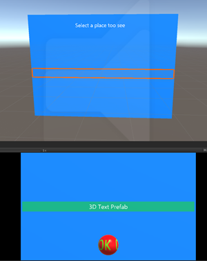
First, we will make a material for the menu items, as this will be easier for debugging. Go to the App/Materials folder, find HelpScreenMaterial, hit CTRL-D, and rename HelpScreenMaterial 1 to MenuItemMaterial. Then, change its color to a kind of green, for instance 00B476FF. Also, change the rendering mode to "Opaque". This is so we can easily see the plane.
Inside the MenuHolder we make a new empty game object. I called it - d'oh - MenuItem. Inside that MenuItem, we first make a 3DTextPrefab, then a Plane. The plane will be of course humongous again, and very white. So first drag the green MenuItemMaterial on it. Then change it's X Rotation to 270 so it will be upright again. Then you have to experiment a little with the X and Z scale until it is more or less the same width as your blue Plane, and a little over 1 line of text height, as showed to the left.The values I got were X = 0.065 and Z = 0.004 but this depends of course on the font size you take. Make sure there is some extra padding between the left and right edges of the green Plane and the blue Plane.

Since this is a Menu, we want the text to appear from the left. The Anchor is now middle center and it's Alignment Center, and that is not desirable. So we have to set Alignment to Left and Anchor to Middle Left, and then we drag the text prefab to the left till the edge of the green plane. I found an X position value of -0.32.
Now create a folder "Prefabs" in your App folder in the Assets pane, and drag the MenuItem object from there. This will create a Prefab. The text MenuItem in the Hierarchy will turn blue.
You can now safely delete the MenuItem from the Hierarchy. Mind you, the Hierarchy. Make sure it stays in Prefabs.
Building a Menu Item part 2 - code
Our 'menu' needs some general data structure helper. So we start with an interface for that:
public interface IMenuItemData
{
    object SelectMessageObject { get; set; }

    string Title { get; set; }

    int MenuId { get; set; }
}
And a default implementation:
public class MenuItemData : IMenuItemData
{
    public object SelectMessageObject { get; set; }

    public string Title { get; set; }

    public int MenuId { get; set; }
}
The SelectedMessageObject is the payload - the actual data. The Title contains the text we want to have displayed on the menu, and the MenuId we need so we can distinguish select events coming from multiple menus, should your application have such. For the distribution of events we once again use the Messenger that I introduced before (and have used extensively ever since).
To send a selected object around we need a message class:
public class MenuSelectedMessage
{
    public IMenuItemData MenuItem { get; set; }
}
And then we only need to add this simple MenuItemController, a behaviour that handles when the MenuItem is tapped:
using HoloToolkit.Unity.InputModule;
using HoloToolkitExtensions.Messaging;
using UnityEngine;

public class MenuItemController : MonoBehaviour, IInputClickHandler
{
    private TextMesh _textMesh;
    private IMenuItemData _menuItemData;

    public IMenuItemData MenuItemData
    {
        get { return _menuItemData; }
        set
        {
            if (_menuItemData == value)
            {
                return;
            }
            _menuItemData = value;
            _textMesh = GetComponentInChildren<TextMesh>();
            if (_menuItemData != null && _textMesh != null)
            {
                _textMesh.text = _menuItemData.Title;
            }
        }
    }

    public void OnInputClicked(InputClickedEventData eventData)
    {
        if (MenuItemData != null)
        {
            Messenger.Instance.Broadcast(
                new MenuSelectedMessage {MenuItem = MenuItemData});
            PlayConfirmationSound();
        }
    }

    private AudioSource _audioSource;
    private void PlayConfirmationSound()
    {
        if (_audioSource == null)
        {
            _audioSource = GetComponent<AudioSource>();
        }
        if (_audioSource != null)
        {
            _audioSource.Play();
        }
    }
}
There is a property MenuItemData that accepts an IMenuItemData. If you set it, it will retain the value in a private field but also shows the value of Title in a TextMesh component. This behaviour is also an IInputClickHandler, so if the user taps this, the OnInputClicked method is called. Essentially all it does, is sending off it's MenuItemData object - that was used to fill the text with a value - to the Messenger. And it tries to play a sound. You should decide for yourself if you want that.
So all we have to to is add this behaviour MenuItem prefab, as this is the thing we are going to click on. That way, if you click next to the text but at the correct height (the menu 'row'), it's still selected. So select MenuItem, hit the "Add Component" button and add the Menu Item Controller.
Now if you like, you can add an with AudioSource with a special sound that signifies the selection of a menu. As I have stated before, immediate (audio) feedback is very important in immersive applications. I have done not so. I usually let the receiver of a MenuSelectedMessage do the notification sound.
Building the menu itself
This is done by a surprisingly small and simple behavior. All it does is instantiate a number of game object on a certain positions.
using System.Collections.Generic;
using System.Linq;
using UnityEngine;public class MenuBuilder :MonoBehaviour
{
    public float MaxNumber = 10;

    public float TopMargin = 0.1f;

    public float MenuItemSize = 0.1f;

    private List<GameObject> _createdMenuItems = new List<GameObject>();
    public MenuBuilder()
    {
        _menuItems = new List<IMenuItemData>();
    }
    public GameObject MenuItem;

    private IList<IMenuItemData> _menuItems;

    public IList<IMenuItemData> MenuItems
    {
        get { return _menuItems; }
        set
        {
            _menuItems = value;
            BuildMenuItems();
        }
    }

    private void BuildMenuItems()
    {
        foreach (var menuItem in _createdMenuItems)
        {
            DestroyImmediate(menuItem);
        }
        if (_menuItems == null || !_menuItems.Any())
        {
            return;
        }
        for (var index = 0; index < MenuItems.Count; index++)
        {
            var newMenuItem = MenuItems[index];
            var newGameObject = Instantiate(MenuItem, gameObject.transform);
            newGameObject.transform.localPosition -=
                new Vector3(0,(MenuItemSize * index) - TopMargin, 0);

            var controller = newGameObject.GetComponent<MenuItemController>();
            controller.MenuItemData = newMenuItem;
            _createdMenuItems.Add(newGameObject);
        }
    }
}
All the important work happens in BuildMenuItems. Any existing items are destroyed first, then we simply loop through the list of menu items - these are IMenuItemData objects. Then a game object provided in MenuItem is instantiated inside the current game object, and it's vertical position is calculated and set. Then it gets the MenuItemController from the instantiated game object - it just assumes it must be there - and puts the newMenuItem in it - so the MenuItem will show the associated text.
So now add the MenuBuilder to the HelpHolder. Then, from prefabs, drag the MenuItem prefab onto the Menu Item property. Net result:
Now let's add an initialization behaviour to actually make stuff appear in the menu. This behavior has some hard coded data in it, but you can imagine this coming from some Azure data source
using System.Collections.Generic;
using UnityEngine;

public class VistaMenuController : MonoBehaviour
{
    void Start()
    {
        var builder = GetComponent<MenuBuilder>();

        IList<IMenuItemData> list = new List<IMenuItemData>();
        list.Add(new MenuItemData
        {
            Title = "Mount Everest, Nepal",
            MenuId = 1,
            SelectMessageObject = new WorldCoordinate(27.91282f, 86.94221f)
        });
        list.Add(new MenuItemData
        {
            Title = "Kilomanjaro, Tanzania",
            MenuId = 1,
            SelectMessageObject = new WorldCoordinate(-3.21508f, 37.37316f)
        });
        list.Add(new MenuItemData
        {
            Title = "Mount Rainier, Washington, USA",
            MenuId = 1,
            SelectMessageObject = new WorldCoordinate(46.76566f, -121.7554f)
        });
        list.Add(new MenuItemData
        {
            Title = "Niagra falls (from Canada)",
            MenuId = 1,
            SelectMessageObject = new WorldCoordinate(43.07306f, -79.07561f)
        });
        list.Add(new MenuItemData
        {
            Title = "Mount Robson, British Columbia, Canada",
            MenuId = 1,
            SelectMessageObject = new WorldCoordinate(53.061809f, -119.168358f)
        });
        list.Add(new MenuItemData
        {
            Title = "Athabasca Glacier, Alberta, Canada",
            MenuId = 1,
            SelectMessageObject = new WorldCoordinate(52.18406f, -117.257f)
        });
        list.Add(new MenuItemData
        {
            Title = "Etna, Sicily, Italy",
            MenuId = 1,
            SelectMessageObject = new WorldCoordinate(37.67865f, 14.9964f)
        });

        builder.MenuItems = list;
    }
}
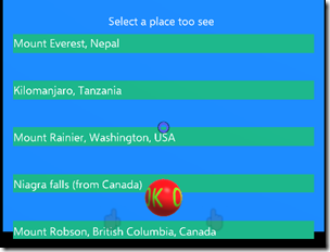
This comes straight from Walk the World - these 7 of it's 10 vistas with a location to look from it. Add this behaviour to the Help Holder as well. Now it's time to run the code and see our menu for the very first time!
 Some tweaking and fiddling
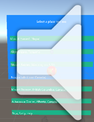
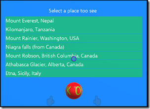
If you press the play button in Unity, you will get something like displayed to the left. A former British colleague would say something among the lines of "It's not quite what I had in mind". But we can fix this, fortunately.
In the Menu Item Builder that you have added to HelpHolder, there's two more properties:
The first one is the relative location where the first item should appear, and the second the size allotted for each menu. Clearly the first MenuItem is placed too low. The only way to really get this done is by trial an error. The higher you make Top Margin, the higher up the first item moves. A value of 0.18 gives about this and that seems about right:
And 0.041 for Menu Item Size gives this:
Which is just what you want - a tiny little space between the menu items. Like I said, just trial and error.
Testing if its works
Once again, a bit lame: a simple behaviour to listen to the menu selection messages:
using HoloToolkitExtensions.Messaging;

public class MenuListener : MonoBehaviour
{
    // Use this for initialization
    void Start()
    {
        Messenger.Instance.AddListener<MenuSelectedMessage>(ProcessMenuMessage);
    }

    private void ProcessMenuMessage(MenuSelectedMessage msg)
    {
        if (msg.MenuItem.MenuId == 1 )
        {
            Debug.Log("Taking you to " + msg.MenuItem.Title);
            Debug.Log(msg.MenuItem.SelectMessageObject.ToString());
        }
    }
}
Add this behaviour to the Managers object, click play, and sure enough if you click menu items, you will see in Unity's debug console:
Yes, I know, that's a lame demo - you connect something to the message that actually does something. Speak out the name. Have a dancing popup. The point is that it works and the messages get out when you click :)
Some final look & feel bits
Yah! We have a more or less working menu but it looks kind of ugly and not everything works - the close button, for instance. Let's fix the look & feel first. We needed the greenish background of the menu item to properly space and align the items, but now we do not need it anymore. So go to the MenuItemMaterial. Select a new 
Then go all the way down, to "Other" and set "Cull" to front. That way, the front part of the plane - the green strips will be invisible - but still hittable.
If you press play, the menu should now look like this:
Getting the button to work
As stated above, the button is not working - and for a very simple reason: in my previous post I showed that it looks for a component in it's parent that is a BaseTextScreenController (or a child class of that). There are none.
So let's go back to the VistaMenuController again. The top says
public class VistaMenuController : MonoBehaviour
Let's change that into
public class VistaMenuController : BaseTextScreenController
You will need to add "using HoloToolkitExtensions.Animation;" to top to get this to work. You will also need to change
void Start()
{
into
public override void Start()
{
  base.Start();
If you now hit "Play" in Unity you will end up with this
Right. Nothing at all :). This is because the base Start method (which is the Start method of BaseTextScreenController) actually hides the menu, on the premises that you don't want to see the menu initially. So we have to have a way to make it visible. Fortunately, that's very easy. We will just re-use the ShowHelpMessage from the previous post again to make this work. Go back one more time to the VistaMenuController "Start" method, and add one more statement:
public override void Start()
{
  base.Start();
  Messenger.Instance.AddListener<ShowHelpMessage>(m => Show());
If you now press play, you will still see nothing. But if you yell "Show help" to your computer (or press "0" - zero) the menu pops up and comes into view. With, I might add, the for my apps now iconic "pling" sound. And if you click the button, the menu will disappear with the equally iconic "clonk" .
Some concluding remarks
Of course, this is still pretty primitive. With the current font size and menu item size, stuff will be happily rendered outside of the actual menu screen if your texts are too long or you have more than 7 menu items. That is because the screen is just a floating backdrop. Scrolling for more items? Nope. Dynamic or manual resizing? Nope. But it is a start, and I have used it with great success.
Let me know if this was valuable to you, and what you used it for. Full demo project at GitHub, as always.





3 comments:
Can I ask what the benefit of this is vs Unity UI elements?
Not dynamic, and I had considerable trouble getting those to work. I used them before, but this was less work. May just be my inexperience with it ;) Oh, and I was trying to make a semi 3D experience (hence the round 'button')
Yes, the 3d is a pro for sure. I believe Unity UI is dynamic though, you can edit most properties in a script. So far I've found them easier to use because of all the documentation, but that's my preference I suppose.
Post a Comment