Intro
Way too often I still see Mixed Reality apps with default (white) splash screens, app windows, or even worse – the default Unity Icon. When Mixed Reality was HoloLens-only and brand new, you kinda got away with that, as the WOW factor of the actual app eclipsed almost everything else, and the iconography did not matter much as there was only the Holographic Start menu. Also, although judging from my download numbers a fair number of HoloLenses are in use worldwide, the number is pretty limited compared to, say, PCs.
These days of leeway are over. With the advent of the Fall Creators Update, Mixed Reality apps can run on PCs with the right hardware – and in stead of a $3000+ device, a $400 headset will do. And as soon as I made an app available for immersive headsets, my download numbers exploded. Much more eyeballs so much more visibility, and in Windows, the flexible start menu and it’s different tile sizes makes omissions in the iconography glaringly visible. I also notice ‘ordinary’ users are a lot less forgiving. So, time to step up your game.
Note: I am currently using Unity 2017.2.0p2 MRTP5. Things may change. They tend to do that very much in this very new and exiting field :)
So what do you need?
At the very minimum, and icon of size 620x620 and a 1240x600 splash screen. 620x620 is the 310x310 icon at 200% scale. I tend to used 200% icons as they are the default sizes that are created by the Unity editor. I give the start 620x620 file the default name “Square310x310Logo.scale-200.png” and go from there.
In my Unity Assets folder I create a folder “UWPassets” and I drag the “Square310x310Logo.scale-200.png” in 
- Wide310x150Logo.scale-200.png (620x310 pixels)
- Square150x150Logo.scale-200.png (300x300 pixels)
- Square71x71Logo.scale-200.png (142x142 pixels)
- Square44x44Logo.scale-200.png (88x88 pixels)
- StoreLogo.scale-100.png (50x50 pixels)
Do pay attention to the last one – that‘s 100% scale, so it’s actual size. To the right you see my actual icon.
These are just the standard sizes for UWP apps, if you are coming in from a Unity perspective you may not be familiar with them.
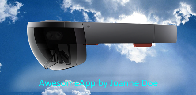
And then, as I said, you need the splash screen. This needs to be 1240x600. I have created this ‘awesome’ splash screen:
I suggest you take something that says something more about your app, but this will to for an example.
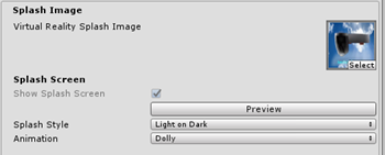
The result in the Unity editor:
Putting icons in the right place in Unity
This is not rocket science: Hit File/Build Settings and then the button “Player Settings”. This will open the “PlayerSettings” pane on the right side of your editor. First, you open the pane “Icon” and then the section “Store logo”. From the UWPAssets folder, drag the “StoreLogo.scale-100” into the top box.
You can leave the rest empty. Then skip all the other sections, scroll all the way down to the section “Universal 10 tiles and logos”. Open “Square 44x44 Logo”
Drag the “Square44x44Logo.scale-200.png” into the 4th box from the top, marked 200%. Then open section “Square 71x71 Logo” and drag “Square71x71Logo.scale-200.png” in. Proceed similarly with the remaining three sizes till all the 200% boxes are filled.
Splash screen, splash screen and splash screen
Now dig this – there are actually three places to put splash screens in. Potentially you can have different splash images - I tend to use the same one everywhere. So scroll further down to the Splash Screen section. First up, on top, is the “Virtual Reality Splash Image”. You can drag your splash screen in there if you want.
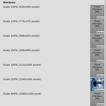
Next up, a bit further down, is the Windows splash screen:
This is the most important one. This appears on your desktop when the app starts, it also is shown in a rectangle in Immersive Headsets during the app ‘transition scene’ (when your Cliff House is replaced by the app), and it’s displayed on your default app screen:
And finally, there’s Windows Holographic Splash screen:
This is actually important in a HoloLens. As this does not have a ‘transition scene’, it shows a floating splash screen for a few seconds. You can see it in an immersive headset too, but usually for a very short time – most of the time you see it flash by in a split second before the actual app appears.
So where is the very first splash screen for? To be honest, I have no idea. Possibly it’s for other, non Windows Mixed Reality based apps.
Just tiny thing left
I tend to generate the app in a subfolder “App” in the root of the project. Typically, I place a .gitignore in there that, look like this:
*.*
*
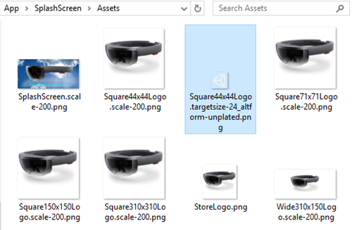
true to it’s name, it ignores – everything. Because, well, it’s a generated app, right? But if you go into the generated app’s assets (App\SplashScreen\Assets) you will notice something odd:
Although we nicely created an icon for every size, there’s still this pesky “Square44x44Logo.targetsize-24_altform-unplated.png” icon with the default logo that – interestingly, is 24x24 pixels big. So where is this used? Apparently in the task bar and – as I have noticed – in the developer portal. So although your customers won’t see it in the Store (I think), you will, it will clutter op your app list in the developer portal, and that’s annoying. I have found no way to actually create this from Unity, so I take the easy approach: I create yet another icon, now 24x24, overwrite that “Square44x44Logo.targetsize-24_altform-unplated.png” in App\SplashScreen\Assets and add it to Git manually there. Unity won’t overwrite it, and if it get’s deleted or overwritten, I can always revert. You just need to remember to check the icon before actually submitting.
Conclusion
So now you know how to properly assign the minimum iconography and splash screens, and I let’s agree on no longer publishing stuff with default icons or empty splash screens to the store, right? ;)
Project code – although it does not actually do anything – can be found here. But it’s useful reference material.





3 comments:
Reading this, I think back to the Windows Phone app days,and.. cringe. Never liked the whole visual resource maze of publishing apps one bit, but you are right that it is very important. PowerShell modules might have their own idiosyncrasies, but visual resource mazes are not among them. ;-)
Great article! I learned a lot actually
I learned YOU something Dennis? *blink* *blink*. Wow. Well enjoy it.
Post a Comment