 Intro
Intro
When I started making Mixed Reality apps (or better, HoloLens apps, as Mixed Reality as we learned to know only became available with the Fall Creators Update) I had the nerve to create my own ‘buttons’, as I assumed simple 3D ‘switches’ were too skeuomorphic. I assumed a kind of 3D variant of “that-what-not-should-be-called-Metro” would appear, and I took a shot at it myself with a red rotating spherical OK button. Let’s say the responses have been less then enthusiastic, especially from real designers.
Fast forward half a year, the Mixed Reality Toolkit now contains a number of standard UI components, and also have started to incorporate some elements of then Mixed Reality Design Labs project (that apparently has been abandoned, as its last commits are now 7 months old, and that’s only a README update – the code has not been touched for longer).
What’s in there?
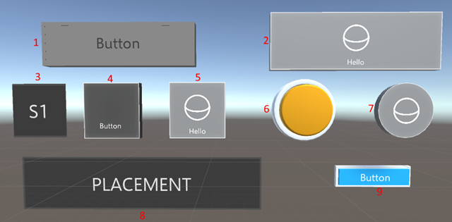
If you copy the Mixed Reality Toolkit Samples UI elements into your project next to the Mixed Reality Toolkit itself (as I described here) you will find no less than 9 different push buttons that I think are usable
For your and my convenience, I labeled them with numbers.
- Prefab “Button”, from HoloToolkit-Examples/Ux/Prefabs
- Prefab “RectangleButton” fromHoloToolkit/Ux/Prefabs/Buttons
- Prefab “MiniButton”, from HoloToolkit-Examples/Prototyping/Prefabs
- Prefab “ButtonHolographic”, from HoloToolkit-Examples/Ux/Prefabs
- Prefab “SquareButton”, fromHoloToolkit/Ux/Prefabs/Buttons
- Prefab “ButtonPush”, from HoloToolkit-Examples/Ux/Prefabs
- Prefab “CircleButton”, from HoloToolkit/Ux/Prefabs/Buttons
- Prefab “BasicButton”, from HoloToolkit-Examples/Prototyping/Prefabs
- Prefab “ButtonTraditional”, from HoloToolkit-Examples/Ux/Prefabs
There is some more stuff, but I don’t think they are very usable compared to these.
Interactive or not interactive, that’s the question
Some buttons (but not all) have an “Interactive” script component attached. Only the Button (1), the MiniButton(3) and the BasicButton (8) have this script attached. For the other 6 buttons, it’s simply a matter of dragging it onto the button from HoloToolkit-Examples/Ux/Scripts.
To see how that works, I have made a little script, that shows game object for about 1/10th of a second when the method “Click” is called. It’s not quite rocket science
using System.Collections;
using UnityEngine;

public class Clicker : MonoBehaviour
{

    public GameObject ObjectToShow;

    private void Awake()
    {
        ObjectToShow.SetActive(false);
    }

    public void Click()
    {
        ObjectToShow.SetActive(true);
        StartCoroutine(HideAfterTimeout());
    }

    IEnumerator HideAfterTimeout()
    {
        yield return new WaitForSeconds(0.1f);
        ObjectToShow.SetActive(false);
    }
}
Then I add a 3DTextPrefab to the scene (let’s call that ClickText), attach the script about it, and then drag the ClickText object on top of the “ObjectToShow” field
Now if we want the MiniButton (3) to actually respond to these events…
…we have to click the + button under “On Select Events()”, select “Editor and Runtime”, drag the ClickText on the object box, and then select “Clicker.Click” from the dropdown (first select “Clicker”, then “Click” – it’s a menu with a submenu). Now if you have done everything right, the text “Click!” will briefly flash when you tap the MiniButton.
You can use this trick for all the buttons – if they don’t have the Interactive script by default, just drag it on them, and go from there. In the sample project, all buttons make the text appear.
Feedback sounds
In Mixed Reality environments, most users are new, so giving feedback that the actually selected something is key. This may happen trough sound. You are lazy (like me): RectangleButton (2), MiniButton (3), ButtonHolographic (4) and CircleButton actually have these built-in. When you press those, they will make a click sound.
Visual feedback
Basically, there are two types of feedback involved with buttons. First, you want to make sure the user understand something is actually selectable. A nice way is to have the button light up in some way when the gaze cursor hits it. And guess what, apart from the BasicButton, they all have that built-in for free.
- RectangleButton (2), MiniButton(3), SquareButton (5), ButtonPush (6) and CircleButton(7) become brighter if the gaze cursor strikes them.
- ButtonHolographic (4) does not only become brighter, but text and icon on the button move a bit ‘forward’ when the gaze cursor strikes it. A pretty cool sight to see.
- Button (1) and ButtonTraditional (9) not only become brighter, but also animate part of themselves outward in an animation that makes it very clear this can be clicked upon. They very much resemble real physical buttons, in that way.
When it comes to actually clicking the button:
- RectangleButton (2), MiniButton(3),SquareButton (5), and CircleButton(7) flicker briefly when they are actually clicked
- ButtonHolographic (4) does not flicker, but the text and it’s icon move slightly backward into the button. Note: default the ButtonHolographic only shows text, more on that later.
- Button (1), ButtonPush (6) and ButtonTraditional (9) animate backwards and change color slightly when pushed, really mimicking the behavior of a physical button.
Setting Icons – the tricky way
SquareButton, RectangularButton and CircleButton
These at least show a default icon, called ObjectCollectionSphere
The UI suggests you can use select from a number of predefined icons using a dropdown. Now that is technically correct, but unfortunately that does not have any effect – the dropdown always jumps back to “ObjectCollectionSphere” and the icon never changes. Fortunately there’s another way to change the Icon.
First of all, we need an icon to use. I took this one as displayed to the right: I want to make this into a kind of “Play” button, as if to start music. First copy the image (play.png) into your project (be aware – the background is not black, but transparent). I typically make a folder “Textures” for these kind of images. Then simply select “Override Icon” and drag the Icon in “Icon Override”
And lo and behold:
One icon with button. The same procedure can be followed for SquareButton and CircleButton
HolographicButton
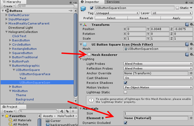
This is a bit harder, but not much. In theory, you should be able to using the same UI as with the previous buttons, but unless I miss something, I can’t get it to work. So I dived a little deeper, and found the sub prefab UIButtonSquareIcon. That has a Mesh renderer, but that’s turned off, and has no materials defined either
If you just fix enable the Mesh Render, you just get an ugly magenta square – the color Unity typically uses when something is wrong.
So how do we this thing to display an icon on this button? suppose we want to make this a “play” button, with an icon like before. Make a new Material (I always use a folder “Materials” for that). After that,you only need to select the Fast Configurable shaded, set Rendering mode to transparent, and drag the Play image on top of the square I indicated.
And then it’s simply a matter of dragging the material in the first entry of the Materials list

Audio feedback
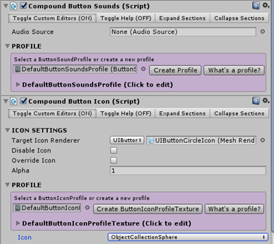
I have found out people also very much like audio feedback – since all computers have sounds and HoloLens even has the awesome Spatial Sound, so why not use it? RectangleButton (2), ButtonHolographic (4), SquareButton (5) and CircleButton (6) have a built-in click sound. It’s quite subtle, so maybe you want to replace it with a louder or different sound. You can change the click sound, and assign a lot more sounds to other events in these buttons, by finding the “Compound Button Sounds” script and setting a whole lot of other sounds. I would like to advise modesty: I don’t think Mixed Reality sounding like a pinball machine will be particularly convincing to business stakeholders – but there’s at least the possibility to tinker with sound on events:
Some bits, pieces and observations
- Although all buttons work, I see no reason to use BasicButton (8) because it has no built-in feedback at all. I just mentioned it for the sake of completeness.
- In some cases, I have noticed the click sounds not always works, or stops working halfway in the app. I have not yet been able to track down when and why this is happening.
- Using older versions of Unity and/or of the Mixed Reality Toolkit I have observed the icons or texts disappear under some viewing angles. In the demo app, I have not been able to observe that. Maybe the newer version of Unity (I used 2017.3.0f3 this time) fixed it
- The TraditionalButton has a bit of weird origin. If you select the button, you can see it’s origin is a bit above, a bit before, and quite a bit to the right of the actual graphics. This makes aligning it a bit of a challenge, but once you know that, it’s not a real problem
Conclusion
There’s quite a bit more of fun UI elements in the Mixed Reality Toolkit and it’s examples, and I intend to explore these a little bit more soon. Finally, I have to thank my colleague Edwin van Manen for coming up with the blog post title when I was describing it’s contents this morning. For those who don’t recognize it, it’s a reference to the movie “Fantastic Beast and Where To Find Them” that’s set in the Harry Potter ‘Universe’. Given the fact Mixed Reality in general and HoloLens in particular still feels like magic, it’s an awesome title indeed :D.
Code (although there is hardly any) can be found here.







No comments:
Post a Comment